


( 6488 Students )


Career Path - Data Analyst
You’ll learn core data analysis skills and the cutting-edge tools and technologies used in analytics and advanced data analytics.Preview Career Path - Data Analyst course
Price Match Guarantee Full Lifetime Access Access on any Device Technical Support Secure Checkout Course Completion Certificate 95% Started a new career
BUY THIS COURSE (
95% Started a new career
BUY THIS COURSE (GBP 32 GBP 99 )-
 94% Got a pay increase and promotion
Students also bought -
-
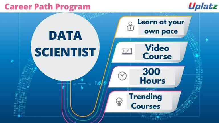
- Career Path - Data Scientist
- 300 Hours
- GBP 32
- 6978 Learners
-

- Career Path - Data Engineer
- 100 Hours
- GBP 32
- 1167 Learners
-
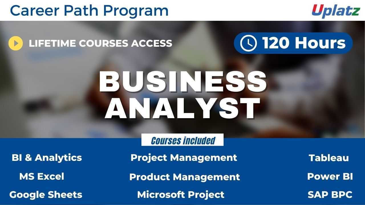
- Career Path - Business Analyst
- 120 Hours
- GBP 32
- 612 Learners
The Data Analyst Career Path Program consists of 14 courses on trending data analysis technologies, tools, and software.
1) Data Visualization in Python
2) Data Visualization in R
3) Power BI (basic to advanced)
4) Power BI
5) Tableau (basic to advanced)
6) Tableau
7) Tableau (comprehensive)
8) SAS Business Intelligence
9) SAP BusinessObjects Business Intelligence (SAP BO)
10) Talend
11) SQL Programming with MySQL
12) Google Analytics
13) Microsoft Excel
14) Google Sheets
A data analyst will take data and figure out a variety of things, such as how to price new materials, how to reduce transportation costs, or how to deal with issues that cost the company money. Data analysts are in high demand across all sectors, such as finance, consulting, manufacturing, pharmaceuticals, government and education. The ability to pay attention to detail, communicate well and be highly organised are essential skills for data analysts. They not only need to understand the data, but be able to provide insight and analysis through clear visual, written and verbal communication.
Businesses have access to huge volumes of data, but the skills to turn information into action are just catching up. As a result, there is a huge demand for data analytics skills, offering career opportunities across a range of industries and specialisms. A decade back IBM stated that 90% of the world's data has been created in the last two years and the creation of data has grown exponentially. In the last five years, job postings asking for data visualisation have grown by 540% and demands for Tableau skills by 1000%. Growing your confidence in business analytics can unlock rewarding career opportunities and ensure that you continue to progress through to decision-making roles.
This Data Analyst Career Track program by Uplatz will help you acquire the core data analysis skills and the cutting-edge tools and technologies used in analytics and advanced data analytics. By the end of this course you'll understand the inner workings of the data analytics pipeline from joining, filtering, extracting data to developing dashboards. With this data analytics career path program, you'll acquire skills to be able to create in-depth analyses with bar charts, line charts, donut charts and even geographical maps. This course can be a turning point in your data analytics and consulting career!
Course/Topic 1 - Business Intelligence and Data Analytics - all lectures
-
In this lecture session we discuss about Bi concepts, examples and application of business intelligence and data analytics and also cover other concepts of BI.
-
In this lecture session we learn about basic concepts of BI and also cover factors of business intelligence in brief.
-
In this lecture session we learn about data warehouse data access and data dashboarding and also cover presentation in BI.
-
In this lecture session we learn about product database, advertise database and customer demographic database and also cover data analyst concepts.
-
In this lecture session we learn about basic introduction of business intelligence and also cover factors of business intelligence in brief.
-
In this lecture session we learn about introduction of predictive modeling and also cover functions of predictive modeling in brief.
-
In this lecture session we learn about data related to customer services and also talk about customer relation databases in brief.
-
In this lecture session we learn about introduction of NoSQL and also cover basic functions of NoSQL in business intelligence.
-
In this lecture session we learn about graph stores and also talk about the advantages and disadvantages of graph stores in BI.
-
In this lecture session we learn about hierarchical clustering in business intelligence and also talk about clustering factors in BI.
-
In this lecture session we learn about introduction of salesforce in business intelligence and also talk about some basic uses of salesforce.
-
In this lecture session we learn about introduction to NLP and also cover what is natural language processing in artificial intelligence.
-
In this lecture session we learn about natural language processing speech to text conversion and also cover the importance of natural language processing.
-
In this lecture session we learn about introduction of apache server in business intelligence and also talk about basics of apache server.
-
In this lecture session we learn about deep drive into business intelligence and also talk about factors or deep drive in business intelligence.
-
In this lecture session we learn about data warehousing in business intelligence and data analytics and also talk about factors and features of data warehousing.
-
In this lecture session we learn about types of data in business intelligence and also talk about different types of data in BI.
-
In this lecture session we learn about mobile BI and also talk about open source BI software replacing vendor offering.
-
In this lecture session we learn about real time BI in business intelligence and also talk about factors of real time BI in brief.
-
In this lecture session we learn about data analytics comprehensively and also talk about functions of data analytics.
-
In this lecture session we talk about data analytics vs business analytics and also talk about the importance of data analytics.
-
In this lecture session we learn about Embedded analytics and also talk about functions of Embedded analytics in data analytics.
-
In this lecture session we learn about collection analytics and also cover the importance of collection analytics.
-
In this lecture session we learn about survival analytics and also cover duration analytics in brief.
-
In this lecture session we learn about machine learning techniques and also cover the importance and factors of machine learning techniques in business intelligence.
-
In this lecture session we learn about geospatial predictive analytics and also talk about functions of geospatial predictive analytics in business intelligence.
-
In this lecture session we learn about cohort analysis in data analyst and we also cover functions and importance of cohort analysis.
-
In this lecture session we learn about data mining in business intelligence and also talk about data mining functions and why we need data mining in business intelligence.
-
In these lecture sessions we learn about anomaly detection and also talk about functions of anomaly detection in brief.
-
In these lecture sessions we learn about statistically sound association and also talk about factors of statistically sound association in business intelligence.
-
In this lecture session we learn about cluster analysis. We’ll cover all types of cluster analysis in brief and also cover the importance of cluster analysis in business analysis.
-
In this lecture session we learn about DBSCAN in business intelligence and also talk about DBSCAN functions and importance.
-
In this lecture session we learn about regression models in business intelligence and also talk about the function of regression models.
-
In this lecture session we learn about extraction based summarization in business intelligence and also cover all types of summarization in data analyst.
-
In this lecture session we learn about machine learning in BI and also talk about factors and importance of machine learning in brief.
-
In this lecture session we learn about machine learning vs BI we also discuss the basic difference between machine learning and business intelligence.
-
In this lecture session we learn about how ml can make BI better and also talk about ml basic functions.
-
In this lecture session we learn about data warehousing and also talk about how we manage data warehousing in business intelligence.
-
In this lecture session we learn about data warehousing in business intelligence and data analytics and also talk about factors and features of data warehousing.
-
In this lecture session we learn about data mart in business intelligence and also talk about data mart function.
-
In this lecture session we learn about data dimensions in business intelligence and also cover all types of data dimension in BI.
-
In this lecture session we learn about data dimension in business intelligence and also cover functions and importance of data dimension.
-
In this lecture session we learn about data vault modeling in business intelligence and also cover different types of vault modeling in brief.
-
In this lecture session we learn about links and satellites and also cover the importance and factors of links and satellites in business intelligence.
Course/Topic 2 - Data Visualization in Python - all lectures
-
In this first video tutorial on Data Visualization in Python course, you will get a brief introduction and overview on what is data visualization, its importance, benefits and the top python libraries for Data Visualization like Matplotlib, Plotly and Seaborn.
-
In this first part of the video on Matplotlib, you will learn both the theoretical and the practical knowledge on Matplotlib, which is one of the most popular and top python libraries for Data Visualization. You will get a complete introduction to Matplotlib, the installation of Matplotlib with pip, the basic plotting with Matplotlib and the Plotting of two or more lines in the same plot.
-
In this second part of the Matplotlib video tutorial, you will learn how to add labels and titles like plt.xlabel and plt.ylabel along with understanding how to create lists and insert functions onto it. All this can be seen explained it detail by the instructor by taking examples for it.
-
In this tutorial, you will learn about 2 important python libraries namely; Numpy and Pandas. Along with the theoretical concepts, you will also get practical implementation on various topics related to these two such as what is Numpy and what is its use, the installation of Numpy along with example, what is pandas and its key features, with the installation of Python Pandas and finally the Data Structure with examples of Pandas.
-
In this second part of the Numpy and Pandas tutorial, you will learn the complete overview of Pandas like its history, its key features, the installation process of Pandas, Pandas Data Structure and within it the Data Frame and syntax to create Data Frame. All this will be explained in detail by the instructor.
-
In this third part of the video tutorial on Numpy and Pandas, you will learn about creating Data Frame from Dictionary. Also, you will understand how to read CSV Files with Pandas using practical examples by the Instructor.
-
In this tutorial, you will learn about the different Data Visualization Tools such as Bar Chart, Histogram and the Pie Chart. You will get a complete understanding of what is these tools, why and how to use these 3 tools, the syntax for creating Bar Chart, Histogram and the Pie Chart and different programs for creating these data visualization tools. In the first part of the video, you will learn about the Bar Chart and in the subsequent videos, you will learn about the Histogram and the Pie Chart.
-
In this second part of the Data Visualization Tools video, you will learn about the complete overview of Histogram like what is Histogram, how to create Histogram and many others with the help of practical examples by the instructor.
-
In this third and final part of the Data Visualization Tools video, you will learn about the Pie Chart-what is Pie Chart, how to create the Pie Chart and how to create the syntax for Pie Chart? All these questions will be explained in detail by the instructor by taking practical examples. Further, you will understand the concept of Autoptic parameter in Pie Chart.
-
In this first part of the video tutorial on more data visualization tools, you will learn about some additional data visualization tools apart from Bar Chart, Histogram and Pie Chart such as Scatter Plot, Area Plot, STACKED Area Plot and the Box Plot. The first part of this tutorial consists of mainly the Scatter Plot, the theoretical concepts associated with it such as what is Scatter Plot, the syntax for creating Scatter Plot and creating Scatter Plot with examples.
-
In this second part of the video tutorial, you will learn and understand what is Area Plot, creating Area Plot with Function and Syntax and creating Area Plot with examples. All these will be seen explained in detail by the instructor. Further, you will also learn and understand the concept associated with the STACKED Area Plot.
-
In this final part of the video tutorial, you will learn about the Box Plot; which is also known as Whisker Plot, how to create Box Plot, its syntax and arguments used like Data & Notch, the parameters used in Box Plot such as vert, patch artist and widths. These will be seen explained in detail by the instructor.
-
In this first video tutorial on Advanced Data Visualization Tools, you will learn about the Waffle Chart – its definition, complete overview, the syntax and programs to create Waffle Chart and the step-by-step procedure to create the Waffle Chart. All these will be seen explained in detail by the instructor.
-
In this second part of the video tutorial on Advanced Data Visualization Tools, you will learn about the Word Cloud-its definition, the reason why Word Cloud is used, what are the modules needed in generating the Word Cloud in Python, how to install Word Cloud and how to create Word Cloud with the help of some examples.
-
In this tutorial, you will learn and understand about the concept of Heat Map and how one can create the Heat Map along with the help of the parameter camps. This will be seen explained in detail by the instructor.
-
In this first part of the video tutorial on Specialized Data Visualization Tools, you will learn about the Bubble Chart; its definition and how to create bubble charts with the help of different examples.
-
In this video, you will learn about the Contour Plots; which is also sometimes referred to as Level Plots. Along with understanding the whole theoretical concept of Contour Plots, you will also learn how to create Contour Plots with practical examples as will be seen explaining by the instructor in details.
-
In this third part of the video on Specialized Data Visualization Tools, you will learn about the Quiver Plot and how to create the Quiver Plot by taking different examples. This will be seen explained in complete details by the instructor.
-
In this video on Specialized Data Visualization Tools, you will learn about 3D plotting in Matplotlib and also the 3D Line Plot used in Data Visualization with the help of different practical examples and how to create it. This will be seen explained in detailed by the instructor throughout the tutorial.
-
In this tutorial, you will learn about the 3D Scatter Plot and how to create a 3D Scatter Plot. The instructor will be seen explaining this in complete details with the help of different examples.
-
In this tutorial, you will learn and understand the 3D Contour Plot, what is the function used in creating the 3D Contour Plot and how it can be created; which will be explained in detail by the instructor with the help of examples.
-
In this last part of the video tutorial on Specialized Data Visualization Tools, you will learn about the 3D Wireframe Plot and the 3D Surface Plot, along with creating the same with the help of different examples, seen explained in detail by the instructor.
-
In this tutorial, you will learn about Seaborn, which is another very important Python library. Through this video, you will get an introduction to Seaborn, along with some important features of it, functionalities of Seaborn, Installation of Seaborn, the different categories of plot in Seaborn and some basic type of plots one can create using Seaborn like Distribution Plot.
-
In this second part of the video on Seaborn Library, you will learn and understand some basic plots using Seaborn Library like the Line Plot. Here, the instructor will be seen explaining in detail the Seaborn Line Plot and with a detailed example of how to create Seaborn Line Plot with random data.
-
This is a continuation video of creating the Line Plot with some more examples using the Seaborn library. Along with this, you will also learn about the Lmplot and the function used for creating the Lmport. This can be seen explained in detailed by the instructor with practical examples.
-
In this tutorial, you will learn about Data Visualization using Seaborn library. Under this, you will learn the Strip Plot, how to create the strip plot and the program used to create the Strip Plot. This will be shown by the Instructor with detailed examples like Strip plot using inbuilt data-set given in Seaborn and others.
-
In this video, you will learn about the Swarm Plot; its definition, complete overview and how you can create the Swarm Plot. This can be seen explained in detail by the instructor with examples like visualization of “fmri” dataset using swarm plot().
-
In this tutorial, you will learn a complete overview on Plotting Bivariate Distribution along with the concepts of Hexbin Plot, Kernel Density Estimation (KDE) and the Reg Plots. You will understand many of the in-depth concepts on these, with detailed explanation by the instructor with examples.
-
In this tutorial, you will learn about the Pair Plot Function in Visualizing Pairwise Relationship under Seaborn library. You will understand the complete overview of Pair Plot Function, the syntax for using it, the parameters used like hue, palette, kind and diag kind. This will be seen explained in detail by the instructor with the help of examples.
-
In this tutorial, you will learn about the Box Plot, Violin Plots and the Point Plots – their definitions and how to create them which will be seen explained in detail by the instructor throughout the video.
Course/Topic 3 - Data Visualization in R - all lectures
-
In this introductory tutorial on Data Visualization in R Programming, you will learn about what is data visualization, the type of graph or chart one should select for data visualization, what is the importance and benefits of data visualization and finally what are the applications of data visualization.
-
In this video, you will learn how to work on the Histogram, which falls under different Chart types used in Data Visualization in R Programming; along with working on the bar chart, box plot and heat map. You will be seeing a detailed explanation by the instructor on the complete workaround of these by taking different examples.
-
In this video, you will learn what is density plot and how you can create the density plot by taking different examples for it. You will also learn about the different applications being used in the density plot under Data Visualization with R Programming.
-
In this tutorial, you will learn about Data Visualization with GGPLOT2 Package where inside it you will learn the overview of GGPLOT2, iteratively building plots, univariate distributions and bar plot, annotation with GGPLOT2, axis manipulation and the density plot. You will get a complete understanding of the theoretical concept along with the implementation of each of these.
-
In this second part of the video tutorial, you will learn about Plotting with GGPLOT2 and building your plots iteratively, along with the importance of the ‘+’ symbol and its use in the GGPLOT2 work process. You will be seeing a detailed explanation from the instructor by taking different examples.
-
In this video you will learn about the complete theoretical and practical implementation of Univariate Distribution and Bar Plot, which can be seen explained in complete details by the instructor throughout the tutorial.
-
In this tutorial, you will learn about annotation with ggplot2, along with geom text () and adding labels with geom label () with complete explanation on this by the instructor with the help of different examples.
-
In this tutorial, you will learn about Axis Manipulation with ggplot2, its complete overview and in-depth concepts along with the different functions used during the process. You will be seeing explaining the topic in complete details by the instructor by taking examples and working in R studio.
-
In this section, you will learn about Text Mining and Word Cloud, along with the Radar Chart, Waffle Chart, Area Chart and the Correlogram. In this first part of the video, you will learn about the Text Mining and Word Cloud, the different reasons behind using Word Cloud for text data, who is using Word Clouds and the various steps involved in creating word clouds.
-
In this video, you will learn how to execute data using redline function. Also, you will understand the usage of corpus function and content transformer function. Further, you will understand about the text stemming, Term Document Matrix function and the Max word’s function.
-
In this tutorial, you will learn about the Radar Chart, the function used in the Radar Chart which is gg Radar (), scales, mapping and the use label. Along with this, you will also learn how to create Radar Chart in R studio. Moreover, you will learn about the Waffle Chart in R and how to create vector data in Waffle Chart with the help of different examples.
-
In this last part of the session, you will learn about the Area Chart, its in-depth concepts and how to work on it. This will be seen explained in detail by the instructor. Moreover, you will also learn about the Correlogram in R, the correlation matrix, Mt cars and the work around on different visualization methods been used.
-
This is a project tutorial titled Visualizing COVID-19 where you will see the different scenarios being explained by the tutor on visualizing COVID-19 data and how it can be done through Data Visualization in R process. In this first part, you will understand the complete overview of the project, its description and the different tasks associated with it being done by the ggplot.
-
In this second part of the project video, you will learn about the “Annotate” process and the number of COVID cases being reported in China with the help of Data Visualization. You will be seeing the task performed on the dataset being provided by the WHO along with understanding the tribble function and how it will help during the entire work process.
-
In this last part of the session, you will understand the work around of the task being done with the help of plot. You will see a detailed explanation by the instructor seeking help of few examples to explain the complete process of plotting in respect to the COVID-19 project being implemented.
Course/Topic 4 - Power BI (basic to advanced) - all lectures
-
This is an introductory video of Power BI to get you started in this tutorial video, learn how to get started using Microsoft Power BI. Power BI allows you to get insight from your business data.
-
Microsoft Power BI is one of the most popular Data Visualization and Business Intelligence tool. The Power BI tool is the collection of apps, data connectors, and software services which are used to get the data from different data sources, transforms data, and produces useful reports.
-
In Microsoft Power BI services which are based on SaaS and mobile Power BI apps that are available for different platforms. These set of services are used by the business users to consume data and to build Power BI reports.
-
This tutorial helps you to clear all the essential concepts in Power BI and provides enough knowledge on how to use Power BI or how to work on Power BI.
-
The BI term refers to Business Intelligence. It is a data-driven decision support system, which helps you to analyse the data and provide actionable information. It helps the business manager, corporate executives, and other users in making their decisions easily.
-
This Business intelligence refers to the applications, technologies, and practices for the collection, analysis, integration, and presents the business information. The purpose of business intelligence is to support better decision making.
-
Business intelligence is used to improve all parts of a company by improving access to the firm's data and then using that data to increase profitability. Companies that practice BI can translate their collected data into insights their business processors.
-
Power BI is a Data Visualization, and Business Intelligence tool which helps to convert data from different data sources into interactive dashboards and BI reports. It provides interactive visualizations with self-service business intelligence capabilities where end users can create reports and dashboards by themselves, without having to depend on information technology staff or database administrators.
-
Power BI provides multiple connectors, software, and services. These services based on the SaaS and mobile Power BI apps which are available for different platforms. These set of services are used by business users to consume data and to build BI reports.
-
Power BI dashboard is a single page, also called a canvas that uses visualization to tell the story. It is limited to one page; therefore, a well-designed dashboard contains only the most essential elements of that story.
-
A Power BI report is a multi-perspective view into the dataset, with visualizations which represent different findings and insights from that dataset.
-
Power BI Desktop and Power BI Services support a large range of data sources. Click on the Get Data button, and it shows you all the available data connections. You can connect to different Flat files, Azure cloud, SQL database, and Web platforms, also such as Google Analytics, Facebook, and Salesforce objects. It includes an ODBC connection to connect to other ODBC data sources.
-
In this section of the Power BI tutorial, we will learn about each of these Power BI services or components and their roles.
-
In this section, we will briefly walk through a case study of Power BI. This will help to understand the role of Power BI in a real-life scenario.
-
Moving forward in our Power BI tutorials series, let us explore some important features of Power BI thoroughly. Power BI is an efficient business intelligence tool loaded with data visualization and analytics rich features.
-
This Power BI tutorial we’re going to learn from the basics then we will gradually move upwards, learn about its components and how it works.
-
In this tutorial, we studied Power BI Architecture. Today, we will discuss Power BI Building Blocks. In this Power BI Tutorial, we are going to explore the components of Power BI: Visualizations, Datasets, Reports, Dashboards, and Tiles. So, let’s start the Power BI Building Blocks Tutorial.
-
In this Power BI Tutorial, we will discuss Power BI Query, Power BI Pivot, Power BI View, Power BI Map, Power BI Q&A, Power BI Desktop, Power BI Website, and Power BI Mobile Apps. So, let’s start the Power BI Components Tutorial.
-
we learn how to download and Install Power BI. First of all, we will see a list of an operating system which supports Power BI. Moreover, we will study, seven simple and quick steps to install power BI on windows.
-
In this lesson, we are going to discuss the pros and cons of Power BI. As we learned from the tutorial on Features of Power BI, it’s a great tool to use for data analysis and discovering important insights. But, let us go into a little detail and learn about the advantages and disadvantages of Power BI so that you can have some basis to compare it with other tools.
-
In this Power Bi tutorial, we will study about Power BI data modeling. Moreover, we will see how we use Data Modeling in Power BI, and how to Create Calculated Columns in Data Modeling in Power BI.
-
In addition, we will talk about how to Create a Calculated table in Power BI Data Modeling and Use information Modeling and Navigation.
-
In Power BI Tutorial, we talked about Power BI Dashboard. Here, we are going to create Workspace in Power BI or in other words we are creating groups in Power BI Workspace.
-
Moving forward in our series of Power BI tutorials, the next interesting topic is Power BI Dashboard. Power BI Dashboard is a fundament element in Power BI Desktop.
-
In Power BI tutorial, we studied How to Create Workspace in Power BI. Today, in this instructional exercise, we will figure out how to Share Power BI Dashboard – Outside Organization/Clients. Moreover, we will discuss different ways to share internal & external clients.
-
Despite the fact that Power BI is intended for you to impart a dashboard to clients who are inside a similar association, you can likewise impart dashboards to individuals from different associations.
-
In this Power BI tutorial, we will learn about how Power BI Create dashboard & report on iPhone, iPad, Android Phone, Android Tablet, Windows 10. Moreover, we will discuss the How power BI view dashboard on land space mode of Windows 10 Devices.
-
Whenever you will search for Power BI Desktop on Google, you will find many websites covering the installation and functions of Power BI in a technical language. But here I am providing you with all the aspects of Power BI in a very simple language.
-
In this Power BI tutorial, we will learn about Interface with information in Power BI work area. Moreover, we will learn how to connect to data in Power BI Desktop.
-
In our tutorial, we discussed Analytics Pane in Power BI. Today, in this Q & A in Power BI Desktop Tutorial, we will learn how to add a missing relationship and rename tables and columns. Moreover, we will study how to fix incorrect data types and choose the data category for each date and geography column. At last, we will cover to normalize your model.
-
In this tutorial, we will study Power BI Measure. Today, we are going to learn the Power BI Archived Workspace. Moreover, we will study the Confinements and Moving Content in your Archived Workspace in Power BI. At last, we will cover the Power BI Archived Workspace in Office 365.
-
In this video, we talked about the Power BI Archived Workspace. In this Power BI Data Source Tutorial, we are going to learn Data Sources for Power BI Services. Moreover, we are going to discuss how data originates from an alternate source and some subtle elements. Along with this, we will cover the types of data sources for Power BI.
-
In this Power BI tutorial, we will study Power BI Data Source. Today in this Power BI Admin tutorial, we will learn about the various roles of Power BI administration: Purchasing, REST API, and Security.
-
Continuing with our Power BI tutorial series, now, we will learn about Power BI Report Server. As we know, Power BI as a technology is a collection of several other technologies and services. Power BI Report Server is one such crucial technology. Here, we will learn about its different aspects.
-
In this session we are going to explore the working of a table in Power BI. In addition, we will discuss when to use a Power BI table with its prerequisites. Along with this we will study how to Create a table & Format the table, and adjust the column width of a table in Power BI.
Course/Topic 5 - Power BI - all lectures
-
Learn how you can leverage Power BI to easily build reports and dashboards with interactive visualizations and see how other organizations have used this solution to drive business results with actionable insights.
-
In this session, with Power BI Desktop, you can build advanced queries, models, and reports that visualize data. You can also build data models, create reports, and share your work by publishing to the Power BI service.
-
This is the first part of Basic Dashboard in Power BI. In this video you will learn how to create a basic dashboard with simple data points.
-
In this Video, we will show you how can you install Power PI desktop in PC.
-
The third part in a series of Microsoft Power BI tutorials for beginners. This tutorial cover Filter’s pane and the Slicers.
-
In this Part 4, video shows the time slicer feature of Power BI Desktop. Also running some simple statistics using the matrix visualization.
-
In this Part 5 session you will learn about how to create a simple R script in Power BI desktop using the grid Extra package for displaying data and the dplyr package for data munging.
-
In this Microsoft Power BI video, you will learn how to represent the data in a Map using Power BI. For this purpose, a data that contains the columns such as a State, Province, Country, City, ZIP Code/Postal Code, etc. must be present in the database
-
In this video you can explore, what is Star Schema, why it is important in Power BI, Among the most basic design skills in designing a data warehouse solution is the star schema design.
-
In this Power BI Tutorial, you will look at how to use Power Query in Power BI Desktop to merge different queries and join kind. This Microsoft Power BI tutorial for beginners is aimed at new Power BI users.
-
In this video we will go through the basics of data modelling in Power BI, to get you started fast and easy.
-
In this video, learn how to use relationship’s view, what other views exist in Power BI Desktop and why it's important to use them.
-
This video explains the importance of cross filter direction in Microsoft Power BI. It discusses how the single or bi-directional filter affects the data in the report.
-
In this video you will see details about m language and dax language.
-
In this video you will learn how to create two interactive Power BI dashboards, plus a decomposition tree using the free Power BI tools.
-
In this video, we will show you how you can use a parameter, within a Power BI report, to dynamically change the data in a report.
Course/Topic 6 - Tableau (basic to advanced) - all lectures
-
Tableau Tutorial provides basic and advanced concepts of Tableau. Our Tableau Tutorial is designed for beginners and professionals both. Tableau is a data visualization tool or business intelligence tool which analyzes and shows data in a chart or report fast. It is very easy to use, because it does not require any programming skill.
-
In this tutorial, we are going to learn about data sources or data connections in Tableau. We will start with the basics and explore in detail how to make connections with different types of data sources in Tableau. So, let’s get started.
-
In this tutorial, we will discuss about Dimensions and Measures, what they are and how we use them.
-
This tutorial walks you through the features and functions of Tableau Desktop. As you work through this tutorial, you will create multiple views in a Tableau workbook. The steps you'll take and the workbook you'll work in are based on a story about an employee who works at headquarters for a large retail chain. The story unfolds as you step through asking questions about your business and its performance.
-
Building Basic Views
-
In this session you will learn to combine dimensions if you want to encode a data view using multiple dimensions.
-
In this tutorial, Measures can share a single axis so that all the marks are shown in a single pane. To blend multiple measures, drag one measure or axis and drop it onto an existing axis.
-
Building a table of multiple measures in Tableau is straightforward. You can build the table using only two pills. Use the dimension Measure Names and the measure Values. This also works to compare multiple measures side by side in a Tableau bar chart. Building the multiple measures bar chart is covered towards the end of this video.
-
This tutorial walks you through some of the most common tasks you might perform when creating maps in Tableau.You'll learn how to connect to and join geographic data; format that data in Tableau; create location hierarchies; build and present a basic map view; and apply key mapping features along the way.
-
In this Tableau Tutorial, you will learn how to apply filters on data in a Tableau workbook. Here, you will learn about applying simple Tableau filters on data visuals as well as about some advanced types like extract filters, interactive filters, etc. So, open your Tableau Desktop and learn with us!
-
Tableau provides the ability to filter individual views or even entire data sources on dimensions, measures, or sets. What’s more, most of these filters can be put into the hands of you and your end users to change – a powerful tactic for finding stories in the data.
-
The filters can be applied in a worksheet to restrict the number of records present in a dataset. Various types of filters are used in Tableau Desktop based on different purposes. The different types of filters used in Tableau. The name of filter types is sorted based on the order of execution in Tableau.
-
Data joining is a very common requirement in any data analysis. You may need to join data from multiple sources or join data from different tables in a single source. Tableau provides the characteristics to join the table by using the data pane available under Edit Data Source in the Data menu.
-
Data Blending is a very powerful feature in Tableau. It is used when there is related data in multiple data sources, which you want to analyze together in a single view.
-
Hierarchies are logical relationships between categories such as Country, State, City. Groups are selections of attributes that you may want to examine because they are outliers or of a specific type.
-
This video puts together different Tableau Charts with the type of data you’re analyzing and questions you want to answer, to help you find the appropriate chart for your needs.
-
Cascading filters are filters in which the selections in the first filter can change the options in the second filter to limit them to only those values that are relevant to the first filter.
-
As tableau being a visual intelligence tool, we can display the output in the form of visuals. If you want to display the values associated in the form of image, then we can be able to perform the imaged processing in tableau.
-
Sorting of data is a very important feature of data analysis. Tableau allows the sorting of data of the fields, which are called dimensions.
-
This video describes how to create and use calculated fields in Tableau using an example. If you're new to Tableau calculations or to creating calculated fields in Tableau, this is a good place to start.
-
You'll learn Tableau calculation concepts, as well as how to create and edit a calculated field. You will also learn how to work with the calculation editor and use a calculated field in the view.
-
Table Calculations are basically a special type of field that computes on the local data. The following article is going to take you through all you need to know to start using Table Calculations in Tableau.
-
Table calculations in Tableau are basically transformations you apply to the values in a visualization. They are calculated based on what is currently in the visualization and do not consider any measures or dimensions that are filtered out of the visualization.
-
Tableau Table Calculations are the special type of calculated field. Unlike regular calculated fields, table calculations in Tableau are based on the data that is currently visualized in a report. This article shows how to create Tableau table calculations, and how to use their properties.
-
In this Tableau tutorial I will discuss a basic quick table calculation and try to demystify what is happening behind the scenes. All of the following will hopefully be made clearer in the video.
-
Data Blending is a very powerful feature in Tableau. It is used when there is related data in multiple data sources, which you want to analyze together in a single view. It is a method for combining data that supplements a table of data from one data source with columns of data from another data source.
-
You can show trend lines in a visualization to highlight trends in your data. You can publish a view that contains trend lines, and you add trend lines to a view as you edit it on the web.
-
Table calculations are among the most powerful features Tableau has to offer for answering your analytical questions. You can select from a collection of pre-defined calculations or create your own Table Calculation from scratch using Table Calculation functions.
-
A table calculation is a transformation we apply to the values of a single measure in our view, based on the dimensions in the level of detail.
-
Tableau provides a complete range of chart styles. You really don’t even have to understand why a particular chart is better. If you rely on the show me button, tableau will provide an appropriate chart based on the combination of measures and dimensions you’ve selected.
-
In this session you will learn about the next step of advanced chart which help you in creating the chart.
-
Level of Detail (LOD) expressions are used to run complex queries involving many dimensions at the data source level instead of bringing all the data to Tableau interface. A simple example is adding dimension to an already calculated aggregate value.
-
Moving on with our Tableau learning spree, in this tutorial we are going to learn about another interesting topic, that is, Level of Detail or LOD in Tableau. In this tutorial, we are going to learn about the types of LOD expressions, how to create LODs in Tableau with examples.
-
Add context and interactivity to your data using actions. Users interact with your visualizations by selecting marks, or hovering, or clicking a menu, and the actions you set up can respond with navigation and changes in the view.
-
Using the Sample-superstore, plan to create a dashboard showing the sales and profits for different segments and Sub-Category of products across all the states.
-
Tableau dashboard is a group of various views which allows you to compare different types of data simultaneously. Datasheets and dashboards are connected ones if any modification happens to the data that directly reflects in dashboards. It could be the best way to visualize and analyze the data.
-
A dashboard is a collection of different kinds of visualizations or views that we create on Tableau. We can bring together different elements of multiple worksheets and put them on a single dashboard. The dashboard option enables us to import and add charts and graphs from worksheets to create a dashboard. On a dashboard, we can place relevant charts and graphs in one view and analyze them for better insights. Now, we will learn in a stepwise manner how to create a dashboard in Tableau Desktop.
-
Tableau has a very wide variety of formatting options to change the appearance of the visualizations created. You can modify nearly every aspect such as font, color, size, layout, etc. You can format both the content and containers like tables, labels of axes, and workbook theme, etc.
-
In our part 2, we study how to create a word cloud in Tableau, in this tutorial, we are going learn about the Tableau formatting, the various types of formats in Tableau: Formatting the Axes, Change the Font, Change the Shade and Alignment, Format Borders. We will learn about them and thus move a step further in our journey of mastering Tableau. So, let’s start Tableau Formatting.
-
Sometimes, analyzing data that is stored in a crosstab format can be difficult in Tableau. When working with Microsoft Excel, text file, Google Sheets, and .pdf data sources, you can pivot your data from crosstab format into columnar format. If you are working with other data sources, you can Pivot using custom SQL (Tableau Desktop).
-
In this session you will learn about the order of operations in Tableau, sometimes called the query pipeline, is the order in which Tableau performs various actions. Actions are also known as operations. Many operations apply filters, which means that as you build a view and add filters, those filters always execute in the order established by the order of operations.
-
In this last video, you will understand how Tableau works it is useful to know the order in which it manipulates and filters data when producing your view. This process is called the order of operations. It helps to know the order of operations so you can use it to your advantage when using any kind of filter or level of detail calculation, or if you ever find yourself confused as to why Tableau won’t produce the view you want.
Course/Topic 7 - Tableau - all lectures
-
In this video lecture we learn basic about Tableau. Tableau is a business intelligent tool for visually analysing the data.
-
In this video we talk about Tableau Desktop Basics and also cover all the Basic topics of Tableau Desktop.
-
In this video we learn how to install Tableau business intelligent tool into your desktop and process of Tableau Desktop Installation.
-
In this video we about Tableau Desktop Workspace Navigation and cover all the importance of Tableau Desktop Workspace Navigation.
-
In this session we talk about Tableau Design Flow and also cover all the different types of Tableau Design Flows.
-
In this video we learn about Connections to Multiple Data Sources and cover all techniques of data sourcing.
-
In this video we talk about Hands-on - Tableau Data Connection and also cover different between live and exact Tableau Data Connection.
-
In this session we learn basic about Tableau Filters and different types of filters we can use in Tableau business tool.
-
Data can be organized and simplifies by using various techniques in Tableau. In this session we also cover types of filters and condition of filters in Tableau.
-
In this session we learn about Tableau Operators. Types of Tableau Operators and how to use these Tableau Operators.
-
In this video we talk about Bins - Groups - Sets – Parameters and also cover all the parameters we use in Tableau.
-
In this session we learn about Hands on - Tableau Sets and cover all different sets in Hands on - Tableau Sets..
-
In this session we talk about Basic Tableau Charts and learn about different types of charts.
-
In this video we talk about Hands on - Basic Tableau Charts how to make pie chart and importance of charts in Tableau business tool.
-
In this lecture we learn the Tableau Advanced Topics like Advance graphs, LODS and its usage and extensions etc.
-
In this video we talk about Tableau Extensions and cover all different types of extensions in a single video.
-
In this Lecture section we talk and overview the Tableau Dashboards and explore the Dashboards of Tableau.
-
In this lecture session we talk about the Tableau Story. In Tableau story is a sequence of visualization that work together to convey the information.
-
In this video we talk about Tableau LODs extension and importance of LODs extension in Tableau business tool.
-
In this lecture session we talk about Tableau Actions and also cover all Actions filters.
Course/Topic 8 - Tableau (comprehensive) - all lectures
-
In this session you will learn about the Business intelligence (BI) which combines business analytics, data mining, data visualization, data tools and infrastructure, and best practices to help organizations to make more data-driven decisions
-
In this session we will introduce you about Tableau which is a widely used business intelligence (BI) and analytics software trusted by companies like Amazon, Experian, and Unilever to explore, visualize, and securely share data in the form of Workbooks and Dashboards. With its user-friendly drag-and-drop functionality it can be used by everyone to quickly clean, analyze, and visualize your team’s data.
-
This session is all about the history of Tableau which was founded by Pat Hanrahan, Christian Chabot, and Chris Stolte from Stanford University in 2003. The main idea behind its creation is to make the database industry interactive and comprehensive.
-
In this tutorial, we will discuss the Tableau interface and understand its functioning in detail. Followed by the general understanding of Tableau’s working. Along with this, we will learn the Components of Tableau Server.
-
In this session, you will get to know how to use Tableau Prep Builder to clean and prepare your data, start a new flow by connecting to your data, just like in Tableau Desktop. You can also open an existing flow and pick up where you left off.
-
In this video, once you have chosen the best Tableau product for you, it is time to start finding insights in your data! Much like Tableau’s suite of products, data connections come in many shapes and sizes. As of this writing, Tableau Desktop: Personal has four different types of data connections, and Tableau Desktop.
-
This session teaches you about the Data blending which is a method for combining data from multiple sources. Data blending brings in additional information from a secondary data source and displays it with data from the primary data source directly in the view.
-
If you are connected to a data source that has been modified, you can immediately update Tableau Desktop with the changes by selecting a data source on the Data menu and then selecting Refresh.
-
In this Tableau tutorial, we are going to study about what is sorting in Tableau. We will also discuss how to use Quick Sort in Tableau. At last, we will see why is my king broken and combined filed. Tableau sort is the process of arranging or ordering the data in Ascending Order or Descending Order.
-
In this video, we will show you How to perform sorting in Tableau reports with example. For this Tableau sort demo, we are going to use the report we created in our previous article.
-
In this tutorial, we will show you How to perform grouping in Tableau reports with example. For this Tableau Grouping demo, we are going to use the report we created in our previous article. Tableau Grouping is the process of merging or combining two or more values for further analysis.
-
In this video, we will show you How to perform grouping in Tableau reports with example? For this Tableau Grouping demo, we are going to use the report we created in our previous video.
-
In this video, we will show you how to create Tableau Set, Constant Sets, and Computed Sets. First, Drag and Drop the State Name from Dimension Region to Rows Shelf and Profit from Measures region to Columns Shelf.
-
In addition to a Set Action, you can also allow users to change the membership of a set by using a filter-like interface known as a Set Control, which makes it easy for you to designate inputs into calculations that drive interactive analysis. For details, see Show a set control in the video.
-
In this session you begin filtering data in Tableau, it's important to understand the order in which Tableau executes filters in your workbook. Filtering is an essential part of analyzing data. This article describes the many ways you can filter data from your view. It also describes how you can display interactive filters in the view, and format filters in the view.
-
In this video you will get to know about filtering which is an essential part of analyzing data. This article describes the many ways you can filter data from your view. It also describes how you can display interactive filters in the view, and format filters in the view.
-
In this tutorial, we will learn about another interesting and useful feature of Tableau that is Tableau parameters. Here, we will try and gain a good understanding of the parameters in Tableau and their use in Tableau. We will start by discussing the definition of parameters followed by learning how to create parameters and use them in Tableau.
-
In this session you will understand how to use parameter actions to let your audience change a parameter value through direct interaction with a viz, such as clicking or selecting a mark. You can use parameter actions with reference lines, calculations, filters, and SQL queries, and to customize how you display data in your visualizations.
-
In this Tableau tutorial, we will study What is Tableau Reference Lines, functions of Reference lines in Tableau and the steps involved in creating / Adding reference lines to the Tableau Bar Chart. At last, we will how to create reference lines in Tableau with example. So, let us start Tableau Reference Lines.
-
In the tutorial you will get to know how to show trend lines in a visualization to highlight trends in your data. You can publish a view that contains trend lines, and you add trend lines to a view as you edit it on the web. When you add trend lines to a view, you can specify how you want them to look and behave.
-
In this Tableau tutorial, you will learn about the story which is a sequence of visualizations that work together to convey information. You can create stories to tell a data narrative, provide context, demonstrate how decisions relate to outcomes, or to simply make a compelling case.
-
In this session you will understand how to Use stories to make your case more compelling by showing how facts are connected, and how decisions relate to outcomes. You can then publish your story to the web or present it to an audience. Each story point can be based on a different view or dashboard, or the entire story can be based on the same visualization seen at different stages, with different filters and annotations.
-
In this video, we will show you, How to Format Tableau Dashboard Layout with an example. For this, we are going to use the below-shown dashboard. Once you created your dashboard (added required Sheets), you can use the layout tab to format those Sheets or Items as per your requirements.
-
Tableau Layout Containers control the spacing between dashboard components. They allow you to format common elements and move multiple dashboard objects at the same time.
-
In our last Tableau tutorial, we discuss How to Format Tableau Dashboard Layout. Here, in this tutorial, we are going to learn about How to Tableau Interactive Dashboard with Data Granularity, Interactivity, and Intuitiveness in Tableau. In other word or in general words we can call this playing with maps in a tableau. so, let us start with How to Create Tableau Interactive Dashboard.
-
This tutorial walks you through some of the most common tasks you might perform when creating maps in Tableau. You’ll learn how to connect to and join geographic data; format that data in Tableau; create location hierarchies; build and present a basic map view; and apply key mapping features along the way. If you're new to building maps in Tableau, this a great place to start.
-
This tutorial describes how to create and use calculated fields in Tableau using an example. You'll learn Tableau calculation concepts, as well as how to create and edit a calculated field. You will also learn how to work with the calculation editor, and use a calculated field in the view. If you're new to Tableau calculations or to creating calculated fields in Tableau, this is a good place to start.
-
You can build several different types of maps for your geographic analysis in Tableau. If you're new to maps, or simply want to take advantage of the built-in mapping capabilities that Tableau provides, you can create a simple point or filled (polygon) map.
-
You can always customize a table calculation by editing it in the Table Calculations dialog box, but there are other, more specialized ways to customize a table calculation.
-
This video introduces the basics of understanding calculations in Tableau. In this topic, you'll learn why and when to use calculations.
-
This session explains the types of LOD expressions you can use in Tableau, as well as when to use them, and how to format them. It also uses an example to demonstrate how to create a simple LOD expression. Level of Detail expressions (also known as LOD expressions) allow you to compute values at the data source level and the visualization level. However, LOD expressions give you even more control on the level of granularity you want to compute.
-
To edit a table calculation Right-click the measure in the view with the table calculation applied to it and select Edit Table Calculation. In the Table Calculation dialog box that appears, make your changes.
-
Tableau can create interactive visualizations customized for the target audience. In this tutorial, you will learn about the measures, chart types and its features.
-
When you save a level of detail expression, Tableau adds it to either the Dimensions or the Measures area in the Data pane. FIXED level of detail expressions can result in measures or dimensions, depending on the underlying field in the aggregate expression.
-
In this Tableau tutorial, we are going to learn about using a Histogram in Tableau. Here, we will find answers to questions like what is a histogram, and how do we create it in our Tableau software.
-
In this tutorial, 'Sample-Superstore.csv' is used for the demonstration. You can connect to the data source and follow the steps given in the tutorial. Tableau can create interactive visualizations customized for the target audience. In this tutorial, you will learn about the measures, chart types and its features.
-
In this Tableau Tutorial, we are going to learn about an interesting chart that is a bubble chart or packed bubble chart. Here, we will learn how to create a bubble chart in Tableau in a stepwise manner. You can create your first Tableau bubble chart with us on your own device. All you need, as of now is a sample data set and Tableau software in your device.
-
A histogram is a chart that displays the shape of a distribution. A histogram looks like a bar chart but groups values for a continuous measure into ranges, or bins.
-
Tableau Bubble Chart is used to display the data in circles. We can define each bubble using any of our Dimension members and size by Measure value.
-
In this tutorial we will learn about Tree maps which are the relatively simple data visualization that can provide insight in a visually attractive format. Use packed bubble charts to display data in a cluster of circles. Dimensions define the individual bubbles, and measures define the size and color of the individual circles.
-
In this Video we will get to know about the best practices which are key to developing informative visualizations that drive your audience to act. A dashboard is successful when people can easily use it to derive answers. Even a beautiful dashboard with an interesting data source could be rendered useless if your audience can’t use it to discover insights.
Course/Topic 9 - SAS Business Intelligence - all lectures
-
This tutorial teaches you the integrated platform for delivering enterprise intelligence. This platform, which we call the SAS Enterprise Intelligence Platform, optimally integrates individual technology components within your existing IT infrastructure into a single, unified system.
-
This session teaches the change management feature enables a team of SAS Data Integration Studio users to work simultaneously with a set of related metadata and avoid overwriting each other's changes. With change management, most users are restricted from adding or updating the metadata in a change-managed folder in the Folders tree.
-
This teaches you the Data marts which are small slices of data warehouse. This module is a collection of tips on how to run your data mart implementation project Planning a Data Warehouse, Exercises
-
This Help you to Learn how to build a data mart during SAS BI training, starting from reviewing a case study. Review of the Case Study, Define the Source Data, what are the Target Tables in SAS BI, Load the Target Tables, Exercises
-
In this session, you will learn the On-Line Analytical Processing (or OLAP) has long been part of the data storage and exploitation strategy for SAS professional. Take an overview on OLAP in this module of SAS BI Training. What Is OLAP, Building an OLAP Cube in SAS BI, Solutions to Exercises
-
This tutorial is designed to give you a good idea about SCD, its dimensions, load transformation and Lookup transformation. Defining Slowly Changing Dimensions in SAS BI How to use SAS BI SCD Type 2 Loader Transformation Using the Fact Table Lookup Transformation
-
This session teaches you how to schedule data integration studio jobs during SAS BI training. Scheduling SAS Data Integration Studio Jobs
-
In this session you will understand about the online analytical processing concepts, building an OLAP cube with SAS OLAP Cube Studio, building an information map from a SAS OLAP cube
-
This video teaches you about the introduction to SAS Visual BI and exploring the SAS integration with JMP
-
This tutorial helps you to Reviewing the platform for SAS Business Analytics and reviewing the course environment
-
This video teaches you about the SAS Stored Process concepts, creating a stored process from a SAS Enterprise Guide project creating a stored process from a SAS program, creating stored process parameters, creating a stored process to provide a dynamic data source
Course/Topic 10 - SAP BO - all lectures
-
In this video tutorial, you will get a brief introduction on SAP BO, how it came to be known as SAP BI, what are the different layers in SAP BI, characteristics in Data Warehouse, schema, master data tables and also a detailed explanation on how a student can access and work on the server for practicing his daily SAP system works.
-
In this tutorial, you will learn how you can access the Business Object components in the SAP system through remote desktop. You will also be able to understand a detailed explanation on the different designing components. Lastly, you will get a detailed demonstration on how to work on the different design tools in the SAP system.
-
In this lecture, you will be able to understand what a Designer is in the SAP BO module and how to work with the different designing tools available in the SAP system. You will also learn what is a Universe, Role of a Universe and the Semantic Layer in the initial screen of the designing tool.
-
In this tutorial, you will learn how to create a Universe in the designing tool of the BO module, manually. This is explained in a detailed demonstration by the Instructor which will help you in getting a practical experience on the work process. Further, you will also understand what the different types of OLTP systems are and what is their role in the SAP BO design tool.
-
In this tutorial, you will learn how you can create the characters in the SAP BO system, how IDT and UDT helps in the Online Analytic Process (OLAP). You will also learn how to create an infocube and what are the steps to be followed while creating an infocube in the SAP BW system.
-
In this video, you will learn how to create data from scratch using the Universe Design tool in the SAP BO module. You will also learn how you can create the BSO in the system tool, using a pictorial description of the entire work process.
-
To access anything from the ECC server, one needs to know the Transaction Codes. In this video, you will learn about these Transaction Codes or T-Codes which will be used in working on the SAP BO system module. You will also get an overview on the Object Hierarchies, which allows users in performing multi-dimensional analysis.
-
In this tutorial, you will be learning the role of IDT and UDT in the SAP BO Design Tool. You will also learn about the types of Web Intelligence and the entire work process with a detailed demonstration from the instructor. Along with this, you will be learning on how to create reports and the different fields and attributes required in creating the reports.
-
In this video lecture, you will learn the different formatting options available to create and modify reports in the SAP BO Design Tools. You will learn how to add rows and columns, category, margins, pictures, articles and others. Further, you will learn how to work on the sub-reports and the functionalities available in the crystal reports. Moreover, you will also get an overview on the dashboard components.
-
In this lecture, you will learn what are the parameters to be used while working on a crystal report by a user. Also, you will see a detailed demonstration on how to work on the Table Article Label, Article Lookup and the Body of the report.
-
In this lecture, you will learn about the different types of dashboard designing components used in the SAP BO module. Further, you will learn how to work on the SAP Lumira Design component, how to add new data set, characteristic dimensions and the different modes in the Lumira Designing Tool.
-
In this video tutorial, you will get a detailed and practical demonstration on how to work on the Information and Quick Design Tool in the SAP BO module. You will also get some more detail concepts and work around on the SAP Lumira Designing Tool.
-
In this tutorial, you will be learning how to connect to a SAP HANA database. Also, you will learn how to use the database and the data models. Moreover, you will also learn how to do the HANA connectivity. This whole work process will be practically demonstrated by the instructor in detail.
-
In this video, you will learn how to access the views using Information Design Tool (IDT), which can be done using the HANA Data Acquisition Connector. You will also be learning how to assign a data source and also working on the whole of the data source work process.
-
In this tutorial, you will learn what is a Web Application Designer (WAD) and what is its role in connecting with the BW Server. You will also learn how to work on the Basis Analysis Layout Template, which is a pre-defined standard template used for ad-hoc slicing and dicing data sources. You will also learn how to work on the attribute views.
-
In this last video lecture, you will learn how you can connect to HANA tables and modules using IDT. You will further learn to work on the SAP HANA business layer and other concepts related to the SAP BO module.
Course/Topic 11 - SQL Programming with MySQL Database - all lectures
-
In this video get an in-depth introduction to the terminology, concepts, and skills you need to understand database objects, administration, security, and management tools. Plus, explore T-SQL scripts, database queries, and data types
-
In this video learn basic of SQL Programming and overview the SQL basic commands and how we use these commands in SQL Programming. This SQL tutorial will teach you basics on how to use SQL in MySQL, SQL Server, MS Access, Oracle, Sybase, Informix, Postgres, and other database systems.
-
In this video we talk about DDL (DATA DEFINATION LANGUAGE) and also cover all the basic techniques of DDL.In this video we will learn about the SQL commands – DDL, DML, DCL; SQL Constraints – Keys, Not Null, Check , Default, and also MYSQL Hands-on and basic Querying
-
In this video session we learn SQL commands and how to use these commands like select command, insert command, delete command etc. In this video we will learn about hands-on experience on the terminal, creating database, Tables and manipulating data.
-
In this video we learn about SQL Basic and Aggregate Functions and also cover different functions of SQL. This tutorial teaches us about clauses and the update command. We will also cover making records, updating and modifying rows.
-
In this session we talk about SQL Regular Expression and we also cover all techniques of SQL Regular Expression.This tutorial teaches us about clauses and the update command. We will also cover making records, updating and modifying rows and EML commands.
-
In this video we learn about SQL Comparison Clauses and how we use Comparison Clauses in SQL. This tutorial covers Comparison Operators by relating values by a mathematical symbol which is used to compare two values. Learn about comparison operators result - TRUE, FALSE, or UNKNOWN
-
In this session we learn about SQL String and also cover all types of string in SQL and how we can use SQL Strings. In this video we will learn about the basic string functions such as concat_ws, file format, and insert function, L-case, u case, and lower case. We will also learn about basic functions such as upper functions.
-
In this session we cover advance level string function and also cover all different commands we use in SQL String Function. This video is a sequel for string functions tutorial. In this tutorial we will learn few most useful string functions such as spaces and null issue as well, L-Pad command.
-
In this SQL String function part 3 we learn select Repeat function and Select Replace function and also cover different between Select Repeat function and Select Replace function. This tutorial is another sequel to string functions, however, these functions are used less and not used that frequently. We will further learn here about the repeat function, absolute function, ceiling, and floor and down functions.
-
In this session we learn about SQL Numeric Functions and how we use Numeric functions in SQL. In this video, we will be covering numerical functions. Learn about the basic date functions and also about truncate functions.
-
In this video session we learn about SQL Numeric Function and also cover the basic functionality of SQL Numeric Function. SQL Data Functions. In this video we will learn about few more Date functions. We will further look into the day function option as well. This tutorial covers basic querying over a single table.
-
: In this video we talk about SQL Joins Introduction and Demonstration and basic join’s function and how to make table using joins. In this tutorial learn about joints in SQL. This tutorial teaches us how to connect two different tables with joints. We will also cover the topic of querying two or more tables and about subquery .
-
In this lecture last session we talk about MySQL Workbench and procedures and Views and MySQL Workbench functionality. In this tutorial learn about SQL in automating things. This tutorial covers stroll procedure, functions and views which are helpful for automation purposes in SQL.
Course/Topic 12 - Google Analytics - all lectures
-
Lecture 1 - Introduction to Google Analytics
-
Lecture 2 - Setting up Google Analytics using GTM
-
Lecture 3 - Account-Property-View
-
Lecture 4 - Google Analytics Home
-
Lecture 5 - Real-time Report
-
Lecture 6 - Audience Report and Segments - part 1
-
Lecture 7 - Audience Report and Segments - part 2
-
Lecture 8 - Acquisition Report - part 1
-
Lecture 9 - Acquisition Report - part 2
-
Lecture 10 - Behavior Report - part 1
-
Lecture 11 - Behavior Report - part 2
-
Lecture 12 - Conversions Report
-
Lecture 13 - Customization and Discover
Course/Topic 13 - Microsoft Excel - all lectures
-
Lecture 1 - Introduction to Microsoft Excel
-
Lecture 2 - Key in Data
-
Lecture 3 - Font and Alignment
-
Lecture 4 - Cut Paste and Format Painter
-
Lecture 5 - Control plus Keys
-
Lecture 6 - Home Commands and Clipboard
-
Lecture 7 - File Tab
-
Lecture 8 - Sorting and Filtering
-
Lecture 9.1 - Basic Formulas
-
Lecture 9.2 - Text Formulas
-
Lecture 10.1 - VLookup - part 1
-
Lecture 10.2 - VLookup - part 2
-
Lecture 10.3 - HLookup
-
Lecture 10.4 - This is a bonus session on Vlookup from a different tutor
-
Lecture 10.5 - This is a bonus session on Vlookup from a different tutor
-
Lecture 11.1 - Pivot Tables - part 1
-
Lecture 11.2 - Pivot Tables - part 2
-
Lecture 11.3 - Pivot Tables - part 3
-
Lecture 11.4 - Pivot Tables - part 4
-
Lecture 12.1 - Charts - part 1
-
Lecture 12.2 - Charts - part 2
-
Lecture 12.3 - Column Charts
-
Lecture 12.4 - Bar Charts
-
Lecture 12.5 - Line Charts
Course/Topic 14 - Google Sheets course - all lectures
-
Lesson 1 - Introduction to Google Sheets
-
Lesson 2 - Menu Options - File
-
Lesson 3 - Menu Options - Edit
-
Lesson 4 - Menu Options - View
-
Lesson 5 - Menu Options - Insert
-
Lesson 6 - Menu Options - Format
-
Lesson 7 - Menu Options - Data and more
-
Lesson 8 - Entering Data and Editing
-
Lesson 9 - Functions - Numeric Function
-
Lesson 10 - Functions - Text Function
-
Lesson 11 - Functions - Date Functions
-
Lesson 12 - Charts and Conditional Formatting
-
Lesson 13 - Pivot Tables
-
Lesson 14 - Saving - Sharing
1.Data Visualization in Python
a).Learn to create compelling data visualizations using Python libraries like Matplotlib and Seaborn.
b).Understand how to convey data insights effectively through charts, graphs, and interactive plots.
c).Gain hands-on experience in data visualization best practices and techniques.
d).Apply Python to transform raw data into meaningful visuals for data-driven decision-making.
2.Data Visualization in R
a).Develop the skills to generate informative data visualizations using the R programming language.
b). Explore the capabilities of ggplot2 and other R packages for creating customized plots.
c).Master the art of data storytelling and communicating findings through visual representations.
d).Apply R for data visualization in various domains, from business analytics to scientific research.
3.Power BI (Basic to Advanced)
a).Build a strong foundation in Power BI by learning the basics of data modeling, report creation, and dashboard design.
b).Progress from basic to advanced Power BI features, including DAX calculations and advanced data transformations.
c).Create interactive and visually appealing reports and dashboards for business intelligence.
d).Develop skills for data analysis, data-driven decision-making, and sharing insights with stakeholders.
4.Power BI
a).Acquire the fundamentals of Power BI, from data import and transformation to visualization.
b).Create impactful reports and dashboards to showcase data insights.
c).Discover the power of Power Query and Power Pivot for data modeling.
d).Learn to use Power BI as a tool for data exploration, analysis, and storytelling.
5.Tableau (Basic to Advanced)
a).Learn the basics of Tableau, including data connection, visualization creation, and dashboard development.
b).Progress to advanced Tableau features, such as calculated fields, parameters, and advanced visualization techniques.
c).Gain proficiency in creating interactive, real-time dashboards.
d).Use Tableau to transform data into compelling stories that drive decision-making.
6.Tableau
a).Get started with Tableau by understanding its interface and basic functionality.
b).Learn to import data and create simple visualizations.
c).Master the essentials of data exploration and presentation using Tableau.
7.Tableau (Comprehensive)
a).Become a Tableau expert by covering all aspects of data visualization, from data connection to advanced calculations.
b).Create comprehensive, interactive dashboards that provide deep insights.
c).Explore best practices in data storytelling and design for maximum impact.
d).Handle complex data scenarios and troubleshoot Tableau challenges.
8.SAS Business Intelligence
a).Develop a strong understanding of SAS BI tools and architecture.
b).Learn to create and manage reports, graphs, and dashboards in SAS Visual Analytics.
c).Gain skills in data exploration, analytics, and sharing insights with SAS BI solutions.
d).Use SAS BI for data-driven decision-making in various industries.
9.SAP BusinessObjects Business Intelligence (SAP BO)
a).Explore the SAP BO suite and understand its components, such as Web Intelligence and Crystal Reports.
b).Create dynamic, interactive reports and dashboards to support business operations.
c).Learn to access and transform data for meaningful visualizations and analysis.
d).Gain proficiency in using SAP BO for enterprise-level business intelligence.
10.Talend
a).Develop expertise in data integration using Talend.
b).Learn to connect, transform, and load data from various sources to target systems.
c).Master ETL processes for data warehousing and analytics.
d).Use Talend for efficient data management and automation.
11.SQL Programming with MySQL
a).Master SQL programming and querying using MySQL.
b).Learn to create, retrieve, update, and delete data in databases.
c).Understand database design, normalization, and data manipulation techniques.
d).Apply SQL skills to manage and analyze data efficiently.
12.Google Analytics
a).Gain proficiency in setting up, configuring, and using Google Analytics for web and mobile app tracking.
b).Understand the key metrics, reports, and insights provided by Google Analytics.
c).Learn to make data-driven decisions to optimize online presence and user experience.
d).Explore advanced features like event tracking and e-commerce analytics.
13.Microsoft Excel
a).Master Microsoft Excel for data analysis, reporting, and automation.
This course is designed to equip participants with the essential skills and knowledge required to become proficient Data Analysts. The syllabus covers data analysis techniques, tools, and methodologies, providing a comprehensive foundation for analyzing data and deriving actionable insights.
Part 1: Introduction to Data Analysis
Week 1: Fundamentals of Data Analysis
a).Definition and importance of data analysis
b).Overview of the data analysis process
c).Types of data: Structured vs. unstructured
d).Group Discussion: Real-world applications of data analysis
Week 2: Data Literacy and Interpretation
a).Understanding data types and sources
b).Key statistical concepts and terminology
c).Data visualization principles and best practices
d).Hands-on Exercise: Analyzing a simple dataset
Part 2: Data Preparation
Week 3: Data Collection Techniques
a).Methods for collecting data: Surveys, web scraping, APIs
b).Data quality: Importance and techniques for ensuring accura- cy
c).Data cleaning processes and tools
d).Hands-on Exercise: Collecting and cleaning a dataset
Week 4: Data Wrangling and Transformation
a).Introduction to data wrangling techniques
b).Tools for data wrangling (Pandas, Excel, SQL)
c).Transforming and reshaping data for analysis
d).Hands-on Exercise: Wrangling a dataset using Python
Part 3: Data Analysis Tools and Techniques
Week 5: Introduction to Excel for Data Analysis
a).Key functions and formulas for data analysis
b).Data analysis tools in Excel: PivotTables, charts, and graphs
c).Hands-on Exercise: Creating PivotTables and visualizations in Excel
Week 6: Introduction to SQL for Data Analysis
a).Understanding databases and SQL basics
b).Writing SQL queries for data retrieval and analysis
c).Joining and aggregating data using SQL
d).Hands-on Exercise: Analyzing a database using SQL
Part 4: Advanced Data Analysis Techniques
Week 7: Statistical Analysis
a).Introduction to descriptive and inferential statistics
b).Key statistical tests: T-tests, chi-square tests, regression analy-sis
c).Interpreting statistical results
d).Hands-on Exercise: Performing statistical analysis using Pyth- on (SciPy, StatsModels)
Week 8: Data Visualization Tools
a) Overview of data visualization tools (Tableau, Power BI, Matpl- otlib)
b) Best practices for effective data visualization
c) Creating interactive dashboards and reports
d) Hands-on Exercise: Building a dashboard in Tableau
Part 5: Data Storytelling and Communication
Week 9: Data Storytelling Principles
a).The art of storytelling with data
b).Structuring a data presentation: Introduction, findings.
c).Techniques for effective communication of data insights
d).Group Discussion: Analyzing examples of data storytelling
Week 10: Presenting Data Insights
a).Preparing and delivering presentations
b).Tools for creating impactful presentations (PowerPoint, GoogleSlides)
c).Engaging with stakeholders and addressing questions
d).Hands-on Exercise: Presenting findings from a data analysis project
Part 6: Capstone Project
Week 11: Capstone Project Preparation
a).Overview of project objectives and expectations
b).Defining project scope: Analyzing a dataset to derive insights and recommendations
c).Initial project planning and outlining tasks
d).Group Discussion: Feedback on project proposals
Week 12: Capstone Project Execution
a).Implementing the project using skills learned throughout the course
b).Presenting the analysis and findings to the class
c).Peer reviews and discussions on project experiences
Recommended Resources:
1).Textbooks:
a)"Data Science for Business" by Foster Provost and Tom Fawcett
b)"Naked Statistics" by Charles Wheelan
2).Online Resources:
a).Courses on Coursera, edX, and DataCamp
b).Data analysis blogs and forums for knowledge sharing
3).Tools:
Excel, Python (Pandas, NumPy, Matplotlib), SQL, Tableau, Power BI
4)Assessment:
4.1).Weekly quizzes and assignments
4.2).Mid-term project focused on data analysis and visualization
4.3).Final capstone project showcasing comprehensive data analysis skills
The Data Analyst Certification ensures you know planning, production and measurement techniques needed to stand out from the competition.
Yes, data analytics is a good career choice as data has become a significant part of any industry to make strategic and informed decisions. This increases the demand for data analyst thereby making it one of the best career choices.
Those who earn Microsoft Certified: Data Analyst Associate are proficient in data preparation, data modeling, data visualization and data analysis in the context of Power BI. Ideal candidates for this certification are data professionals and business intelligence professionals.
The Google Data Analytics Professional Certificate is worth it, especially for data analytics beginners. A Google Data Analytics certificate is worth getting for its credibility, 174 hours of learning content, and career resources with connections to 130 US employers, for an affordable cost of USD$39/month.
The Google Analytics exam is free to take. It's made up of 70 questions (which are randomly drawn from a larger library of questions) and you have 1.5 hours to sit the exam (even though they say 60 minutes).
Uplatz online training guarantees the participants to successfully go through the Data Analytics Engineercertification provided by Uplatz. Uplatz provides appropriate teaching and expertise training to equip the participants for implementing the learnt concepts in an organization.
Course Completion Certificate will be awarded by Uplatz upon successful completion of the Data Analyticsonline course.
The Data Analytics draws an average salary of $100.952 per year depending on their knowledge and hands-on experience. The Data Analytics Admin job roles are in high demand and make a rewarding career.
Data Analysis has become one of the most high-in-demand jobs around the world. As a result, a Data Analyst salary in India is significantly higher than other software related professionals.
A data analyst is a person whose job is to gather and interpret data in order to solve a specific problem. The role includes plenty of time spent with data, but entails communicating findings too. Here's what many data analysts do on a day-to-day basis: Gather data: Analysts often collect data themselves.
Note that salaries are generally higher at large companies rather than small ones. Your salary will also differ based on the market you work in.
Job Titles/Roles you can aim for after learning Data Analysis course with Uplatz are:
1. Data Visualization in Python
a. Data Analyst
b. Data Visualization Specialist
c. Business Intelligence Analyst
d.Python Data Visualization Developer
2. Data Visualization in R
a.R Data Analyst
b.Data Visualization Consultant
c.Statistician
d.Research Data Scientist
3. Power BI (Basic to Advanced)
a.Power BI Developer
b.Business Intelligence Analyst
c.Power BI Consultant
d.Data Analyst
4. Power BI
a.Power BI Analyst
b.Data Visualization Specialist
c.Business Intelligence Associate
d.Reporting Analyst
5. Tableau (Basic to Advanced)
a.Tableau Developer
b.Tableau Analyst
c.Data Visualization Engineer
d.Tableau Consultant
6. Tableau
a.Tableau Beginner
b.Data Visualization Assistant
c.Data Analyst (Tableau)
d.Tableau Support Specialist
7. Tableau (Comprehensive)
a.Senior Tableau Developer
b.Tableau Architect
c.Tableau Expert
d.Data Visualization Manager
8. SAS Business Intelligence
a.SAS BI Developer
b.Business Intelligence Analyst (SAS)
c.SAS BI Consultant
d.Data Integration Specialist
9. SAP BusinessObjects Business Intelligence (SAP BO)
a.SAP BO Consultant
b.SAP BusinessObjects Analyst
c.Business Intelligence Developer (SAP BO)
d.SAP BO Administrator
10. Talend
a.Talend Developer
b.ETL (Extract, Transform, Load) Developer
c.Data Integration Specialist
d.Talend Consultant
11. SQL Programming with MySQL
a.SQL Developer
b.Database Administrator
c.Data Analyst (SQL)
d.Database Programmer
12. Google Analytics
a.Web Analyst
b.Digital Marketing Analyst
c.Google Analytics Specialist
d.Web Data Scientist
13. Microsoft Excel
a.Financial Analyst
b.Excel Specialist
c.Business Analyst
d.Project Manager
14. Google Sheets
a.Data Coordinator
b.Collaboration Analyst
c.Google Sheets Specialist
d.Productivity Analyst
Q1. What are the job responsibilities of a Data analyst?
Ans-The Job Responsibility of a Data analyst are,
a).Provide support to all data analysis and organize with customers and staffs
b).Resolve business related issues for clients and performing audit on data
c).Analyse results and transform data using statistical techniques and provide reports
d).Arrange business needs and work closely with management and information needs
e).Identify new process for scope of improvement
f).Secure database by restricting access system through user level of access
Q2. What skill set is required to become a data analyst?
Ans-The skill set for a data analyst are,
a).Strong knowledge on reporting packages (Business Objects), programming language (XML, Javascript, or ETL frameworks), databases (SQL, SQLite, etc.)
b).Technical knowledge in database design, data models, data mining techniques
c).Strong knowledge on statistical packages for analyzing large datasets (SAS, Excel, SPSS, etc.)
Q3. Mention the various steps in an analytics project?
Ans-The steps comprised in an analytics project include
a).Problem definition
b).Data exploration
c).Data preparation
d.Modelling
e).Validation of data
f).Implementation and tracking
Q4. Define data cleansing?
Ans.Data cleaning also known as data cleansing, deals with identifying and removing errors and inconsistencies from data in order to improve the quality of data.
Q5. List out the practices for data cleaning?
Ans-The practices for data cleaning include,
a).Classify data by different attributes
b).For large datasets clean it stepwise and improvise the data with each step until you reach a good data quality
c).For large datasets, break them into small data chunks. Working with less amount of data will increase your iteration speed
d).To handle common cleansing task,maintain a set of utility functions/tools/scripts.
e).Maintain track of every date cleaning operation, so you can do changes or remove operations if needed
6. Define logistic regression?
Ans-Logistic regression refers to statistical method for inspecting a dataset in which there are one or more independent variables that decides an outcome.
7.Mention some of the best tools that can be useful for data-analysis?
Ans-
a) Tableau
b) RapidMiner
c) OpenRefine
d) KNIME
e) Google Search Operators
f) Solver
g) NodeXL
h) io
i) Wolfram Alpha’s
j) Google Fusion tables
Q8. What is the difference between data mining and data profiling?
Ans-The difference between data mining and data profiling are
a)-Data profiling: It aims on the instant analysis of individual attributes. It provides information on various attributes like value range, discrete value and their frequency, occurrence of null values, data type, length, etc.
b)-Data mining: It targets on cluster analysis, detection of unusual records, dependencies, sequence discovery, relation holding between several attributes, etc.
Q9. Name some of the common problems faced by data analyst?
Ans-The common problems faced by data analyst are
a) Common misspelling
b) Duplicate entries
c) Missing values
d) Illegal values
e) Varying value representations
f) Identifying overlapping data
Q10. What is the name of the framework developed by Apache for processing large data set in an application in a distributed computing environment?
Ans-Hadoop and MapReduce is the programming framework developed by Apache for processing large data set of any application within a distributed computing environment.
Q11. Name the missing patterns that are generally observed?
Ans-The missing patterns that are generally observed are
a) Missing completely at random