


( 954 Students )


Bundle Course - BI Tools (Tableau - Power BI - SAP BO)
You will develop your skills as a BI/Analytics Professional to derive information from data, analyze complex business problems, derive useful trends.Preview Bundle Course - BI Tools (Tableau - Power BI - SAP BO) course
View Course Curriculum Price Match Guarantee Full Lifetime Access Access on any Device Technical Support Secure Checkout Course Completion Certificate 68% Started a new career
BUY THIS COURSE (
68% Started a new career
BUY THIS COURSE (USD 31 USD 69 )-
 89% Got a pay increase and promotion
Students also bought -
-

- Business Intelligence and Data Analytics
- 50 Hours
- USD 17
- 816 Learners
-
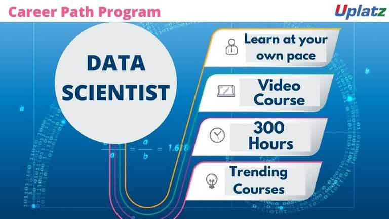
- Career Path - Data Scientist
- 300 Hours
- USD 45
- 6978 Learners
-
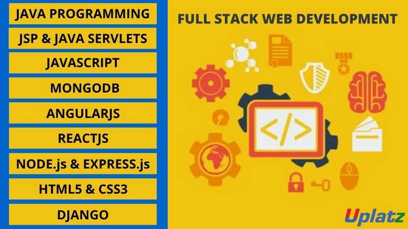
- Bundle Course - Full Stack Web Development
- 200 Hours
- USD 31
- 3788 Learners
BI Tools bundle course consists of self-paced courses on 3 of the leading Business Intelligence & Reporting tools in the industry. These are:
1) Tableau
2) Power BI
3) SAP BusinessObjects Business Intelligence
Tableau is a visual investigation platform changing the manner in which we use information to tackle issues—enabling individuals and associations to capitalize on their information. As the leader in modern business intelligence, the Tableau platform is known to quickly and easily transform any type of data from nearly any system into active insights. It's as easy as dragging and dropping.
With Uplatz's Tableau course you will learn -
Data Visualization, Business Intelligence tools, Introduction to Tableau, Tableau Architecture, Tableau Server Architecture, VizQL, Introduction to Tableau Prep, Tableau Prep Builder User Interface, Data Preparation techniques using Tableau Prep Builder tool, and more.
Power BI is a Business Intelligence, cloud-based platform that provides non-technical users with tools to analyse, visualize and store data. Power BI is simple and user friendly and best for the user familiar with Excel. It converts data from different sources to interactive dashboards and BI reports and is used by data analyst and business intelligence to a create report. Power BI includes several components: Power BI desktop, gateway, mobile app and services. It allows user to connect to SQL database, Azure cloud and web platform like Facebook, Google analytics etc.
This PowerBI course by Uplatz provides comprehensive knowledge on the end to end process involved in PowerBI. This training will help you to master in data analyst and business intelligence in great details.
SAP BusinessObjects Business Intelligence (simply known as SAP BO or BOBJ) is a reporting and analytics tool aimed at providing business insights and management reporting. SAP BO suite consists of a number of reporting applications that allow users to discover data, perform analysis to derive insights and create reports that visualize the insights.
SAP BusinessObjects BI enable the organizations to connect to any data source, structured and unstructured, relational, multidimensional or hybrid databases, OLAP cubes, documents, e-mails, social media, etc., process this data into useful information, and place it in the users hands for easy, yet dynamic and personalized visualization leading to increased sales, conversions, and customer experience.
Course/Topic 1 - Tableau (basic to advanced) - all lectures
-
Tableau Tutorial provides basic and advanced concepts of Tableau. Our Tableau Tutorial is designed for beginners and professionals both. Tableau is a data visualization tool or business intelligence tool which analyzes and shows data in a chart or report fast. It is very easy to use, because it does not require any programming skill.
-
In this tutorial, we are going to learn about data sources or data connections in Tableau. We will start with the basics and explore in detail how to make connections with different types of data sources in Tableau. So, let’s get started.
-
In this tutorial, we will discuss about Dimensions and Measures, what they are and how we use them.
-
This tutorial walks you through the features and functions of Tableau Desktop. As you work through this tutorial, you will create multiple views in a Tableau workbook. The steps you'll take and the workbook you'll work in are based on a story about an employee who works at headquarters for a large retail chain. The story unfolds as you step through asking questions about your business and its performance.
-
Building Basic Views
-
In this session you will learn to combine dimensions if you want to encode a data view using multiple dimensions.
-
In this tutorial, Measures can share a single axis so that all the marks are shown in a single pane. To blend multiple measures, drag one measure or axis and drop it onto an existing axis.
-
Building a table of multiple measures in Tableau is straightforward. You can build the table using only two pills. Use the dimension Measure Names and the measure Values. This also works to compare multiple measures side by side in a Tableau bar chart. Building the multiple measures bar chart is covered towards the end of this video.
-
This tutorial walks you through some of the most common tasks you might perform when creating maps in Tableau.You'll learn how to connect to and join geographic data; format that data in Tableau; create location hierarchies; build and present a basic map view; and apply key mapping features along the way.
-
In this Tableau Tutorial, you will learn how to apply filters on data in a Tableau workbook. Here, you will learn about applying simple Tableau filters on data visuals as well as about some advanced types like extract filters, interactive filters, etc. So, open your Tableau Desktop and learn with us!
-
Tableau provides the ability to filter individual views or even entire data sources on dimensions, measures, or sets. What’s more, most of these filters can be put into the hands of you and your end users to change – a powerful tactic for finding stories in the data.
-
The filters can be applied in a worksheet to restrict the number of records present in a dataset. Various types of filters are used in Tableau Desktop based on different purposes. The different types of filters used in Tableau. The name of filter types is sorted based on the order of execution in Tableau.
-
Data joining is a very common requirement in any data analysis. You may need to join data from multiple sources or join data from different tables in a single source. Tableau provides the characteristics to join the table by using the data pane available under Edit Data Source in the Data menu.
-
Data Blending is a very powerful feature in Tableau. It is used when there is related data in multiple data sources, which you want to analyze together in a single view.
-
Hierarchies are logical relationships between categories such as Country, State, City. Groups are selections of attributes that you may want to examine because they are outliers or of a specific type.
-
This video puts together different Tableau Charts with the type of data you’re analyzing and questions you want to answer, to help you find the appropriate chart for your needs.
-
Cascading filters are filters in which the selections in the first filter can change the options in the second filter to limit them to only those values that are relevant to the first filter.
-
As tableau being a visual intelligence tool, we can display the output in the form of visuals. If you want to display the values associated in the form of image, then we can be able to perform the imaged processing in tableau.
-
Sorting of data is a very important feature of data analysis. Tableau allows the sorting of data of the fields, which are called dimensions.
-
This video describes how to create and use calculated fields in Tableau using an example. If you're new to Tableau calculations or to creating calculated fields in Tableau, this is a good place to start.
-
You'll learn Tableau calculation concepts, as well as how to create and edit a calculated field. You will also learn how to work with the calculation editor and use a calculated field in the view.
-
Table Calculations are basically a special type of field that computes on the local data. The following article is going to take you through all you need to know to start using Table Calculations in Tableau.
-
Table calculations in Tableau are basically transformations you apply to the values in a visualization. They are calculated based on what is currently in the visualization and do not consider any measures or dimensions that are filtered out of the visualization.
-
Tableau Table Calculations are the special type of calculated field. Unlike regular calculated fields, table calculations in Tableau are based on the data that is currently visualized in a report. This article shows how to create Tableau table calculations, and how to use their properties.
-
In this Tableau tutorial I will discuss a basic quick table calculation and try to demystify what is happening behind the scenes. All of the following will hopefully be made clearer in the video.
-
Data Blending is a very powerful feature in Tableau. It is used when there is related data in multiple data sources, which you want to analyze together in a single view. It is a method for combining data that supplements a table of data from one data source with columns of data from another data source.
-
You can show trend lines in a visualization to highlight trends in your data. You can publish a view that contains trend lines, and you add trend lines to a view as you edit it on the web.
-
Table calculations are among the most powerful features Tableau has to offer for answering your analytical questions. You can select from a collection of pre-defined calculations or create your own Table Calculation from scratch using Table Calculation functions.
-
A table calculation is a transformation we apply to the values of a single measure in our view, based on the dimensions in the level of detail.
-
Tableau provides a complete range of chart styles. You really don’t even have to understand why a particular chart is better. If you rely on the show me button, tableau will provide an appropriate chart based on the combination of measures and dimensions you’ve selected.
-
In this session you will learn about the next step of advanced chart which help you in creating the chart.
-
Level of Detail (LOD) expressions are used to run complex queries involving many dimensions at the data source level instead of bringing all the data to Tableau interface. A simple example is adding dimension to an already calculated aggregate value.
-
Moving on with our Tableau learning spree, in this tutorial we are going to learn about another interesting topic, that is, Level of Detail or LOD in Tableau. In this tutorial, we are going to learn about the types of LOD expressions, how to create LODs in Tableau with examples.
-
Add context and interactivity to your data using actions. Users interact with your visualizations by selecting marks, or hovering, or clicking a menu, and the actions you set up can respond with navigation and changes in the view.
-
Using the Sample-superstore, plan to create a dashboard showing the sales and profits for different segments and Sub-Category of products across all the states.
-
Tableau dashboard is a group of various views which allows you to compare different types of data simultaneously. Datasheets and dashboards are connected ones if any modification happens to the data that directly reflects in dashboards. It could be the best way to visualize and analyze the data.
-
A dashboard is a collection of different kinds of visualizations or views that we create on Tableau. We can bring together different elements of multiple worksheets and put them on a single dashboard. The dashboard option enables us to import and add charts and graphs from worksheets to create a dashboard. On a dashboard, we can place relevant charts and graphs in one view and analyze them for better insights. Now, we will learn in a stepwise manner how to create a dashboard in Tableau Desktop.
-
Tableau has a very wide variety of formatting options to change the appearance of the visualizations created. You can modify nearly every aspect such as font, color, size, layout, etc. You can format both the content and containers like tables, labels of axes, and workbook theme, etc.
-
In our part 2, we study how to create a word cloud in Tableau, in this tutorial, we are going learn about the Tableau formatting, the various types of formats in Tableau: Formatting the Axes, Change the Font, Change the Shade and Alignment, Format Borders. We will learn about them and thus move a step further in our journey of mastering Tableau. So, let’s start Tableau Formatting.
-
Sometimes, analyzing data that is stored in a crosstab format can be difficult in Tableau. When working with Microsoft Excel, text file, Google Sheets, and .pdf data sources, you can pivot your data from crosstab format into columnar format. If you are working with other data sources, you can Pivot using custom SQL (Tableau Desktop).
-
In this session you will learn about the order of operations in Tableau, sometimes called the query pipeline, is the order in which Tableau performs various actions. Actions are also known as operations. Many operations apply filters, which means that as you build a view and add filters, those filters always execute in the order established by the order of operations.
-
In this last video, you will understand how Tableau works it is useful to know the order in which it manipulates and filters data when producing your view. This process is called the order of operations. It helps to know the order of operations so you can use it to your advantage when using any kind of filter or level of detail calculation, or if you ever find yourself confused as to why Tableau won’t produce the view you want.
Course/Topic 2 - Tableau - all lectures
-
In this video lecture we learn basic about Tableau. Tableau is a business intelligent tool for visually analysing the data.
-
In this video we talk about Tableau Desktop Basics and also cover all the Basic topics of Tableau Desktop.
-
In this video we learn how to install Tableau business intelligent tool into your desktop and process of Tableau Desktop Installation.
-
In this video we about Tableau Desktop Workspace Navigation and cover all the importance of Tableau Desktop Workspace Navigation.
-
In this session we talk about Tableau Design Flow and also cover all the different types of Tableau Design Flows.
-
In this video we learn about Connections to Multiple Data Sources and cover all techniques of data sourcing.
-
In this video we talk about Hands-on - Tableau Data Connection and also cover different between live and exact Tableau Data Connection.
-
In this session we learn basic about Tableau Filters and different types of filters we can use in Tableau business tool.
-
Data can be organized and simplifies by using various techniques in Tableau. In this session we also cover types of filters and condition of filters in Tableau.
-
In this session we learn about Tableau Operators. Types of Tableau Operators and how to use these Tableau Operators.
-
In this video we talk about Bins - Groups - Sets – Parameters and also cover all the parameters we use in Tableau.
-
In this session we learn about Hands on - Tableau Sets and cover all different sets in Hands on - Tableau Sets..
-
In this session we talk about Basic Tableau Charts and learn about different types of charts.
-
In this video we talk about Hands on - Basic Tableau Charts how to make pie chart and importance of charts in Tableau business tool.
-
In this lecture we learn the Tableau Advanced Topics like Advance graphs, LODS and its usage and extensions etc.
-
In this video we talk about Tableau Extensions and cover all different types of extensions in a single video.
-
In this Lecture section we talk and overview the Tableau Dashboards and explore the Dashboards of Tableau.
-
In this lecture session we talk about the Tableau Story. In Tableau story is a sequence of visualization that work together to convey the information.
-
In this video we talk about Tableau LODs extension and importance of LODs extension in Tableau business tool.
-
In this lecture session we talk about Tableau Actions and also cover all Actions filters.
Course/Topic 3 - Power BI (basic to advanced) - all lectures
-
This is an introductory video of Power BI to get you started in this tutorial video, learn how to get started using Microsoft Power BI. Power BI allows you to get insight from your business data.
-
Microsoft Power BI is one of the most popular Data Visualization and Business Intelligence tool. The Power BI tool is the collection of apps, data connectors, and software services which are used to get the data from different data sources, transforms data, and produces useful reports.
-
In Microsoft Power BI services which are based on SaaS and mobile Power BI apps that are available for different platforms. These set of services are used by the business users to consume data and to build Power BI reports.
-
This tutorial helps you to clear all the essential concepts in Power BI and provides enough knowledge on how to use Power BI or how to work on Power BI.
-
The BI term refers to Business Intelligence. It is a data-driven decision support system, which helps you to analyse the data and provide actionable information. It helps the business manager, corporate executives, and other users in making their decisions easily.
-
This Business intelligence refers to the applications, technologies, and practices for the collection, analysis, integration, and presents the business information. The purpose of business intelligence is to support better decision making.
-
Business intelligence is used to improve all parts of a company by improving access to the firm's data and then using that data to increase profitability. Companies that practice BI can translate their collected data into insights their business processors.
-
Power BI is a Data Visualization, and Business Intelligence tool which helps to convert data from different data sources into interactive dashboards and BI reports. It provides interactive visualizations with self-service business intelligence capabilities where end users can create reports and dashboards by themselves, without having to depend on information technology staff or database administrators.
-
Power BI provides multiple connectors, software, and services. These services based on the SaaS and mobile Power BI apps which are available for different platforms. These set of services are used by business users to consume data and to build BI reports.
-
Power BI dashboard is a single page, also called a canvas that uses visualization to tell the story. It is limited to one page; therefore, a well-designed dashboard contains only the most essential elements of that story.
-
A Power BI report is a multi-perspective view into the dataset, with visualizations which represent different findings and insights from that dataset.
-
Power BI Desktop and Power BI Services support a large range of data sources. Click on the Get Data button, and it shows you all the available data connections. You can connect to different Flat files, Azure cloud, SQL database, and Web platforms, also such as Google Analytics, Facebook, and Salesforce objects. It includes an ODBC connection to connect to other ODBC data sources.
-
In this section of the Power BI tutorial, we will learn about each of these Power BI services or components and their roles.
-
In this section, we will briefly walk through a case study of Power BI. This will help to understand the role of Power BI in a real-life scenario.
-
Moving forward in our Power BI tutorials series, let us explore some important features of Power BI thoroughly. Power BI is an efficient business intelligence tool loaded with data visualization and analytics rich features.
-
This Power BI tutorial we’re going to learn from the basics then we will gradually move upwards, learn about its components and how it works.
-
In this tutorial, we studied Power BI Architecture. Today, we will discuss Power BI Building Blocks. In this Power BI Tutorial, we are going to explore the components of Power BI: Visualizations, Datasets, Reports, Dashboards, and Tiles. So, let’s start the Power BI Building Blocks Tutorial.
-
In this Power BI Tutorial, we will discuss Power BI Query, Power BI Pivot, Power BI View, Power BI Map, Power BI Q&A, Power BI Desktop, Power BI Website, and Power BI Mobile Apps. So, let’s start the Power BI Components Tutorial.
-
we learn how to download and Install Power BI. First of all, we will see a list of an operating system which supports Power BI. Moreover, we will study, seven simple and quick steps to install power BI on windows.
-
In this lesson, we are going to discuss the pros and cons of Power BI. As we learned from the tutorial on Features of Power BI, it’s a great tool to use for data analysis and discovering important insights. But, let us go into a little detail and learn about the advantages and disadvantages of Power BI so that you can have some basis to compare it with other tools.
-
In this Power Bi tutorial, we will study about Power BI data modeling. Moreover, we will see how we use Data Modeling in Power BI, and how to Create Calculated Columns in Data Modeling in Power BI.
-
In addition, we will talk about how to Create a Calculated table in Power BI Data Modeling and Use information Modeling and Navigation.
-
In Power BI Tutorial, we talked about Power BI Dashboard. Here, we are going to create Workspace in Power BI or in other words we are creating groups in Power BI Workspace.
-
Moving forward in our series of Power BI tutorials, the next interesting topic is Power BI Dashboard. Power BI Dashboard is a fundament element in Power BI Desktop.
-
In Power BI tutorial, we studied How to Create Workspace in Power BI. Today, in this instructional exercise, we will figure out how to Share Power BI Dashboard – Outside Organization/Clients. Moreover, we will discuss different ways to share internal & external clients.
-
Despite the fact that Power BI is intended for you to impart a dashboard to clients who are inside a similar association, you can likewise impart dashboards to individuals from different associations.
-
In this Power BI tutorial, we will learn about how Power BI Create dashboard & report on iPhone, iPad, Android Phone, Android Tablet, Windows 10. Moreover, we will discuss the How power BI view dashboard on land space mode of Windows 10 Devices.
-
Whenever you will search for Power BI Desktop on Google, you will find many websites covering the installation and functions of Power BI in a technical language. But here I am providing you with all the aspects of Power BI in a very simple language.
-
In this Power BI tutorial, we will learn about Interface with information in Power BI work area. Moreover, we will learn how to connect to data in Power BI Desktop.
-
In our tutorial, we discussed Analytics Pane in Power BI. Today, in this Q & A in Power BI Desktop Tutorial, we will learn how to add a missing relationship and rename tables and columns. Moreover, we will study how to fix incorrect data types and choose the data category for each date and geography column. At last, we will cover to normalize your model.
-
In this tutorial, we will study Power BI Measure. Today, we are going to learn the Power BI Archived Workspace. Moreover, we will study the Confinements and Moving Content in your Archived Workspace in Power BI. At last, we will cover the Power BI Archived Workspace in Office 365.
-
In this video, we talked about the Power BI Archived Workspace. In this Power BI Data Source Tutorial, we are going to learn Data Sources for Power BI Services. Moreover, we are going to discuss how data originates from an alternate source and some subtle elements. Along with this, we will cover the types of data sources for Power BI.
-
In this Power BI tutorial, we will study Power BI Data Source. Today in this Power BI Admin tutorial, we will learn about the various roles of Power BI administration: Purchasing, REST API, and Security.
-
Continuing with our Power BI tutorial series, now, we will learn about Power BI Report Server. As we know, Power BI as a technology is a collection of several other technologies and services. Power BI Report Server is one such crucial technology. Here, we will learn about its different aspects.
-
In this session we are going to explore the working of a table in Power BI. In addition, we will discuss when to use a Power BI table with its prerequisites. Along with this we will study how to Create a table & Format the table, and adjust the column width of a table in Power BI.
Course/Topic 4 - Power BI - all lectures
-
Learn how you can leverage Power BI to easily build reports and dashboards with interactive visualizations and see how other organizations have used this solution to drive business results with actionable insights.
-
In this session, with Power BI Desktop, you can build advanced queries, models, and reports that visualize data. You can also build data models, create reports, and share your work by publishing to the Power BI service.
-
This is the first part of Basic Dashboard in Power BI. In this video you will learn how to create a basic dashboard with simple data points.
-
In this Video, we will show you how can you install Power PI desktop in PC.
-
The third part in a series of Microsoft Power BI tutorials for beginners. This tutorial cover Filter’s pane and the Slicers.
-
In this Part 4, video shows the time slicer feature of Power BI Desktop. Also running some simple statistics using the matrix visualization.
-
In this Part 5 session you will learn about how to create a simple R script in Power BI desktop using the grid Extra package for displaying data and the dplyr package for data munging.
-
In this Microsoft Power BI video, you will learn how to represent the data in a Map using Power BI. For this purpose, a data that contains the columns such as a State, Province, Country, City, ZIP Code/Postal Code, etc. must be present in the database
-
In this video you can explore, what is Star Schema, why it is important in Power BI, Among the most basic design skills in designing a data warehouse solution is the star schema design.
-
In this Power BI Tutorial, you will look at how to use Power Query in Power BI Desktop to merge different queries and join kind. This Microsoft Power BI tutorial for beginners is aimed at new Power BI users.
-
In this video we will go through the basics of data modelling in Power BI, to get you started fast and easy.
-
In this video, learn how to use relationship’s view, what other views exist in Power BI Desktop and why it's important to use them.
-
This video explains the importance of cross filter direction in Microsoft Power BI. It discusses how the single or bi-directional filter affects the data in the report.
-
In this video you will see details about m language and dax language.
-
In this video you will learn how to create two interactive Power BI dashboards, plus a decomposition tree using the free Power BI tools.
-
In this video, we will show you how you can use a parameter, within a Power BI report, to dynamically change the data in a report.
Course/Topic 5 - SAP BO - all lectures
-
In this video tutorial, you will get a brief introduction on SAP BO, how it came to be known as SAP BI, what are the different layers in SAP BI, characteristics in Data Warehouse, schema, master data tables and also a detailed explanation on how a student can access and work on the server for practicing his daily SAP system works.
-
In this tutorial, you will learn how you can access the Business Object components in the SAP system through remote desktop. You will also be able to understand a detailed explanation on the different designing components. Lastly, you will get a detailed demonstration on how to work on the different design tools in the SAP system.
-
In this lecture, you will be able to understand what a Designer is in the SAP BO module and how to work with the different designing tools available in the SAP system. You will also learn what is a Universe, Role of a Universe and the Semantic Layer in the initial screen of the designing tool.
-
In this tutorial, you will learn how to create a Universe in the designing tool of the BO module, manually. This is explained in a detailed demonstration by the Instructor which will help you in getting a practical experience on the work process. Further, you will also understand what the different types of OLTP systems are and what is their role in the SAP BO design tool.
-
In this tutorial, you will learn how you can create the characters in the SAP BO system, how IDT and UDT helps in the Online Analytic Process (OLAP). You will also learn how to create an infocube and what are the steps to be followed while creating an infocube in the SAP BW system.
-
In this video, you will learn how to create data from scratch using the Universe Design tool in the SAP BO module. You will also learn how you can create the BSO in the system tool, using a pictorial description of the entire work process.
-
To access anything from the ECC server, one needs to know the Transaction Codes. In this video, you will learn about these Transaction Codes or T-Codes which will be used in working on the SAP BO system module. You will also get an overview on the Object Hierarchies, which allows users in performing multi-dimensional analysis.
-
In this tutorial, you will be learning the role of IDT and UDT in the SAP BO Design Tool. You will also learn about the types of Web Intelligence and the entire work process with a detailed demonstration from the instructor. Along with this, you will be learning on how to create reports and the different fields and attributes required in creating the reports.
-
In this video lecture, you will learn the different formatting options available to create and modify reports in the SAP BO Design Tools. You will learn how to add rows and columns, category, margins, pictures, articles and others. Further, you will learn how to work on the sub-reports and the functionalities available in the crystal reports. Moreover, you will also get an overview on the dashboard components.
-
In this lecture, you will learn what are the parameters to be used while working on a crystal report by a user. Also, you will see a detailed demonstration on how to work on the Table Article Label, Article Lookup and the Body of the report.
-
In this lecture, you will learn about the different types of dashboard designing components used in the SAP BO module. Further, you will learn how to work on the SAP Lumira Design component, how to add new data set, characteristic dimensions and the different modes in the Lumira Designing Tool.
-
In this video tutorial, you will get a detailed and practical demonstration on how to work on the Information and Quick Design Tool in the SAP BO module. You will also get some more detail concepts and work around on the SAP Lumira Designing Tool.
-
In this tutorial, you will be learning how to connect to a SAP HANA database. Also, you will learn how to use the database and the data models. Moreover, you will also learn how to do the HANA connectivity. This whole work process will be practically demonstrated by the instructor in detail.
-
In this video, you will learn how to access the views using Information Design Tool (IDT), which can be done using the HANA Data Acquisition Connector. You will also be learning how to assign a data source and also working on the whole of the data source work process.
-
In this tutorial, you will learn what is a Web Application Designer (WAD) and what is its role in connecting with the BW Server. You will also learn how to work on the Basis Analysis Layout Template, which is a pre-defined standard template used for ad-hoc slicing and dicing data sources. You will also learn how to work on the attribute views.
-
In this last video lecture, you will learn how you can connect to HANA tables and modules using IDT. You will further learn to work on the SAP HANA business layer and other concepts related to the SAP BO module.
The main objective of this course is to gain proficiency in the top leading business intelligence reporting tools.
The main objectives are:
a).To understand the essentials of data analytics in the industry
b).To be familiar with the steps involved in the analytics process
c).Toknow about the fundamental principles of data science and the business analytics
d).To gain factual knowledge such as terminologies, classification, methods and trends
Bundle Course – BI Tools - Course Syllabus
Tableau – Course Syllabus
1) Tableau History, Interface and Components
2) Connecting to databases and preparing data
3) Data Refresh and Blending
4) Sorting
5) Grouping
6) Creating Sets
7) Filters
8) Filter shelves
9) Quick Filter
10) Parameters
11) Formatting
12) Trend Lines and reference lines
13) Drills
14) Introduction to Dashboards and Story
15) Building dashboards
16) Layouts and Formatting
17) Interactivity
18) StoryPoints
19) Maps
20) Background Images
21) Calculations Syntax
22) Modifying Table calculations
23) Aggregations and LOD Expressions
24) Advanced Charts and graphs (Pareto, Waterfall, Funnel,..)
25) Histograms
26) Tree maps and bubble charts
27) Best practices
28) Case Studies
Power BI Syllabus
Power BI Complete Introduction
1) Power BI Introduction
2) Data Visualization, Reporting
3) Business Intelligence(BI), Traditional BI, Self-Serviced BI
4) Cloud Based BI, On Premise BI
5) Power BI Products
6) Power BI Desktop (Power Query, Power Pivot, Power View)
7) Flow of Work in Power BI Desktop
8) Power BI Report Server, Power BI Service, Power BI Mobile
9) Flow of Work in Power BI / Power BI Architecture
10) A Brief History of Power BI
PBI Desktop Installation, PBI Desktop &Service Overview
1) Power BI Desktop Installation
2) Building Blocks of Power BI
3) Datasets, Visualizations, Reports, Dashboards, Tiles
4) Power BI Desktop User Interface
5) Fields Pane, Visualizations pane, Ribbon, Views, Pages Tab, Canvas
6) Overview of Power Query / Query Editor – Extract, Transform & Load Data
7) Connecting to Data Sources, Establish connection to the Excel source
8) Importing Data into Power BI or Query Editor
9) Transforming the Data using Power Query
10) Model the Data using Power Pivot – Relationship View
11) Creating New Measures and New Columns using DAX – Data View
12) Visualizing the Data using Power View and Power Maps – Report View
13) Saving and Publishing the Visuals or Reports
14) Logon to Power BI Service
15) View the Reports in PBI Service and Share the reports
Power Query
Introduction to Power Query – Extract, Transform & Load
1) Data Transformation, Benefits of Data Transformation
2) Shape or Transform Data using Power Query
3) Overview of Power Query / Query Editor, Query Editor User Interface
4) The Ribbon (Home, Transform, Add Column, View Tabs)
5) The Queries Pane, The Data View / Results Pane, The Query Settings Pane, Formula Bar
6) Advanced Editor – Complete ETL Code
7) Saving Your Work – Appling ETL Changes – Loading into Power Pivot Model
8) Power Query Conceptually
Datatypes and Filters in Power Query
1) Datatypes, Changing the Datatype of a Column
2) Filters in Power Query
3) Auto Filter / Basic Filtering
4) Filter a Column using Text Filters
5) Filter a Column using Number Filters
6) Filter a Column using Date Filters
7) Filter Multiple Columns
Inbuilt Column Transformations
1) Remove Columns / Remove Other Columns
2) Name / Rename a Column
3) Reorder Columns or Sort Columns
4) Add Column / Custom Column
5) Split Columns
6) Merge Columns
7) PIVOT, UNPIVOT Columns
8) Transpose Columns
In built Row Transformations
1) Header Row or Use First Row as Headers
2) Keep Top Rows, Keep Bottom Rows
3) Keep Range of Rows
4) Keep Duplicates, Keep Errors
5) Remove Top Rows, Remove Bottom Rows, Remove Alternative Rows
6) Remove Duplicates, Remove Blank Rows, Remove Errors
7) Group Rows / Group By
Combine Queries (Append Queries & Merge Queries)
Append Queries / Union Queries
1) Append Queries
2) Append Queries as New
3) Append 2 or more files individually with different queries
4) Appending multiple files of same type from a folder using single query
5) Query Options
6) Copy Query, Paste Query
7) Delete Query, Rename Query
8) Enable Load, Include in report Refresh
9) Duplicate Query, Reference Query
10) Move to Group, Move Up, Move Down
Merge Queries / Join Queries
1) Merge Queries, Merge Queries as New
2) Default Types of Joins / Join Kinds / Merge Type
3) Left Outer (all from first, matching from second)
4) Right Outer (all from second, matching from first)
5) Full Outer (all rows from both)
6) Inner (only matching rows)
7) Left Anti (rows only in first)
8) Right Anti (rows only in second)
9) Cartesian Join or Cross Join
Power Pivot
Power BI Data Modeling – Relationship View
1) Data Modeling Introduction
2) Relationship, Need of Relationship
3) Relationship Types / Cardinality in General
4) One-to-One, One-to-Many (or Many-to-One), Many-to-Many
5) AutoDetect the relationship, Create a new relationship, Edit existing relationships
6) Make Relationship Active or Inactive
7) Delete a relationship
8) Cross filter direction (Single, Both), Assume Referential Integrity
Enhancing the Data Model – DAX
1) What is DAX, Calculated Column, Measures
2) DAX Table and Column Name Syntax
3) Creating Calculated Columns, Creating Measures
4) Implicit Vs Explicit Measures
5) Calculated Columns Vs Measures
6) DAX Syntax & Operators
7) DAX Operators
8) Types of Operators
9) Arithmetic Operators, Comparison Operators, Text Concatenation Operator, Logical Operators
DAX Functions Categories
1) Date and Time Functions
2) Logical Functions
3) Text Functions
4) Math & Statistical Functions
5) Filter Functions
6) Time Intelligence Functions
DAX Date & Time Functions
1) YEAR, MONTH, DAY
2) WEEKDAY, WEEKNUM
3) FORMAT (Text Function) à Month Name, Weekday Name
4) DATE, TODAY, NOW
5) HOUR, MINUTE, SECOND, TIME
6) DATEDIFF, CALENDAR
7) Creating Date Dimension Table
DAX Text Functions
1) LEN, CONCATENATE (&)
2) LEFT, RIGHT, MID
3) UPPER, LOWER
4) TRIM, SUBSTITUTE, BLANK
DAX Logical Functions
a. IF
b. TRUE, FALSE
c. NOT, OR, IN, AND
d. IFERROR
e. SWITCH
DAXMath and Statistical Functions
1) INT
2) ROUND, ROUNDUP, ROUNDDOWN
3) DIVIDE
4) EVEN, ODD
5) POWER, SIGN
6) SQRT, FACT
7) SUM, SUMX
8) MIN, MINX
9) MAX, MAXX
10) COUNT, COUNTX
11) AVERAGE, AVERAGEX
12) COUNTROWS, COUNTBLANK
DAX Filter Functions
1) CALCULATE
2) ALL
3) RELATED
DAX Time Intelligence Functions
1) Time Intelligence Introduction
2) TOTALMTD, TOTALQTD, TOTALYTD
3)PREVIOUSDAY,PREVIOUSMONTH, PREVIOUSQUARTER, PREVIOUSYEAR
4) NEXTDAY, NEXTMONTH, NEXTQUARTER, NEXTYEAR
5) SAMEPERIODLASTYEAR
6) YOY Growth
7) MOM Growth
Power View
Report View / Power View
1) Report View User Interface
2) Fields Pane, Visualizations pane, Ribbon, Views, Pages Tab, Canvas
3) Visual Interactions
4) Interaction Type (Filter, Highlight, None)
5) Visual Interactions Default Behavior, Changing the Interaction
Filters in Power View
1) Filter Types
2) Visual Level Filters, Page Level Filters, Report Level Filters, Drill Through Filters
3) Filter Sub Types
4) Basic Filtering, Advanced Filtering, Top N, Relative Date Filtering
5) Numeric field filters, Text field filters, Date and Time field Filters
Grouping, Binning & Sorting
1) Grouping and Binning Introduction
2) Using grouping, Creating Groups on Text Columns
3) Using binning, Creating Bins on Number Column and Date Columns
4) Sorting Data in Visuals
5) Changing the Sort Column, Changing the Sort Order
6) Sort using column that is not used in the Visualization
7) Sort using the Sort by Column button
Hierarchies and Drill-Down Reports
1) Hierarchy Introduction, Default Date Hierarchy
2) Creating Hierarchy, Creating Custom Date Hierarchy
3) Change Hierarchy Levels
4) Drill-Up and Drill-Down Reports
5) Data Actions, Drill Down, Drill Up, Show Next Level, Expand Next Level
6) Drilling filters other visuals option
Power BI Visualizations
1) Visualizing Data, Why Visualizations
2) Visualization types, Field Wells
3) Visuals for Filtering, Visualizing Categorical Data, Visualizing Trend Data
4) Visualizing KPI Data, Visualizing Tabular Data, Visualizing Geographical Data
5) Leveraging Power BI Custom Visuals
Visuals for Filtering
1) Slicer Visualization
2) When to use a Slicer
3) Create and format Slicer Visualization
4) Hierarchy Slicer (Custom Visualization)
5) When to use a Hierarchy Slicer
6) Create and format Hierarchy Slicer
7) Advantages of Hierarchy Slicer
Visualizing Categorical Data
1) Create and Format Bar and Column Charts
2) Create and Format Stacked Bar Chart Stacked Column Chart
3) Create and Format Clustered Bar Chart, Clustered Column Chart
4) Create and Format 100% Stacked Bar Chart, 100% Stacked Column Chart
5) Create and Format Pie and Donut Charts
6) Create and Format theTree Map Visual
7) Create and Format Scatter Charts
Visualizing Trend Data
1) Line and Area Charts
2) Create and Format Line Chart, Area Chart, Stacked Area Chart
3) Combo Charts
4) Create and Format Line and Stacked Column Chart, Line and Clustered Column Chart
5) Create and Format Ribbon Chart, Waterfall Chart, Funnel Chart
Visualizing KPI Data
1) Create and Format Gauge Visual, KPI Visual
2) Create and Format Card Visualization, Multi Row Card
Visualizing Tabular Data, Geographical Data & R Script Visual
1) Create and Format Table Visual, Matrix Visualization
2) Create and Format Map Visual, Filled Map Visual, Arc GIS Maps Visual
3) Create and Format R Script Visual
Power BI Service
Power BI Service Introduction
1) Power BI Service Introduction, Power BI Cloud Architecture
2) Creating Power BI Service Account, SIGN IN to Power BI Service Account
3) Publishing Reports to the Power BI service, Import / Getting the Report to PBI Service
4) My Workspace / App Workspaces Tabs
5) DATASETS, WORKBOOKS, REPORTS, DASHBOARDS
6) Working with Datasets, Creating Reports in Cloud using Published Datasets
7) Power BI Datasets Live Connection using Desktop
8) Working with Workbooks, working with Reports, Sharing Reports
Dashboards Development
1) Creating Dashboards
2) Pin Visuals and Pin LIVE Report Pages to Dashboard
3) Advantages of Dashboards
4) Interacting with Dashboards
5) Adding Tiles to Dashboards
6) Web Content, Image, Text Box,Video
7) Formatting Dashboard
8) Sharing Dashboard
Data Gateways
a. Introduction to Data Gateways
b. How Data Gateways work
c. Connect to an on premise Data Source by using a Data Gateway
d. Download Data Gateway
e. Installing a Data Gateway
f. Types of Gateways
g. On-premises Data Gateway, On-premises Data Gateway (personal mode)
h. Manage Data Gateway
i. Add and Remove Administrators
j. Add Data Source, Add or Remove Users to a Data Source
k. Refresh On Premise Data
l. Configuring Automatic Refresh using Schedules
Collaboration in Power BI using App Workspace
1) Introduction to App Workspaces
2) Create an App Workspace
3) Add Members to App Workspace to Collaborate
4) App Workspace Access
5) Admin, Member, Contributor
Sharing Power BI Content using Apps and Content Packs
a. Introduction to App
b. Publish an App
c. Update a Published App
d. Manage Content in App
e. Include in App, Exclude in App
f. Sharing App
g. Entire Organization, Specific individuals or group
h. Un publishing an App
i. Content Pack Introduction
j. Create Content Pack
k. Sharing Content Packs
l. Specific Groups, My Entire Organization
m. Selecting the Content / Items to Publish or Share
Row Level Security in Power BI
1) Introduction to Row Level Security
2) Row Level Security (RLS) with DAX
3) Manage Roles, Creating Roles, Testing Roles
4) Adding Members to Roles in Power BI Service
5) Dynamic Row Level Security
6) Creating Users Table and Adding to the Model
7) Capturing users using UserName () or UserPrincipalName () DAX Functions
SAP BUSINESSOBJECTS BUSINESS INTELLIGENCE
SAP BusinessObjects (BO) Business Intelligence is a reporting tool offered by SAP. SAP BO offers intelligent solutions that can be made use of by people ranging from analysts and other people who work with information to CEO’s.
1. Introduction:
1) Understanding BusinessObjects Enterprise
2) What is BusinessObjects Enterprise?
3) Working with SAP BO Launchpad (Infoview)
2. SAP Business Objects Web Intelligence and BI Launch Pad 4.1
1) SAP Business Objects Dashboards 4.1
2) BI launch pad: What’s new in 4.1
3) Restricting data returned by a query
4) Enhancing the presentation of data in reports
5) Formatting reports
6) Calculating data with formulas and variables
7) Using multiple data sources
8) Analyzing data
9) Managing and sharing Interactive Analysis documents
10) Reporting from Other Data Sources
11) Introducing Web Intelligence
12) Accessing corporate information with Web Intelligence
13) Understanding how universes allow you to query databases using everyday business terms.
14) Managing documents in InfoView
15) Viewing a Web Intelligence document in InfoView
16) Setting Info View Preferences
17) Creating Web Intelligence Documents with Queries
18) Getting new data with Web Intelligence
19) Creating a new Web Intelligence document
20) Modifying a document’s query
21) Working with query properties
22) Restricting Data Returned by a Query
23) Modifying a query with a predefined query filter
24) Applying a single-value query filter
25) Using prompts to restrict data
26) Using complex filters
27) Displaying data in tables and charts
28) Presenting data in free-standing cells
29) Enhancing the Presentation of Reports
30) Using breaks, calculations, sorts and report filters
31) Ranking data to see top or bottom values
32) Using alerter to highlight information
33) Organizing a report into sections
34) Copying data to other applications
35) Alternative Query Techniques Using Combined Queries Using Sub-Queries
36) Creating a Query based on another Query
37) Character and Date String Functions Using the character string functions Concatenating different data types Using date functions
38) Using If Logic
39) Grouping data using If() logic
40) Using If() to modify calculation behaviour
41) Advanced Reporting Features Formatting breaks
42) Creating custom sorts
43) Displaying document data in free-standing cells
44) Alternative Query Techniques Defining Combined Query Types Using Combined Queries
45) Using Sub-Queries
46) Creating a Query on a Query
47) Character and Date String Functions Understanding Character Strings
48) Using Date Functions User-Defined Objects Creating User Objects
49) Using a User Object in a Query
50) Editing a User Object Deleting a User Object Storing a User Object Grouping Data
3. Information Design Tool 4.0
1) What is the Information Design Tool (IDT)
2) Create a project
3) Create a connection to a relational database (Single and Multiple databases)
4) Create the data foundation with Single & Multiple databases
5) Define the different types joins in a data foundation
6) Create a business layer
7) Create folders and objects
8) Resolve Loops and Use alias
9) Resolve Loops Use contexts
10) Resolving the fan traps and Chasm traps problem
11) Define data restrictions
12) Work with LOVs
13) Use Parameters restrict data
14) Use @functions also Aggregate Awareness
15) Create Derived Tables and Index Awareness
16) Maintain universes
17) Deploy and manage and maintain universes
18) 4. Universe Designer Tool 4.0
19) Understanding Business-Objects Universes.
20) Understanding how universes allow users to query databases using their everyday business terms.
21) Creating Universe Connections.
22) The course database and universe.
23) Creating the universe.
24) Building and populating the Universe Structure.
25) Defining joins in a universe.
26) Creating Dimension Objects.
27) Understanding classes and objects.
28) Creating Measure Objects.
29) Understanding measure objects.
30) Using List of Values.
31) Resolving Loops.
32) Resolving loops using aliases.
33) Resolving loops using contexts.
34) Chasm traps and Fan traps.
35) Restricting the data returned by objects.
36) Using Functions with Objects.
37) Using @ Functions.
38) Using Hierarchies.
39) Working with hierarchies.
40) Aggregate Awareness.
41) Derived Tables
42) Securing Universes.
43) Managing Universes
5. SAP Business Objects Dashboards 4.0 (Crystal Xcelsius 2011)
1) Crystal Xcelsius Overview
2) Creating Dashboards using Query As A Web Service (QAAWS) and Live Office
3) Create Drill Down dashboard reports
4) What’s new in SAP Business Objects Dashboards 4.0
5) Creating a Visualization
6) Producing interactive visualizations
7) Getting around in Xcelsius
8) Working with your Excel workbook
9) Visualizing data with charts
10) Using Xcelsius Components
11) Formatting a Visualization
12) Applying formatting options
13) Using themes and templates to apply formatting
14) Adding Interactivity to a Visualization
15) Using selectors
16) Adding dynamic visibility
17) Using live data sources
18) Connecting to BO Universes using Query as a Web Service
19) Using Live Office data
20) Creating Complex dashboards
6. SAP Crystal Reports 2011
1) Creating reports
2) Selecting records
3) Organizing data on reports
4) Formatting & section formatting
5) Creating basic and complex formulas
6) Using variables
7) Using report templates
8) Applying conditional reporting
9) Building parameterized and specialized reports
10) Summarizing data with cross tabs
11) Using report sections
12) Representing data visually
13) Managing reports
14) Distributing reports
15) Using repository and repository data sources
16) Report processing
17) Linking Crystal Reports to Webi reports
18) Drill down reports
This BI Tools Training course is designed for exploring the structure, concepts of BI Tools modules.
Business intelligence (BI) tools are types of application software which collect and process large amounts of unstructured data from internal and external systems, including books, journals, documents, health records, images, files, email, video and other business sources.
BI reporting tools pull and read data from your company's data sources, on premises and in the cloud. The reporting tool is able to identify measurements such as sales, revenue, inventory counts, etc. and apply dimensions such as date, purchase order, or customer information to create analyses.
Microsoft Power BI. Microsoft's BI suite provides interactive business intelligence capabilities to help marketers create dashboards and reports.
a).Zoho Analytics.
b).Google Data Studio.
c).Qlik.
d).Tableau.
e).Freshworks CRM.
f).HubSpot.
g).Looker.
Uplatz online training guarantees the participants to successfully go through the BI Tools certification provided by Uplatz. Uplatz provides appropriate teaching and expertise training to equip the participants for implementing the learnt concepts in an organization.
Course Completion Certificate will be awarded by Uplatz upon successful completion of the BI Tools online course.
The draws an average salary of $100,080 per year depending on the knowledge and hands-on experience. BI Tools Associate job roles are in high demand and make for a rewarding career.
A Business Intelligence Analyst, or Business Intelligence Specialist, is responsible for managing data retrieval and analysis within an organization. Their duties include organizing data points, communicating between upper management and the IT department and analyzing data to determine a corporation's needs.
Note that salaries are generally higher at large companies rather than small ones. Your salary will also differ based on the market you work in.
The following are the job titles:
a).Business Intelligence Analyst
b).Business Intelligence Specialist
Q1.What is Business Intelligence?
Ans-The business intelligence is used for reporting the data of any business which is very vital and using which management of any organization will make the right decision for the growth of the business.
Q2.List out the decisions made by an organization or business using business tool?
Ans-
1).BI is used to decide whether a business is running as per plan
2).BI is used to classify which things are actually going wrong.
3).BI is used to monitor corrective actions.
4).BI is used to find the recent trends of the business
Q2. Mention the different stages and benefits of Business Intelligence?
Ans-There are totally five stages of Business Intelligence:
1).Data Source
2).Data Analysis
3).Decision-making support
4).Situation Awareness
5).Risk Management
Q3.Mention the benefits if using business intelligence?
Ans-Following are benefits of Business Intelligence:
1).Improves decisions making.
2).Helps to make right decisions
3).Optimize internal business process
4).Gain operational efficiency.
5).Helping for new revenues.
Q4.What are different Business Intelligence tools available in the market?
Ans-There are different intelligence and reporting tools available:
1).SAP Business Intelligence
2).Business Object
3).Tableau
4).Microsoft Business Intelligence Tool
Q5.Define universe in Business Analytics?
Ans-The universe is type of semantic layer in between database and user interface. In simple words, it is one of the interfacing layers in between the client and data warehouse.
Q6.List the differences between OLAP and OLTP?
Ans-OLTP is helping to provide source data in a data warehouse and OLAP used to analyze the same.
Q7.Define dashboard in a data warehouse?
Ans-The dashboard refers the arrangement of all the reports and graphical representations on one page. It refers to the collection of reports in a different format.
Q8.Define Power BI Desktop?
Ans-Power BI Desktop is a free desktop application which is used to provide data exploration, modeling and report creation to highlight data.
Q9.Define Data Source?
Ans-Data Source is extracting data from multiple sources
Q10. Define Data Analysis?
Ans-Data analysis provides proper report based on data of collection.
Q11. Define Decision-making support?
Ans-Decision-making support is using information in right way.
Q12. Define Situation Awareness?
Ans-Situation awareness is used to filter irrelevant information and set the remined information for business context
Q13.Define Risk Management?
Ans-Risk management is used to take corrective actions at different situations
Q14. Define Fact table
Ans-A Fact table is the center table in star schema of a data warehouse. It actually holds quantitative information for analysing purpose.
Q15. Define Dimension Table?
Ans-A dimension table is one of the vital tables in a star schema of a data warehouse, which is used to store attribute, or dimension, that details the objects in a fact table.