


( 360 Students )


Bundle Course - Data Visualization & BI Tools
Master the Art of Visual Analytics with Tableau, Power BI, Python, R, and Qlik Sense – From Foundations to Professional ExpertisePreview Bundle Course - Data Visualization & BI Tools course
Price Match Guarantee Full Lifetime Access Access on any Device Technical Support Secure Checkout Course Completion Certificate 92% Started a new career
BUY THIS COURSE (
92% Started a new career
BUY THIS COURSE (GBP 15 GBP 49 )-
 80% Got a pay increase and promotion
Students also bought -
-

- Data Storytelling with AI: From Dashboards to Narratives
- 10 Hours
- GBP 10
- 10 Learners
-

- Data Visualization in Python
- 23 Hours
- GBP 10
- 558 Learners
-
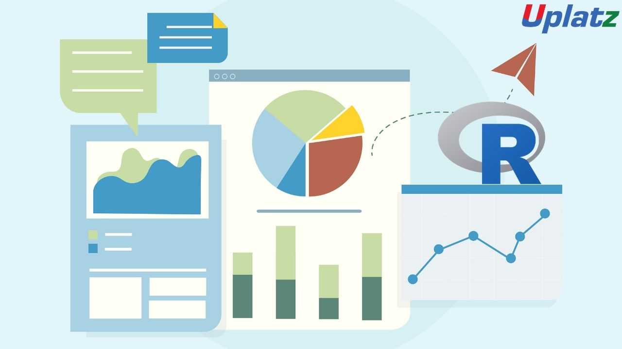
- Data Visualization in R
- 10 Hours
- GBP 10
- 72 Learners
- Data Visualization with Tableau
- Data Visualization in Python
- Data Visualization in R
- Microsoft Power BI
- Qlik Sense – Mastering Data Visualization and Business Intelligence
Start with Tableau to learn core dashboarding, charting, and calculated fields in an intuitive drag-and-drop interface. Continue with Power BI to build robust reports and models using DAX and Power Query. Python and R tracks focus on coding-based visualizations using libraries like Matplotlib, Seaborn, Plotly, and ggplot2. Lastly, Qlik Sense dives deep into associative data modeling and dashboard development in a real-world BI setting. Learners can follow the courses sequentially or select specific tools based on professional relevance.
- Design dynamic dashboards in Tableau and Power BI for real-time insights
- Create coded visualizations using Python (Matplotlib, Seaborn, Plotly)
- Build advanced statistical graphs using R (ggplot2, plotly, lattice)
- Use data modeling, relationships, DAX measures, and slicers in Power BI
- Leverage Qlik Sense for associative data modeling and embedded analytics
- Clean, transform, and prepare data for visualization
- Apply best practices in color theory, UX design, and layout principles
- Understand how to choose the right chart or graph for each data type
- Connect to different data sources including Excel, SQL, and APIs
- Publish and share interactive dashboards across platforms
-
Data Analysts and BI Developers
-
Business Analysts and Decision Makers
-
Data Scientists and Statisticians
-
Excel or SQL professionals moving into visual analytics
-
Aspiring Data Engineers or Data Journalists
-
Professionals preparing for BI certifications
Course/Topic 1 - Course access through Google Drive
-
Google Drive
-
Google Drive
Course/Topic 2 - Data Visualization in Python - all lectures
-
In this first video tutorial on Data Visualization in Python course, you will get a brief introduction and overview on what is data visualization, its importance, benefits and the top python libraries for Data Visualization like Matplotlib, Plotly and Seaborn.
-
In this first part of the video on Matplotlib, you will learn both the theoretical and the practical knowledge on Matplotlib, which is one of the most popular and top python libraries for Data Visualization. You will get a complete introduction to Matplotlib, the installation of Matplotlib with pip, the basic plotting with Matplotlib and the Plotting of two or more lines in the same plot.
-
In this second part of the Matplotlib video tutorial, you will learn how to add labels and titles like plt.xlabel and plt.ylabel along with understanding how to create lists and insert functions onto it. All this can be seen explained it detail by the instructor by taking examples for it.
-
In this tutorial, you will learn about 2 important python libraries namely; Numpy and Pandas. Along with the theoretical concepts, you will also get practical implementation on various topics related to these two such as what is Numpy and what is its use, the installation of Numpy along with example, what is pandas and its key features, with the installation of Python Pandas and finally the Data Structure with examples of Pandas.
-
In this second part of the Numpy and Pandas tutorial, you will learn the complete overview of Pandas like its history, its key features, the installation process of Pandas, Pandas Data Structure and within it the Data Frame and syntax to create Data Frame. All this will be explained in detail by the instructor.
-
In this third part of the video tutorial on Numpy and Pandas, you will learn about creating Data Frame from Dictionary. Also, you will understand how to read CSV Files with Pandas using practical examples by the Instructor.
-
In this tutorial, you will learn about the different Data Visualization Tools such as Bar Chart, Histogram and the Pie Chart. You will get a complete understanding of what is these tools, why and how to use these 3 tools, the syntax for creating Bar Chart, Histogram and the Pie Chart and different programs for creating these data visualization tools. In the first part of the video, you will learn about the Bar Chart and in the subsequent videos, you will learn about the Histogram and the Pie Chart.
-
In this second part of the Data Visualization Tools video, you will learn about the complete overview of Histogram like what is Histogram, how to create Histogram and many others with the help of practical examples by the instructor.
-
In this third and final part of the Data Visualization Tools video, you will learn about the Pie Chart-what is Pie Chart, how to create the Pie Chart and how to create the syntax for Pie Chart? All these questions will be explained in detail by the instructor by taking practical examples. Further, you will understand the concept of Autoptic parameter in Pie Chart.
-
In this first part of the video tutorial on more data visualization tools, you will learn about some additional data visualization tools apart from Bar Chart, Histogram and Pie Chart such as Scatter Plot, Area Plot, STACKED Area Plot and the Box Plot. The first part of this tutorial consists of mainly the Scatter Plot, the theoretical concepts associated with it such as what is Scatter Plot, the syntax for creating Scatter Plot and creating Scatter Plot with examples.
-
In this second part of the video tutorial, you will learn and understand what is Area Plot, creating Area Plot with Function and Syntax and creating Area Plot with examples. All these will be seen explained in detail by the instructor. Further, you will also learn and understand the concept associated with the STACKED Area Plot.
-
In this final part of the video tutorial, you will learn about the Box Plot; which is also known as Whisker Plot, how to create Box Plot, its syntax and arguments used like Data & Notch, the parameters used in Box Plot such as vert, patch artist and widths. These will be seen explained in detail by the instructor.
-
In this first video tutorial on Advanced Data Visualization Tools, you will learn about the Waffle Chart – its definition, complete overview, the syntax and programs to create Waffle Chart and the step-by-step procedure to create the Waffle Chart. All these will be seen explained in detail by the instructor.
-
In this second part of the video tutorial on Advanced Data Visualization Tools, you will learn about the Word Cloud-its definition, the reason why Word Cloud is used, what are the modules needed in generating the Word Cloud in Python, how to install Word Cloud and how to create Word Cloud with the help of some examples.
-
In this tutorial, you will learn and understand about the concept of Heat Map and how one can create the Heat Map along with the help of the parameter camps. This will be seen explained in detail by the instructor.
-
In this first part of the video tutorial on Specialized Data Visualization Tools, you will learn about the Bubble Chart; its definition and how to create bubble charts with the help of different examples.
-
In this video, you will learn about the Contour Plots; which is also sometimes referred to as Level Plots. Along with understanding the whole theoretical concept of Contour Plots, you will also learn how to create Contour Plots with practical examples as will be seen explaining by the instructor in details.
-
In this third part of the video on Specialized Data Visualization Tools, you will learn about the Quiver Plot and how to create the Quiver Plot by taking different examples. This will be seen explained in complete details by the instructor.
-
In this video on Specialized Data Visualization Tools, you will learn about 3D plotting in Matplotlib and also the 3D Line Plot used in Data Visualization with the help of different practical examples and how to create it. This will be seen explained in detailed by the instructor throughout the tutorial.
-
In this tutorial, you will learn about the 3D Scatter Plot and how to create a 3D Scatter Plot. The instructor will be seen explaining this in complete details with the help of different examples.
-
In this tutorial, you will learn and understand the 3D Contour Plot, what is the function used in creating the 3D Contour Plot and how it can be created; which will be explained in detail by the instructor with the help of examples.
-
In this last part of the video tutorial on Specialized Data Visualization Tools, you will learn about the 3D Wireframe Plot and the 3D Surface Plot, along with creating the same with the help of different examples, seen explained in detail by the instructor.
-
In this tutorial, you will learn about Seaborn, which is another very important Python library. Through this video, you will get an introduction to Seaborn, along with some important features of it, functionalities of Seaborn, Installation of Seaborn, the different categories of plot in Seaborn and some basic type of plots one can create using Seaborn like Distribution Plot.
-
In this second part of the video on Seaborn Library, you will learn and understand some basic plots using Seaborn Library like the Line Plot. Here, the instructor will be seen explaining in detail the Seaborn Line Plot and with a detailed example of how to create Seaborn Line Plot with random data.
-
This is a continuation video of creating the Line Plot with some more examples using the Seaborn library. Along with this, you will also learn about the Lmplot and the function used for creating the Lmport. This can be seen explained in detailed by the instructor with practical examples.
-
In this tutorial, you will learn about Data Visualization using Seaborn library. Under this, you will learn the Strip Plot, how to create the strip plot and the program used to create the Strip Plot. This will be shown by the Instructor with detailed examples like Strip plot using inbuilt data-set given in Seaborn and others.
-
In this video, you will learn about the Swarm Plot; its definition, complete overview and how you can create the Swarm Plot. This can be seen explained in detail by the instructor with examples like visualization of “fmri” dataset using swarm plot().
-
In this tutorial, you will learn a complete overview on Plotting Bivariate Distribution along with the concepts of Hexbin Plot, Kernel Density Estimation (KDE) and the Reg Plots. You will understand many of the in-depth concepts on these, with detailed explanation by the instructor with examples.
-
In this tutorial, you will learn about the Pair Plot Function in Visualizing Pairwise Relationship under Seaborn library. You will understand the complete overview of Pair Plot Function, the syntax for using it, the parameters used like hue, palette, kind and diag kind. This will be seen explained in detail by the instructor with the help of examples.
-
In this tutorial, you will learn about the Box Plot, Violin Plots and the Point Plots – their definitions and how to create them which will be seen explained in detail by the instructor throughout the video.
Course/Topic 3 - Data Visualization in R - all lectures
-
In this introductory tutorial on Data Visualization in R Programming, you will learn about what is data visualization, the type of graph or chart one should select for data visualization, what is the importance and benefits of data visualization and finally what are the applications of data visualization.
-
In this video, you will learn how to work on the Histogram, which falls under different Chart types used in Data Visualization in R Programming; along with working on the bar chart, box plot and heat map. You will be seeing a detailed explanation by the instructor on the complete workaround of these by taking different examples.
-
In this video, you will learn what is density plot and how you can create the density plot by taking different examples for it. You will also learn about the different applications being used in the density plot under Data Visualization with R Programming.
-
In this tutorial, you will learn about Data Visualization with GGPLOT2 Package where inside it you will learn the overview of GGPLOT2, iteratively building plots, univariate distributions and bar plot, annotation with GGPLOT2, axis manipulation and the density plot. You will get a complete understanding of the theoretical concept along with the implementation of each of these.
-
In this second part of the video tutorial, you will learn about Plotting with GGPLOT2 and building your plots iteratively, along with the importance of the ‘+’ symbol and its use in the GGPLOT2 work process. You will be seeing a detailed explanation from the instructor by taking different examples.
-
In this video you will learn about the complete theoretical and practical implementation of Univariate Distribution and Bar Plot, which can be seen explained in complete details by the instructor throughout the tutorial.
-
In this tutorial, you will learn about annotation with ggplot2, along with geom text () and adding labels with geom label () with complete explanation on this by the instructor with the help of different examples.
-
In this tutorial, you will learn about Axis Manipulation with ggplot2, its complete overview and in-depth concepts along with the different functions used during the process. You will be seeing explaining the topic in complete details by the instructor by taking examples and working in R studio.
-
In this section, you will learn about Text Mining and Word Cloud, along with the Radar Chart, Waffle Chart, Area Chart and the Correlogram. In this first part of the video, you will learn about the Text Mining and Word Cloud, the different reasons behind using Word Cloud for text data, who is using Word Clouds and the various steps involved in creating word clouds.
-
In this video, you will learn how to execute data using redline function. Also, you will understand the usage of corpus function and content transformer function. Further, you will understand about the text stemming, Term Document Matrix function and the Max word’s function.
-
In this tutorial, you will learn about the Radar Chart, the function used in the Radar Chart which is gg Radar (), scales, mapping and the use label. Along with this, you will also learn how to create Radar Chart in R studio. Moreover, you will learn about the Waffle Chart in R and how to create vector data in Waffle Chart with the help of different examples.
-
In this last part of the session, you will learn about the Area Chart, its in-depth concepts and how to work on it. This will be seen explained in detail by the instructor. Moreover, you will also learn about the Correlogram in R, the correlation matrix, Mt cars and the work around on different visualization methods been used.
-
This is a project tutorial titled Visualizing COVID-19 where you will see the different scenarios being explained by the tutor on visualizing COVID-19 data and how it can be done through Data Visualization in R process. In this first part, you will understand the complete overview of the project, its description and the different tasks associated with it being done by the ggplot.
-
In this second part of the project video, you will learn about the “Annotate” process and the number of COVID cases being reported in China with the help of Data Visualization. You will be seeing the task performed on the dataset being provided by the WHO along with understanding the tribble function and how it will help during the entire work process.
-
In this last part of the session, you will understand the work around of the task being done with the help of plot. You will see a detailed explanation by the instructor seeking help of few examples to explain the complete process of plotting in respect to the COVID-19 project being implemented.
Course/Topic 4 - Tableau (basic to advanced) - all lectures
-
Tableau Tutorial provides basic and advanced concepts of Tableau. Our Tableau Tutorial is designed for beginners and professionals both. Tableau is a data visualization tool or business intelligence tool which analyzes and shows data in a chart or report fast. It is very easy to use, because it does not require any programming skill.
-
In this tutorial, we are going to learn about data sources or data connections in Tableau. We will start with the basics and explore in detail how to make connections with different types of data sources in Tableau. So, let’s get started.
-
In this tutorial, we will discuss about Dimensions and Measures, what they are and how we use them.
-
This tutorial walks you through the features and functions of Tableau Desktop. As you work through this tutorial, you will create multiple views in a Tableau workbook. The steps you'll take and the workbook you'll work in are based on a story about an employee who works at headquarters for a large retail chain. The story unfolds as you step through asking questions about your business and its performance.
-
Building Basic Views
-
In this session you will learn to combine dimensions if you want to encode a data view using multiple dimensions.
-
In this tutorial, Measures can share a single axis so that all the marks are shown in a single pane. To blend multiple measures, drag one measure or axis and drop it onto an existing axis.
-
Building a table of multiple measures in Tableau is straightforward. You can build the table using only two pills. Use the dimension Measure Names and the measure Values. This also works to compare multiple measures side by side in a Tableau bar chart. Building the multiple measures bar chart is covered towards the end of this video.
-
This tutorial walks you through some of the most common tasks you might perform when creating maps in Tableau.You'll learn how to connect to and join geographic data; format that data in Tableau; create location hierarchies; build and present a basic map view; and apply key mapping features along the way.
-
In this Tableau Tutorial, you will learn how to apply filters on data in a Tableau workbook. Here, you will learn about applying simple Tableau filters on data visuals as well as about some advanced types like extract filters, interactive filters, etc. So, open your Tableau Desktop and learn with us!
-
Tableau provides the ability to filter individual views or even entire data sources on dimensions, measures, or sets. What’s more, most of these filters can be put into the hands of you and your end users to change – a powerful tactic for finding stories in the data.
-
The filters can be applied in a worksheet to restrict the number of records present in a dataset. Various types of filters are used in Tableau Desktop based on different purposes. The different types of filters used in Tableau. The name of filter types is sorted based on the order of execution in Tableau.
-
Data joining is a very common requirement in any data analysis. You may need to join data from multiple sources or join data from different tables in a single source. Tableau provides the characteristics to join the table by using the data pane available under Edit Data Source in the Data menu.
-
Data Blending is a very powerful feature in Tableau. It is used when there is related data in multiple data sources, which you want to analyze together in a single view.
-
Hierarchies are logical relationships between categories such as Country, State, City. Groups are selections of attributes that you may want to examine because they are outliers or of a specific type.
-
This video puts together different Tableau Charts with the type of data you’re analyzing and questions you want to answer, to help you find the appropriate chart for your needs.
-
Cascading filters are filters in which the selections in the first filter can change the options in the second filter to limit them to only those values that are relevant to the first filter.
-
As tableau being a visual intelligence tool, we can display the output in the form of visuals. If you want to display the values associated in the form of image, then we can be able to perform the imaged processing in tableau.
-
Sorting of data is a very important feature of data analysis. Tableau allows the sorting of data of the fields, which are called dimensions.
-
This video describes how to create and use calculated fields in Tableau using an example. If you're new to Tableau calculations or to creating calculated fields in Tableau, this is a good place to start.
-
You'll learn Tableau calculation concepts, as well as how to create and edit a calculated field. You will also learn how to work with the calculation editor and use a calculated field in the view.
-
Table Calculations are basically a special type of field that computes on the local data. The following article is going to take you through all you need to know to start using Table Calculations in Tableau.
-
Table calculations in Tableau are basically transformations you apply to the values in a visualization. They are calculated based on what is currently in the visualization and do not consider any measures or dimensions that are filtered out of the visualization.
-
Tableau Table Calculations are the special type of calculated field. Unlike regular calculated fields, table calculations in Tableau are based on the data that is currently visualized in a report. This article shows how to create Tableau table calculations, and how to use their properties.
-
In this Tableau tutorial I will discuss a basic quick table calculation and try to demystify what is happening behind the scenes. All of the following will hopefully be made clearer in the video.
-
Data Blending is a very powerful feature in Tableau. It is used when there is related data in multiple data sources, which you want to analyze together in a single view. It is a method for combining data that supplements a table of data from one data source with columns of data from another data source.
-
You can show trend lines in a visualization to highlight trends in your data. You can publish a view that contains trend lines, and you add trend lines to a view as you edit it on the web.
-
Table calculations are among the most powerful features Tableau has to offer for answering your analytical questions. You can select from a collection of pre-defined calculations or create your own Table Calculation from scratch using Table Calculation functions.
-
A table calculation is a transformation we apply to the values of a single measure in our view, based on the dimensions in the level of detail.
-
Tableau provides a complete range of chart styles. You really don’t even have to understand why a particular chart is better. If you rely on the show me button, tableau will provide an appropriate chart based on the combination of measures and dimensions you’ve selected.
-
In this session you will learn about the next step of advanced chart which help you in creating the chart.
-
Level of Detail (LOD) expressions are used to run complex queries involving many dimensions at the data source level instead of bringing all the data to Tableau interface. A simple example is adding dimension to an already calculated aggregate value.
-
Moving on with our Tableau learning spree, in this tutorial we are going to learn about another interesting topic, that is, Level of Detail or LOD in Tableau. In this tutorial, we are going to learn about the types of LOD expressions, how to create LODs in Tableau with examples.
-
Add context and interactivity to your data using actions. Users interact with your visualizations by selecting marks, or hovering, or clicking a menu, and the actions you set up can respond with navigation and changes in the view.
-
Using the Sample-superstore, plan to create a dashboard showing the sales and profits for different segments and Sub-Category of products across all the states.
-
Tableau dashboard is a group of various views which allows you to compare different types of data simultaneously. Datasheets and dashboards are connected ones if any modification happens to the data that directly reflects in dashboards. It could be the best way to visualize and analyze the data.
-
A dashboard is a collection of different kinds of visualizations or views that we create on Tableau. We can bring together different elements of multiple worksheets and put them on a single dashboard. The dashboard option enables us to import and add charts and graphs from worksheets to create a dashboard. On a dashboard, we can place relevant charts and graphs in one view and analyze them for better insights. Now, we will learn in a stepwise manner how to create a dashboard in Tableau Desktop.
-
Tableau has a very wide variety of formatting options to change the appearance of the visualizations created. You can modify nearly every aspect such as font, color, size, layout, etc. You can format both the content and containers like tables, labels of axes, and workbook theme, etc.
-
In our part 2, we study how to create a word cloud in Tableau, in this tutorial, we are going learn about the Tableau formatting, the various types of formats in Tableau: Formatting the Axes, Change the Font, Change the Shade and Alignment, Format Borders. We will learn about them and thus move a step further in our journey of mastering Tableau. So, let’s start Tableau Formatting.
-
Sometimes, analyzing data that is stored in a crosstab format can be difficult in Tableau. When working with Microsoft Excel, text file, Google Sheets, and .pdf data sources, you can pivot your data from crosstab format into columnar format. If you are working with other data sources, you can Pivot using custom SQL (Tableau Desktop).
-
In this session you will learn about the order of operations in Tableau, sometimes called the query pipeline, is the order in which Tableau performs various actions. Actions are also known as operations. Many operations apply filters, which means that as you build a view and add filters, those filters always execute in the order established by the order of operations.
-
In this last video, you will understand how Tableau works it is useful to know the order in which it manipulates and filters data when producing your view. This process is called the order of operations. It helps to know the order of operations so you can use it to your advantage when using any kind of filter or level of detail calculation, or if you ever find yourself confused as to why Tableau won’t produce the view you want.
- Create interactive dashboards using Tableau, Power BI, and Qlik Sense
- Build coded visualizations using Python’s and R’s data science libraries
- Apply best practices in visual storytelling and dashboard design
- Connect, clean, and transform various data sources
- Use DAX formulas and Power Query in Power BI for data modeling
- Implement calculated fields, filters, LOD expressions in Tableau
- Explore associations and smart search features in Qlik Sense
- Use animation, interactivity, and custom themes for impactful visuals
- Integrate Python and R plots into enterprise BI platforms
- Prepare for interviews and certifications in data visualization and BI tools
- Tableau Interface & Connectors
- Dimensions, Measures, and Data Types
- Filters, Parameters, and Grouping
- Calculated Fields and Table Calculations
- Dual-Axis and Combo Charts
- Dashboard Layouts & Actions
- Level of Detail (LOD) Expressions
- Publishing to Tableau Public / Server
- Introduction to Matplotlib & Seaborn
- Line, Bar, Scatter, Histogram, Heatmap
- Customizing Color, Style, and Labels
- Interactive Plots using Plotly
- Data preparation using Pandas
- Subplots, Facets, and Annotations
- Animated charts with Plotly Express
- Dashboards using Dash framework (optional)
- Base R vs ggplot2 vs lattice plotting
- Scatterplots, Boxplots, Line and Bar Charts
- Mapping with plotly and leaflet
- Interactive dashboards using Shiny
- Data reshaping using dplyr and tidyr
- Themes, Facets, and Color Palettes
- Exporting and publishing plots
- Power BI Desktop and Web Interface
- Importing and transforming data using Power Query
- Relationships and Data Models
- Creating Measures with DAX
- Visualizations: Cards, Charts, KPIs, Maps
- Slicers, Drill-downs, Bookmarks
- Row-level Security and Data Refresh
- Publishing reports to Power BI Service
-
Associative Model and Qlik’s Engine
-
Script Editor and Data Load Script
-
Visualizations and Storytelling Features
-
Master Items, Variables, and Expressions
-
Set Analysis and Aggregation
-
Scripting Joins, Concatenation, and Transformations
-
Section Access and Security
-
Publishing and Sharing Insights
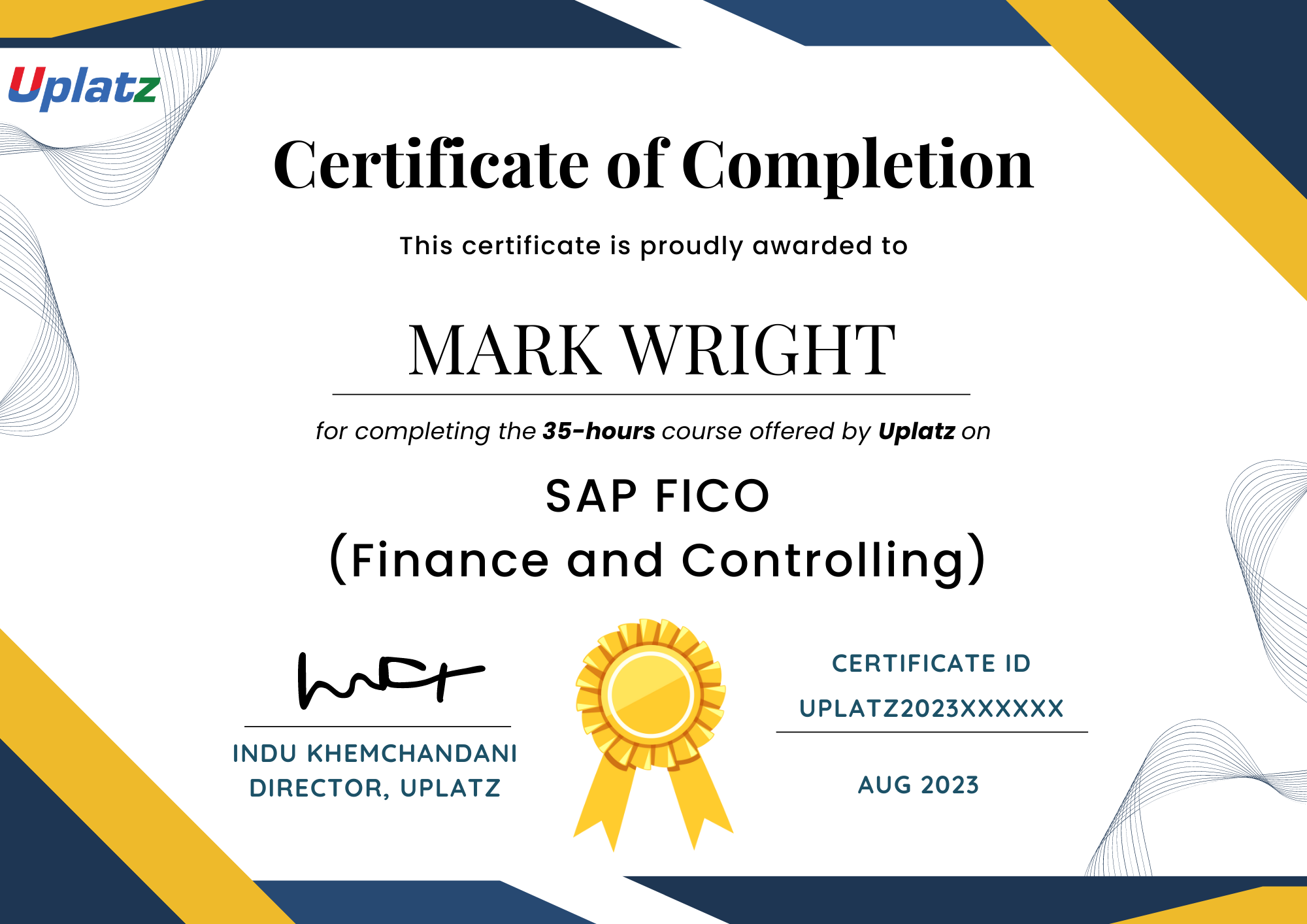
Upon successful completion of the Data Visualization & BI Tools bundle, learners will receive a Certificate of Completion from Uplatz, certifying mastery in visualization techniques across top BI platforms and coding environments. This certificate validates the learner’s ability to design, build, and communicate powerful visual insights through dashboards, plots, and reports using tools like Tableau, Power BI, Python, R, and Qlik Sense. It is a valuable credential for BI Analyst roles and supports preparation for certifications like Tableau Desktop Specialist, Microsoft PL-300, and Qlik Sense Business Analyst.
- Business Intelligence Analyst
- Data Visualization Specialist
- Power BI Developer
- Tableau Consultant
- Qlik Sense Developer
- Python/R Data Analyst
- Data Storyteller
Tableau is known for data visualization depth and user-friendly interface, while Power BI offers tight integration with Microsoft tools, stronger data modeling, and lower pricing.
You can use pandas functions like .fillna(), .dropna(), or apply imputation techniques based on data context.
A calculated field allows you to derive new data values using expressions or formulas based on existing fields in the dataset.
Use hierarchy-enabled visualizations and enable drill-through actions or drill-down icons to explore data layers.
Set Analysis allows you to define a specific data subset in your expressions to analyze and compare data dynamically.
Seaborn provides high-level functions, built-in themes, and easier syntax for complex plots like heatmaps and violin plots.
ggplot2 is a powerful R package for building aesthetic and layered graphics using the grammar of graphics concept.
Bookmarks save a specific report view, allowing users to toggle between states for storytelling or custom interactions.
An iFrame allows embedding Tableau dashboards into web pages, blogs, or portals for public sharing.
Qlik Sense uses an in-memory associative model that allows users to freely explore data without being limited by predefined queries or joins.