


( 1858 Students )


Bundle Course - Data Visualization with Python and R
learn how to form charts, how to tag them, style them, and interpret them.Preview Bundle Course - Data Visualization with Python and R course
View Course Curriculum Price Match Guarantee Full Lifetime Access Access on any Device Technical Support Secure Checkout Course Completion Certificate 95% Started a new career
BUY THIS COURSE (
95% Started a new career
BUY THIS COURSE (GBP 15 GBP 49 )-
 95% Got a pay increase and promotion
Students also bought -
-
- Career Path - Data Visualization Specialist
- 100 Hours
- GBP 32
- 1096 Learners
-
- Data Visualization in Python
- 23 Hours
- GBP 10
- 558 Learners
-
- Data Visualization in R
- 10 Hours
- GBP 10
- 72 Learners
Courses included in Bundle Course Data Visualization with Python and R Bundle Course:
1) Data Visualization in Python
2) Data Visualization in R
Data Visualization is the discipline of trying to understand data by placing it in a visual context so that patterns, trends and correlations that might not otherwise be detected can be exposed.
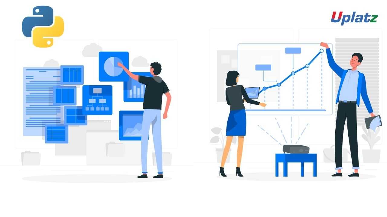
Python offers multiple great graphing libraries that come packed with lots of different features. Data visualization plays an essential role in the representation of both small and large-scale data. One of the key skills of a data scientist is the ability to tell a compelling story, visualizing data and findings in an approachable and stimulating way.
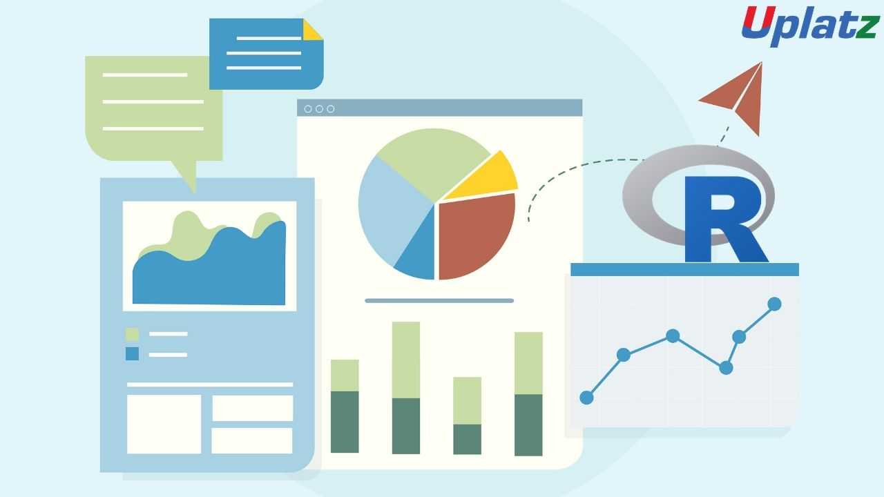
Data visualization is an art of how to turn numbers into useful knowledge. R Programming lets you learn this art by offering a set of inbuilt functions and libraries to build visualizations and present data.
R is an open-sourced, well developed and simple programming language for statistical computing, data analysis, etc. R has inbuilt visualisation libraries that help to present & visualize data in a brief manner with the help of ggplot2, lattice, high charter, leaflets etc. ggplot2 makes it easier to build custom plots & help in producing multi-layered graphics. Lattice help in visualizing multi-varied data while high charters is a visualisation library in JavaScript. Data visualisation in R helps to build maps, 3D plots with the help of RGL and to understand the sequence of events.
With Uplatz Data Visualization in Python Course you will learn-
a).You'll learn Matplotlib and Seaborn and have a solid understanding of how they are used in applied machine learning.
b).You'll work through hands on labs that will test the skills you learned in the lessons.
c).You'll learn the entire Python vernacular specific to data visualization you need to take you skills to the next level.
d).You'll be on your way to becoming a real world machine learning engineer or data engineer.
In this Data Visualization in R course by Uplatz, you will be able to learn the basics and introduction of fundamentals of how R uses an inbuilt visualization library to read multi-varied data, time-series data sets, maps etc. and makes it easier for the business to extract valuable information.
This course also provides a comprehensive introduction on how to plot data with R’s default graphics system, base graphics.
Course/Topic 1 - Data Visualization in Python - all lectures
-
In this first video tutorial on Data Visualization in Python course, you will get a brief introduction and overview on what is data visualization, its importance, benefits and the top python libraries for Data Visualization like Matplotlib, Plotly and Seaborn.
-
In this first part of the video on Matplotlib, you will learn both the theoretical and the practical knowledge on Matplotlib, which is one of the most popular and top python libraries for Data Visualization. You will get a complete introduction to Matplotlib, the installation of Matplotlib with pip, the basic plotting with Matplotlib and the Plotting of two or more lines in the same plot.
-
In this second part of the Matplotlib video tutorial, you will learn how to add labels and titles like plt.xlabel and plt.ylabel along with understanding how to create lists and insert functions onto it. All this can be seen explained it detail by the instructor by taking examples for it.
-
In this tutorial, you will learn about 2 important python libraries namely; Numpy and Pandas. Along with the theoretical concepts, you will also get practical implementation on various topics related to these two such as what is Numpy and what is its use, the installation of Numpy along with example, what is pandas and its key features, with the installation of Python Pandas and finally the Data Structure with examples of Pandas.
-
In this second part of the Numpy and Pandas tutorial, you will learn the complete overview of Pandas like its history, its key features, the installation process of Pandas, Pandas Data Structure and within it the Data Frame and syntax to create Data Frame. All this will be explained in detail by the instructor.
-
In this third part of the video tutorial on Numpy and Pandas, you will learn about creating Data Frame from Dictionary. Also, you will understand how to read CSV Files with Pandas using practical examples by the Instructor.
-
In this tutorial, you will learn about the different Data Visualization Tools such as Bar Chart, Histogram and the Pie Chart. You will get a complete understanding of what is these tools, why and how to use these 3 tools, the syntax for creating Bar Chart, Histogram and the Pie Chart and different programs for creating these data visualization tools. In the first part of the video, you will learn about the Bar Chart and in the subsequent videos, you will learn about the Histogram and the Pie Chart.
-
In this second part of the Data Visualization Tools video, you will learn about the complete overview of Histogram like what is Histogram, how to create Histogram and many others with the help of practical examples by the instructor.
-
In this third and final part of the Data Visualization Tools video, you will learn about the Pie Chart-what is Pie Chart, how to create the Pie Chart and how to create the syntax for Pie Chart? All these questions will be explained in detail by the instructor by taking practical examples. Further, you will understand the concept of Autoptic parameter in Pie Chart.
-
In this first part of the video tutorial on more data visualization tools, you will learn about some additional data visualization tools apart from Bar Chart, Histogram and Pie Chart such as Scatter Plot, Area Plot, STACKED Area Plot and the Box Plot. The first part of this tutorial consists of mainly the Scatter Plot, the theoretical concepts associated with it such as what is Scatter Plot, the syntax for creating Scatter Plot and creating Scatter Plot with examples.
-
In this second part of the video tutorial, you will learn and understand what is Area Plot, creating Area Plot with Function and Syntax and creating Area Plot with examples. All these will be seen explained in detail by the instructor. Further, you will also learn and understand the concept associated with the STACKED Area Plot.
-
In this final part of the video tutorial, you will learn about the Box Plot; which is also known as Whisker Plot, how to create Box Plot, its syntax and arguments used like Data & Notch, the parameters used in Box Plot such as vert, patch artist and widths. These will be seen explained in detail by the instructor.
-
In this first video tutorial on Advanced Data Visualization Tools, you will learn about the Waffle Chart – its definition, complete overview, the syntax and programs to create Waffle Chart and the step-by-step procedure to create the Waffle Chart. All these will be seen explained in detail by the instructor.
-
In this second part of the video tutorial on Advanced Data Visualization Tools, you will learn about the Word Cloud-its definition, the reason why Word Cloud is used, what are the modules needed in generating the Word Cloud in Python, how to install Word Cloud and how to create Word Cloud with the help of some examples.
-
In this tutorial, you will learn and understand about the concept of Heat Map and how one can create the Heat Map along with the help of the parameter camps. This will be seen explained in detail by the instructor.
-
In this first part of the video tutorial on Specialized Data Visualization Tools, you will learn about the Bubble Chart; its definition and how to create bubble charts with the help of different examples.
-
In this video, you will learn about the Contour Plots; which is also sometimes referred to as Level Plots. Along with understanding the whole theoretical concept of Contour Plots, you will also learn how to create Contour Plots with practical examples as will be seen explaining by the instructor in details.
-
In this third part of the video on Specialized Data Visualization Tools, you will learn about the Quiver Plot and how to create the Quiver Plot by taking different examples. This will be seen explained in complete details by the instructor.
-
In this video on Specialized Data Visualization Tools, you will learn about 3D plotting in Matplotlib and also the 3D Line Plot used in Data Visualization with the help of different practical examples and how to create it. This will be seen explained in detailed by the instructor throughout the tutorial.
-
In this tutorial, you will learn about the 3D Scatter Plot and how to create a 3D Scatter Plot. The instructor will be seen explaining this in complete details with the help of different examples.
-
In this tutorial, you will learn and understand the 3D Contour Plot, what is the function used in creating the 3D Contour Plot and how it can be created; which will be explained in detail by the instructor with the help of examples.
-
In this last part of the video tutorial on Specialized Data Visualization Tools, you will learn about the 3D Wireframe Plot and the 3D Surface Plot, along with creating the same with the help of different examples, seen explained in detail by the instructor.
-
In this tutorial, you will learn about Seaborn, which is another very important Python library. Through this video, you will get an introduction to Seaborn, along with some important features of it, functionalities of Seaborn, Installation of Seaborn, the different categories of plot in Seaborn and some basic type of plots one can create using Seaborn like Distribution Plot.
-
In this second part of the video on Seaborn Library, you will learn and understand some basic plots using Seaborn Library like the Line Plot. Here, the instructor will be seen explaining in detail the Seaborn Line Plot and with a detailed example of how to create Seaborn Line Plot with random data.
-
This is a continuation video of creating the Line Plot with some more examples using the Seaborn library. Along with this, you will also learn about the Lmplot and the function used for creating the Lmport. This can be seen explained in detailed by the instructor with practical examples.
-
In this tutorial, you will learn about Data Visualization using Seaborn library. Under this, you will learn the Strip Plot, how to create the strip plot and the program used to create the Strip Plot. This will be shown by the Instructor with detailed examples like Strip plot using inbuilt data-set given in Seaborn and others.
-
In this video, you will learn about the Swarm Plot; its definition, complete overview and how you can create the Swarm Plot. This can be seen explained in detail by the instructor with examples like visualization of “fmri” dataset using swarm plot().
-
In this tutorial, you will learn a complete overview on Plotting Bivariate Distribution along with the concepts of Hexbin Plot, Kernel Density Estimation (KDE) and the Reg Plots. You will understand many of the in-depth concepts on these, with detailed explanation by the instructor with examples.
-
In this tutorial, you will learn about the Pair Plot Function in Visualizing Pairwise Relationship under Seaborn library. You will understand the complete overview of Pair Plot Function, the syntax for using it, the parameters used like hue, palette, kind and diag kind. This will be seen explained in detail by the instructor with the help of examples.
-
In this tutorial, you will learn about the Box Plot, Violin Plots and the Point Plots – their definitions and how to create them which will be seen explained in detail by the instructor throughout the video.
Course/Topic 2 - Data Visualization in R - all lectures
-
In this introductory tutorial on Data Visualization in R Programming, you will learn about what is data visualization, the type of graph or chart one should select for data visualization, what is the importance and benefits of data visualization and finally what are the applications of data visualization.
-
In this video, you will learn how to work on the Histogram, which falls under different Chart types used in Data Visualization in R Programming; along with working on the bar chart, box plot and heat map. You will be seeing a detailed explanation by the instructor on the complete workaround of these by taking different examples.
-
In this video, you will learn what is density plot and how you can create the density plot by taking different examples for it. You will also learn about the different applications being used in the density plot under Data Visualization with R Programming.
-
In this tutorial, you will learn about Data Visualization with GGPLOT2 Package where inside it you will learn the overview of GGPLOT2, iteratively building plots, univariate distributions and bar plot, annotation with GGPLOT2, axis manipulation and the density plot. You will get a complete understanding of the theoretical concept along with the implementation of each of these.
-
In this second part of the video tutorial, you will learn about Plotting with GGPLOT2 and building your plots iteratively, along with the importance of the ‘+’ symbol and its use in the GGPLOT2 work process. You will be seeing a detailed explanation from the instructor by taking different examples.
-
In this video you will learn about the complete theoretical and practical implementation of Univariate Distribution and Bar Plot, which can be seen explained in complete details by the instructor throughout the tutorial.
-
In this tutorial, you will learn about annotation with ggplot2, along with geom text () and adding labels with geom label () with complete explanation on this by the instructor with the help of different examples.
-
In this tutorial, you will learn about Axis Manipulation with ggplot2, its complete overview and in-depth concepts along with the different functions used during the process. You will be seeing explaining the topic in complete details by the instructor by taking examples and working in R studio.
-
In this section, you will learn about Text Mining and Word Cloud, along with the Radar Chart, Waffle Chart, Area Chart and the Correlogram. In this first part of the video, you will learn about the Text Mining and Word Cloud, the different reasons behind using Word Cloud for text data, who is using Word Clouds and the various steps involved in creating word clouds.
-
In this video, you will learn how to execute data using redline function. Also, you will understand the usage of corpus function and content transformer function. Further, you will understand about the text stemming, Term Document Matrix function and the Max word’s function.
-
In this tutorial, you will learn about the Radar Chart, the function used in the Radar Chart which is gg Radar (), scales, mapping and the use label. Along with this, you will also learn how to create Radar Chart in R studio. Moreover, you will learn about the Waffle Chart in R and how to create vector data in Waffle Chart with the help of different examples.
-
In this last part of the session, you will learn about the Area Chart, its in-depth concepts and how to work on it. This will be seen explained in detail by the instructor. Moreover, you will also learn about the Correlogram in R, the correlation matrix, Mt cars and the work around on different visualization methods been used.
-
This is a project tutorial titled Visualizing COVID-19 where you will see the different scenarios being explained by the tutor on visualizing COVID-19 data and how it can be done through Data Visualization in R process. In this first part, you will understand the complete overview of the project, its description and the different tasks associated with it being done by the ggplot.
-
In this second part of the project video, you will learn about the “Annotate” process and the number of COVID cases being reported in China with the help of Data Visualization. You will be seeing the task performed on the dataset being provided by the WHO along with understanding the tribble function and how it will help during the entire work process.
-
In this last part of the session, you will understand the work around of the task being done with the help of plot. You will see a detailed explanation by the instructor seeking help of few examples to explain the complete process of plotting in respect to the COVID-19 project being implemented.
The aim of the bundled data visualization course is to teach how to take data and present them in a form that makes sense to people. The objectivesare:
a).To understand data visualization and its requirement
b).To understand why Python and R is considered as one of the best data visualization tools
c).Torepresent the data in a graphical format for quick understanding
d).To explore data visualization libraries in Python and R
Bundle Course – Data Visualization in Python and R – Course Syllabus
1)-Data Visualization in Python – Course Syllabus
Introduction to Data Visualization
a).What is data visualization
b).Benefits of data visualization
c).Importance of data visualization
d).Top Python Libraries for Data Visualization
Matplotlib
a).Introduction to Matplotlib
b).Install Matplotlib with pip
c).Basic Plotting with Matplotlib
d).Plotting two or more lines on the same plot
Numpy and Pandas
a .What is numpy?
b .Why use numpy?
c .Installation of numpy
d .Example of numpy
e .What is a panda?
f .Key features of pandas
g .Python Pandas - Environment Setup
h .Pandas – Data Structure with example
Data Visualisation tools
a .Bar chart
b .Histogram
c .Pie Chart
More Data Visualisation tools
a .Scatter Plot
b .Area Plot
c .Stacked Area Plot
d .Box Plot
Advanced data Visualisation tools
a .Waffle Chart
b .Word Cloud
c .HEAT MAP
Specialized data Visualisation tools (Part-I)
a .Bubble charts
b .Contour plots
c .Quiver Plot
Specialized data Visualisation tools (Part-II)
a .Three-Dimensional Plotting in Matplotlib
b .3D Line Plot
c .3D Scatter Plot
d .3D Contour Plot
e .3D Wireframe Plot
f .3D Surface Plot
Seaborn
a .Introduction to seaborn
b .Seaborn Functionalities
c .Installing seaborn
d .Different categories of plot in Seaborn
e .Some basic plots using seaborn
Data Visualisation using Seaborn
a .Strip Plot
b .Swarm Plot
c .Plotting Bivariate Distribution
d .Scatter plot, Hexbin plot, KDE, Regplot
e .Visualizing Pairwise Relationship
f .Box plot, Violin Plots, Point Plot
Project on Data Visualisation using Python
Data Visualisation in R – Course Syllabus
a .What is data visualization?
b .Selecting right chart type
c .Importance of data visualization & its benefits
d .Applications of DATA Visualization
e .R Programs for Scatterplot, Histogram, Bar & Stacked bar chart, boxplot, heatmap, line chart, density plot, pie chart
Data Visualisation with ggplot2 package
a .What is ggplot2
i .Plotting with ggplot2
ii .Building your plots iteratively
iii .Univariate distributions & bar plot
iv .Annotation with ggplot2
v .Axis manipulation
vi .Density plot
More Data Visualisation tools in R
a .Text mining and word cloud
b .Radar chart
c .Waffle chart
d .Area Chart
e .Correlogram
Project on Data Visualisation in R
The Data Visualization with Python and R Certification ensures you know planning, production and measurement techniques needed to stand out from the competition.
The process of finding trends and correlations in our data by representing it pictorially is called Data Visualization. To perform data visualization in python, we can use various python data visualization modules such as Matplotlib, Seaborn, Plotly, etc
Visualization is the practice of imagining what you want to achieve in the future. As if it were true today. It involves using all five senses of sight, smell, touch, taste, and hearing. The process of visualizing directs your subconscious to be aware of the end goal you have in mind.
In this world governed by Big Data, data visualization enables you or decision-makers of any enterprise or industry to look into analytical reports and understand concepts that might otherwise be difficult to grasp.
Uplatz online training guarantees the participants to successfully go through the Data Visualization with Python and R certification provided by Uplatz. Uplatz provides appropriate teaching and expertise training to equip the participants for implementing the learnt concepts in an organization.
Course Completion Certificate will be awarded by Uplatz upon successful completion of the Data Visualization with Python and R online course.
The Data Visualization with Python and R draws an average salary of $98,080 per year depending on their knowledge and hands-on experience. The Data Visualization with Python and R job roles are in high demand and make a rewarding career.
Data visualization is a good career, but there aren't many jobs for making reports out of data because it's not a field per se. It's an excellent skill to have and is mostly used in other data jobs. You'll need to know front-end development or data analysis to offer real value to the company.
Note that salaries are generally higher at large companies rather than small ones. Your salary will also differ based on the market you work in.
The following are the job titles:
1).Data Analyst.
2).Data engineers.
Q1. List out the data types used in Python?
Ans-Python has the following built-in data types:
a) Number (float, integer)
b) String
c) Tuple
d) List
e) Set
f) Dictionary
Numbers, strings, and tuples are immutable data types, meaning they cannot be modified during runtime. Lists, sets, and dictionaries are mutable, which means they can be modified during runtime.
Q2. Mention few differences between lists and tuples.
Ans-The lists and tuples are made up of elements, which are values of any Python data type. However, these data types have a number of differences:
a) Lists can be altered, while tuples cannot be altered.
b) Lists are formedusing square brackets (For instance., my_list = [a, b, c]), whereas tuples are closedwithin parentheses (e.g., my_tuple = (a, b, c)).
c) Lists are bit slower than tuples.
Q3. Explain Python dictionary?
Ans-A dictionary is referred as one of the built-in data types in Python. It is used to define not sorted mapping of unique keys to values. Dictionaries are arranged by keys, and the values can be any valid Python data type (even a user-defined class). Dictionaries are mutable, which means they can be altered. A dictionary is formed with curly braces and indexed using the square bracket notation.
Q4. Define lambda functions?
Ans-Lambda functions refers to anonymous functions in Python. They're very useful when you want to define a function that's very short and consists of only one expression.
Q5. Define list comprehensions?
Ans-List comprehensions provide a concise way to create lists.
Q6. Explain how the list is used in Python?
Ans-A list is created using square brackets. But while using a list comprehension, these square brackets contain an expression followed by a for clause and then if clauses, when needed. Assessing the given expression in the context of these for and if clauses generates a list.
Q7. Define negative index, and how is it used in Python?
Ans-A negative index is used in Python to index a list, string, or other container class in reverse order (from the last).
Q8. Mention some well-known Python data analysis libraries?
Ans-The Python Data Analysis Libraries are:
a) NumPy
b) Pandas
c) Matplotlib
d) Seaborn
e) SciKit
Q9. Mention few similarities between R and Python.
Ans-R Programming Language Python Programming Language
a).Model Building is very similar to Python Model Building is very similar to R
b).Model Interpretability is better Models Interpretability is not better than R
c).R has efficient data visualizations libraries and tools Python does not have efficient data visualizations libraries and tools
Q10. Define R Programming Language.
Ans-R is a programming language used for developing statistical software and data analysis.
Q11. How to write R commands?
Ans-R commands begin with # at the starting line of each code.
Q12. List out the cons of R Programming.
Ans-The cons are:
a) Lack of Standard GUI
b) Not preferred for big data
c) Does not provide data in spreadsheet view
Q13. What is the use of With() function?
Ans-The With() function is used to apply an expression to a dataset.
Q14. What is the use of By () function?
Ans-The By () function is used to apply t function at each level of factors.
Q15. How to represent missing values in R programming?
Ans-The missing values are represented as NA which should be only in capital letters.