


( 1344 Students )


Bundle Multi (3-in-1) - Tableau
Learn how to develop visualisations from data models & real-time use of data, build and publish interactive dashboards with Tableau.Preview Bundle Multi (3-in-1) - Tableau course
View Course Curriculum Price Match Guarantee Full Lifetime Access Access on any Device Technical Support Secure Checkout Course Completion Certificate 80% Started a new career
BUY THIS COURSE (
80% Started a new career
BUY THIS COURSE (GBP 15 GBP 49 )-
 92% Got a pay increase and promotion
Students also bought -
-

- Career Path - Technology Manager
- 400 Hours
- GBP 32
- 6860 Learners
-

- Talend
- 20 Hours
- GBP 10
- 117 Learners
-
- Tableau (comprehensive)
- 20 Hours
- GBP 10
- 372 Learners

This is the Bundle Multi (3-in-1) – Tableau course by Uplatz consisting of self-paced training (pre-recorded) videos from two different instructors on Tableau.
These are two different complete sets of courses on Tableau.
1. Tableau
2. Tableau (basic to advanced)
3. Tableau (comprehensive)
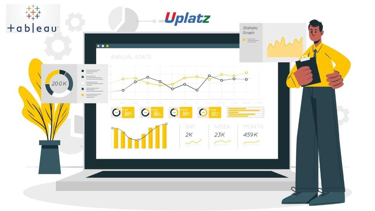
Tableau is one of the fastest evolving Business Intelligence (BI) and data visualization tool. It is very fast to deploy, easy to learn and very intuitive to use for a customer. It helps create interactive graphs and charts in the form of dashboards and worksheets to gain business insights. And all of this is made possible with gestures as simple as drag and drop.
What is Tableau used for?
Usage of Tableau software are listed below:
a) Tableau software is used to translate queries into visualization.
b) It is also used for managing metadata.
c) Tableau software imports data of all sizes and ranges.
d) For a non-technical user, Tableau is a life saver as it offers the facility to create ‘no-code’ data queries.
Key features of Tableau include: a) Data Blending, b) Real time analysis, c) Collaboration of data
Tableau Desktop has a rich feature set and allows you to code and customize reports. Right from creating the charts, reports, to blending them all together to form a dashboard, all the necessary work is created in Tableau Desktop.
For live data analysis, Tableau Desktop provides connectivity to Data Warehouse, as well as other various types of files. The workbooks and the dashboards created here can be either shared locally or publicly.
In this Tableau course, you will learn to develop visualisations from data models that use real-time data, build and publish interactive dashboards with Tableau, and gain exposure to a broad range of data sources, including big data frameworks. Empower your organisation by utilising self-service BI platforms to work with data analytics and gain access to critical business information.
Course/Topic 1 - Tableau (comprehensive) - all lectures
-
In this session you will learn about the Business intelligence (BI) which combines business analytics, data mining, data visualization, data tools and infrastructure, and best practices to help organizations to make more data-driven decisions
-
In this session we will introduce you about Tableau which is a widely used business intelligence (BI) and analytics software trusted by companies like Amazon, Experian, and Unilever to explore, visualize, and securely share data in the form of Workbooks and Dashboards. With its user-friendly drag-and-drop functionality it can be used by everyone to quickly clean, analyze, and visualize your team’s data.
-
This session is all about the history of Tableau which was founded by Pat Hanrahan, Christian Chabot, and Chris Stolte from Stanford University in 2003. The main idea behind its creation is to make the database industry interactive and comprehensive.
-
In this tutorial, we will discuss the Tableau interface and understand its functioning in detail. Followed by the general understanding of Tableau’s working. Along with this, we will learn the Components of Tableau Server.
-
In this session, you will get to know how to use Tableau Prep Builder to clean and prepare your data, start a new flow by connecting to your data, just like in Tableau Desktop. You can also open an existing flow and pick up where you left off.
-
In this video, once you have chosen the best Tableau product for you, it is time to start finding insights in your data! Much like Tableau’s suite of products, data connections come in many shapes and sizes. As of this writing, Tableau Desktop: Personal has four different types of data connections, and Tableau Desktop.
-
This session teaches you about the Data blending which is a method for combining data from multiple sources. Data blending brings in additional information from a secondary data source and displays it with data from the primary data source directly in the view.
-
If you are connected to a data source that has been modified, you can immediately update Tableau Desktop with the changes by selecting a data source on the Data menu and then selecting Refresh.
-
In this Tableau tutorial, we are going to study about what is sorting in Tableau. We will also discuss how to use Quick Sort in Tableau. At last, we will see why is my king broken and combined filed. Tableau sort is the process of arranging or ordering the data in Ascending Order or Descending Order.
-
In this video, we will show you How to perform sorting in Tableau reports with example. For this Tableau sort demo, we are going to use the report we created in our previous article.
-
In this tutorial, we will show you How to perform grouping in Tableau reports with example. For this Tableau Grouping demo, we are going to use the report we created in our previous article. Tableau Grouping is the process of merging or combining two or more values for further analysis.
-
In this video, we will show you How to perform grouping in Tableau reports with example? For this Tableau Grouping demo, we are going to use the report we created in our previous video.
-
In this video, we will show you how to create Tableau Set, Constant Sets, and Computed Sets. First, Drag and Drop the State Name from Dimension Region to Rows Shelf and Profit from Measures region to Columns Shelf.
-
In addition to a Set Action, you can also allow users to change the membership of a set by using a filter-like interface known as a Set Control, which makes it easy for you to designate inputs into calculations that drive interactive analysis. For details, see Show a set control in the video.
-
In this session you begin filtering data in Tableau, it's important to understand the order in which Tableau executes filters in your workbook. Filtering is an essential part of analyzing data. This article describes the many ways you can filter data from your view. It also describes how you can display interactive filters in the view, and format filters in the view.
-
In this video you will get to know about filtering which is an essential part of analyzing data. This article describes the many ways you can filter data from your view. It also describes how you can display interactive filters in the view, and format filters in the view.
-
In this tutorial, we will learn about another interesting and useful feature of Tableau that is Tableau parameters. Here, we will try and gain a good understanding of the parameters in Tableau and their use in Tableau. We will start by discussing the definition of parameters followed by learning how to create parameters and use them in Tableau.
-
In this session you will understand how to use parameter actions to let your audience change a parameter value through direct interaction with a viz, such as clicking or selecting a mark. You can use parameter actions with reference lines, calculations, filters, and SQL queries, and to customize how you display data in your visualizations.
-
In this Tableau tutorial, we will study What is Tableau Reference Lines, functions of Reference lines in Tableau and the steps involved in creating / Adding reference lines to the Tableau Bar Chart. At last, we will how to create reference lines in Tableau with example. So, let us start Tableau Reference Lines.
-
In the tutorial you will get to know how to show trend lines in a visualization to highlight trends in your data. You can publish a view that contains trend lines, and you add trend lines to a view as you edit it on the web. When you add trend lines to a view, you can specify how you want them to look and behave.
-
In this Tableau tutorial, you will learn about the story which is a sequence of visualizations that work together to convey information. You can create stories to tell a data narrative, provide context, demonstrate how decisions relate to outcomes, or to simply make a compelling case.
-
In this session you will understand how to Use stories to make your case more compelling by showing how facts are connected, and how decisions relate to outcomes. You can then publish your story to the web or present it to an audience. Each story point can be based on a different view or dashboard, or the entire story can be based on the same visualization seen at different stages, with different filters and annotations.
-
In this video, we will show you, How to Format Tableau Dashboard Layout with an example. For this, we are going to use the below-shown dashboard. Once you created your dashboard (added required Sheets), you can use the layout tab to format those Sheets or Items as per your requirements.
-
Tableau Layout Containers control the spacing between dashboard components. They allow you to format common elements and move multiple dashboard objects at the same time.
-
In our last Tableau tutorial, we discuss How to Format Tableau Dashboard Layout. Here, in this tutorial, we are going to learn about How to Tableau Interactive Dashboard with Data Granularity, Interactivity, and Intuitiveness in Tableau. In other word or in general words we can call this playing with maps in a tableau. so, let us start with How to Create Tableau Interactive Dashboard.
-
This tutorial walks you through some of the most common tasks you might perform when creating maps in Tableau. You’ll learn how to connect to and join geographic data; format that data in Tableau; create location hierarchies; build and present a basic map view; and apply key mapping features along the way. If you're new to building maps in Tableau, this a great place to start.
-
This tutorial describes how to create and use calculated fields in Tableau using an example. You'll learn Tableau calculation concepts, as well as how to create and edit a calculated field. You will also learn how to work with the calculation editor, and use a calculated field in the view. If you're new to Tableau calculations or to creating calculated fields in Tableau, this is a good place to start.
-
You can build several different types of maps for your geographic analysis in Tableau. If you're new to maps, or simply want to take advantage of the built-in mapping capabilities that Tableau provides, you can create a simple point or filled (polygon) map.
-
You can always customize a table calculation by editing it in the Table Calculations dialog box, but there are other, more specialized ways to customize a table calculation.
-
This video introduces the basics of understanding calculations in Tableau. In this topic, you'll learn why and when to use calculations.
-
This session explains the types of LOD expressions you can use in Tableau, as well as when to use them, and how to format them. It also uses an example to demonstrate how to create a simple LOD expression. Level of Detail expressions (also known as LOD expressions) allow you to compute values at the data source level and the visualization level. However, LOD expressions give you even more control on the level of granularity you want to compute.
-
To edit a table calculation Right-click the measure in the view with the table calculation applied to it and select Edit Table Calculation. In the Table Calculation dialog box that appears, make your changes.
-
Tableau can create interactive visualizations customized for the target audience. In this tutorial, you will learn about the measures, chart types and its features.
-
When you save a level of detail expression, Tableau adds it to either the Dimensions or the Measures area in the Data pane. FIXED level of detail expressions can result in measures or dimensions, depending on the underlying field in the aggregate expression.
-
In this Tableau tutorial, we are going to learn about using a Histogram in Tableau. Here, we will find answers to questions like what is a histogram, and how do we create it in our Tableau software.
-
In this tutorial, 'Sample-Superstore.csv' is used for the demonstration. You can connect to the data source and follow the steps given in the tutorial. Tableau can create interactive visualizations customized for the target audience. In this tutorial, you will learn about the measures, chart types and its features.
-
In this Tableau Tutorial, we are going to learn about an interesting chart that is a bubble chart or packed bubble chart. Here, we will learn how to create a bubble chart in Tableau in a stepwise manner. You can create your first Tableau bubble chart with us on your own device. All you need, as of now is a sample data set and Tableau software in your device.
-
A histogram is a chart that displays the shape of a distribution. A histogram looks like a bar chart but groups values for a continuous measure into ranges, or bins.
-
Tableau Bubble Chart is used to display the data in circles. We can define each bubble using any of our Dimension members and size by Measure value.
-
In this tutorial we will learn about Tree maps which are the relatively simple data visualization that can provide insight in a visually attractive format. Use packed bubble charts to display data in a cluster of circles. Dimensions define the individual bubbles, and measures define the size and color of the individual circles.
-
In this Video we will get to know about the best practices which are key to developing informative visualizations that drive your audience to act. A dashboard is successful when people can easily use it to derive answers. Even a beautiful dashboard with an interesting data source could be rendered useless if your audience can’t use it to discover insights.
Course/Topic 2 - Tableau (basic to advanced) - all lectures
-
Tableau Tutorial provides basic and advanced concepts of Tableau. Our Tableau Tutorial is designed for beginners and professionals both. Tableau is a data visualization tool or business intelligence tool which analyzes and shows data in a chart or report fast. It is very easy to use, because it does not require any programming skill.
-
In this tutorial, we are going to learn about data sources or data connections in Tableau. We will start with the basics and explore in detail how to make connections with different types of data sources in Tableau. So, let’s get started.
-
In this tutorial, we will discuss about Dimensions and Measures, what they are and how we use them.
-
This tutorial walks you through the features and functions of Tableau Desktop. As you work through this tutorial, you will create multiple views in a Tableau workbook. The steps you'll take and the workbook you'll work in are based on a story about an employee who works at headquarters for a large retail chain. The story unfolds as you step through asking questions about your business and its performance.
-
Building Basic Views
-
In this session you will learn to combine dimensions if you want to encode a data view using multiple dimensions.
-
In this tutorial, Measures can share a single axis so that all the marks are shown in a single pane. To blend multiple measures, drag one measure or axis and drop it onto an existing axis.
-
Building a table of multiple measures in Tableau is straightforward. You can build the table using only two pills. Use the dimension Measure Names and the measure Values. This also works to compare multiple measures side by side in a Tableau bar chart. Building the multiple measures bar chart is covered towards the end of this video.
-
This tutorial walks you through some of the most common tasks you might perform when creating maps in Tableau.You'll learn how to connect to and join geographic data; format that data in Tableau; create location hierarchies; build and present a basic map view; and apply key mapping features along the way.
-
In this Tableau Tutorial, you will learn how to apply filters on data in a Tableau workbook. Here, you will learn about applying simple Tableau filters on data visuals as well as about some advanced types like extract filters, interactive filters, etc. So, open your Tableau Desktop and learn with us!
-
Tableau provides the ability to filter individual views or even entire data sources on dimensions, measures, or sets. What’s more, most of these filters can be put into the hands of you and your end users to change – a powerful tactic for finding stories in the data.
-
The filters can be applied in a worksheet to restrict the number of records present in a dataset. Various types of filters are used in Tableau Desktop based on different purposes. The different types of filters used in Tableau. The name of filter types is sorted based on the order of execution in Tableau.
-
Data joining is a very common requirement in any data analysis. You may need to join data from multiple sources or join data from different tables in a single source. Tableau provides the characteristics to join the table by using the data pane available under Edit Data Source in the Data menu.
-
Data Blending is a very powerful feature in Tableau. It is used when there is related data in multiple data sources, which you want to analyze together in a single view.
-
Hierarchies are logical relationships between categories such as Country, State, City. Groups are selections of attributes that you may want to examine because they are outliers or of a specific type.
-
This video puts together different Tableau Charts with the type of data you’re analyzing and questions you want to answer, to help you find the appropriate chart for your needs.
-
Cascading filters are filters in which the selections in the first filter can change the options in the second filter to limit them to only those values that are relevant to the first filter.
-
As tableau being a visual intelligence tool, we can display the output in the form of visuals. If you want to display the values associated in the form of image, then we can be able to perform the imaged processing in tableau.
-
Sorting of data is a very important feature of data analysis. Tableau allows the sorting of data of the fields, which are called dimensions.
-
This video describes how to create and use calculated fields in Tableau using an example. If you're new to Tableau calculations or to creating calculated fields in Tableau, this is a good place to start.
-
You'll learn Tableau calculation concepts, as well as how to create and edit a calculated field. You will also learn how to work with the calculation editor and use a calculated field in the view.
-
Table Calculations are basically a special type of field that computes on the local data. The following article is going to take you through all you need to know to start using Table Calculations in Tableau.
-
Table calculations in Tableau are basically transformations you apply to the values in a visualization. They are calculated based on what is currently in the visualization and do not consider any measures or dimensions that are filtered out of the visualization.
-
Tableau Table Calculations are the special type of calculated field. Unlike regular calculated fields, table calculations in Tableau are based on the data that is currently visualized in a report. This article shows how to create Tableau table calculations, and how to use their properties.
-
In this Tableau tutorial I will discuss a basic quick table calculation and try to demystify what is happening behind the scenes. All of the following will hopefully be made clearer in the video.
-
Data Blending is a very powerful feature in Tableau. It is used when there is related data in multiple data sources, which you want to analyze together in a single view. It is a method for combining data that supplements a table of data from one data source with columns of data from another data source.
-
You can show trend lines in a visualization to highlight trends in your data. You can publish a view that contains trend lines, and you add trend lines to a view as you edit it on the web.
-
Table calculations are among the most powerful features Tableau has to offer for answering your analytical questions. You can select from a collection of pre-defined calculations or create your own Table Calculation from scratch using Table Calculation functions.
-
A table calculation is a transformation we apply to the values of a single measure in our view, based on the dimensions in the level of detail.
-
Tableau provides a complete range of chart styles. You really don’t even have to understand why a particular chart is better. If you rely on the show me button, tableau will provide an appropriate chart based on the combination of measures and dimensions you’ve selected.
-
In this session you will learn about the next step of advanced chart which help you in creating the chart.
-
Level of Detail (LOD) expressions are used to run complex queries involving many dimensions at the data source level instead of bringing all the data to Tableau interface. A simple example is adding dimension to an already calculated aggregate value.
-
Moving on with our Tableau learning spree, in this tutorial we are going to learn about another interesting topic, that is, Level of Detail or LOD in Tableau. In this tutorial, we are going to learn about the types of LOD expressions, how to create LODs in Tableau with examples.
-
Add context and interactivity to your data using actions. Users interact with your visualizations by selecting marks, or hovering, or clicking a menu, and the actions you set up can respond with navigation and changes in the view.
-
Using the Sample-superstore, plan to create a dashboard showing the sales and profits for different segments and Sub-Category of products across all the states.
-
Tableau dashboard is a group of various views which allows you to compare different types of data simultaneously. Datasheets and dashboards are connected ones if any modification happens to the data that directly reflects in dashboards. It could be the best way to visualize and analyze the data.
-
A dashboard is a collection of different kinds of visualizations or views that we create on Tableau. We can bring together different elements of multiple worksheets and put them on a single dashboard. The dashboard option enables us to import and add charts and graphs from worksheets to create a dashboard. On a dashboard, we can place relevant charts and graphs in one view and analyze them for better insights. Now, we will learn in a stepwise manner how to create a dashboard in Tableau Desktop.
-
Tableau has a very wide variety of formatting options to change the appearance of the visualizations created. You can modify nearly every aspect such as font, color, size, layout, etc. You can format both the content and containers like tables, labels of axes, and workbook theme, etc.
-
In our part 2, we study how to create a word cloud in Tableau, in this tutorial, we are going learn about the Tableau formatting, the various types of formats in Tableau: Formatting the Axes, Change the Font, Change the Shade and Alignment, Format Borders. We will learn about them and thus move a step further in our journey of mastering Tableau. So, let’s start Tableau Formatting.
-
Sometimes, analyzing data that is stored in a crosstab format can be difficult in Tableau. When working with Microsoft Excel, text file, Google Sheets, and .pdf data sources, you can pivot your data from crosstab format into columnar format. If you are working with other data sources, you can Pivot using custom SQL (Tableau Desktop).
-
In this session you will learn about the order of operations in Tableau, sometimes called the query pipeline, is the order in which Tableau performs various actions. Actions are also known as operations. Many operations apply filters, which means that as you build a view and add filters, those filters always execute in the order established by the order of operations.
-
In this last video, you will understand how Tableau works it is useful to know the order in which it manipulates and filters data when producing your view. This process is called the order of operations. It helps to know the order of operations so you can use it to your advantage when using any kind of filter or level of detail calculation, or if you ever find yourself confused as to why Tableau won’t produce the view you want.
Course/Topic 3 - Tableau - all lectures
-
In this video lecture we learn basic about Tableau. Tableau is a business intelligent tool for visually analysing the data.
-
In this video we talk about Tableau Desktop Basics and also cover all the Basic topics of Tableau Desktop.
-
In this video we learn how to install Tableau business intelligent tool into your desktop and process of Tableau Desktop Installation.
-
In this video we about Tableau Desktop Workspace Navigation and cover all the importance of Tableau Desktop Workspace Navigation.
-
In this session we talk about Tableau Design Flow and also cover all the different types of Tableau Design Flows.
-
In this video we learn about Connections to Multiple Data Sources and cover all techniques of data sourcing.
-
In this video we talk about Hands-on - Tableau Data Connection and also cover different between live and exact Tableau Data Connection.
-
In this session we learn basic about Tableau Filters and different types of filters we can use in Tableau business tool.
-
Data can be organized and simplifies by using various techniques in Tableau. In this session we also cover types of filters and condition of filters in Tableau.
-
In this session we learn about Tableau Operators. Types of Tableau Operators and how to use these Tableau Operators.
-
In this video we talk about Bins - Groups - Sets – Parameters and also cover all the parameters we use in Tableau.
-
In this session we learn about Hands on - Tableau Sets and cover all different sets in Hands on - Tableau Sets..
-
In this session we talk about Basic Tableau Charts and learn about different types of charts.
-
In this video we talk about Hands on - Basic Tableau Charts how to make pie chart and importance of charts in Tableau business tool.
-
In this lecture we learn the Tableau Advanced Topics like Advance graphs, LODS and its usage and extensions etc.
-
In this video we talk about Tableau Extensions and cover all different types of extensions in a single video.
-
In this Lecture section we talk and overview the Tableau Dashboards and explore the Dashboards of Tableau.
-
In this lecture session we talk about the Tableau Story. In Tableau story is a sequence of visualization that work together to convey the information.
-
In this video we talk about Tableau LODs extension and importance of LODs extension in Tableau business tool.
-
In this lecture session we talk about Tableau Actions and also cover all Actions filters.
1) Gain an introduction to Tableau
2) Extract business intelligence by adding value to your data
3)Produce visually compelling and intuitive dashboards and presentations of your corporate data
4) Explore the flexible and easy-to-use tools to find, clean, model and visualise data
5) Create interactive visualisations to deliver business insights
6) Integrate data from multiple heterogeneous sources
7) Generate Tableau maps for geographical data
8) Share a story using dashboards to highlight your discoveries
9) Data Visualisation best practice: A quick look at the do’s & don’ts of visualising data
10) Connecting to your data: Editing, filtering and extracting a data source; Tableau Data Extracts (TDEs) & why / when you should use them
11) Tableau terminology: Measures & dimensions, discrete vs continuous, pills & shelves giving familiarity with the Tableau interface and key terms to analyse the correct data sets
12) Using the Tableau interface: Creating your first visualisations, custom colours, labels, sorting, filtering and search
13) Keeping your data organised: folders & hierarchies – increasing efficiencies and accessing what you need
14) Creating calculations: Including basic arithmetic calculations: custom aggregations and ratios, date handling, and quick table calculations
15) Introduction to the most common chart types: Represent your data using Cross tabs, Geographic maps, Heat maps, Bar charts, Dual axis charts, Scatter plots & Bullet charts
16) Building dashboards and stories to share visualisations: Best practice data viz tips
17) Using the hover-over functionality to add depth to your visualisations – Supplemental details, sub graphs within hover over, key elements supporting the data set
18) Explore your business’s data in powerful and intuitive new ways
19) Build interactive dashboards that bring meaning to your data
20) Combine data from across your organisation to identify trends and derive powerful new insights
21) Share your dashboards with multiple users in the knowledge that everyone is seeing the same single source of truth
This course provides a comprehensive introduction to Tableau, covering data visualization, dashboard creation, and advanced analytics. Participants will learn to effectively analyze data and present insights using Tableau’s powerful features.
Part 1: Introduction to Tableau
Week 1: Overview of Tableau
a) Introduction to data visualization concepts
b) Overview of Tableau and its components (Desktop, Server, Online)
c) Understanding the Tableau interface and navigation
d) Hands-on exercise: Installing Tableau and exploring the interface
Week 2: Connecting to Data Sources
a) Overview of data connectivity options: Excel, SQL, CSV, and web data connectors
b) Importing and preparing data for analysis
c) Understanding data types and data roles in Tableau
d) Hands-on exercise: Connecting to different data sources and importing data
Week 3: Data Preparation and Transformation
a) Introduction to data cleaning and transformation techniques
b) Using Tableau Prep for data preparation
c) Understanding joins, blends, and relationships in Tableau
d) Hands-on exercise: Preparing data for visualization
Part 2: Data Visualization Techniques
Week 4: Creating Basic Visualizations
a) Overview of basic chart types: bar, line, pie, and scatter plots
b) Best practices for effective data visualization
c) Creating and formatting basic visualizations in Tableau
d) Hands-on exercise: Building various basic charts
Week 5: Advanced Visualizations
a) Exploring advanced chart types: heat maps, bullet charts, and box plots
b) Creating interactive visualizations using parameters and filters
c) Using calculated fields for enhanced data analysis
d) Hands-on exercise: Building advanced visualizations
Week 6: Dashboard Creation
a) Introduction to dashboard concepts and design principles
b) Combining multiple visualizations into interactive dashboards
c) Adding interactivity with actions and filters
d) Hands-on exercise: Creating a functional dashboard
Part 3: Analytics and Sharing
Week 7: Advanced Analytics in Tableau
a) Overview of analytics features: trend lines, forecasting, and clustering
b) Using table calculations and level of detail (LOD) expressions
c) Implementing statistical analysis within Tableau
d) Hands-on exercise: Applying advanced analytics techniques
Week 8: Sharing and Publishing
a) Overview of sharing options: Tableau Server, Tableau Online, and PDF export
b) Best practices for publishing dashboards and visualizations
c) Managing user access and permissions in Tableau Server
d) Hands-on exercise: Publishing and sharing visualizations
Part 4: Capstone Project
Week 9: Capstone Project Preparation
a) Overview of capstone project objectives
b) Selecting a real-world data set and defining the project scope
c) Initial project planning and outlining visualization goals
d) Group discussion and feedback session on project ideas
Week 10: Capstone Project Execution
a) Building and refining the final dashboard using Tableau
b) Presenting findings and visualizations to the class
c) Peer reviews and discussions on project experiences and challenges
Recommended Resources:
a) Textbooks:
a."Learning Tableau 2021" by Joshua N. Milligan
b."Tableau for Dummies" by Molly Monsey and Paul Sochan
b) Online Resources:
a.Tableau Community for discussions and knowledge sharing
b.Tableau Public for exploring and sharing visualizations
c) Tools:
a. Tableau Desktop for hands-on practice
Assessment:
a) Weekly quizzes and assignments
b) Mid-term project focused on specific visualization techniques
c) Final capstone project showcasing a complete Tableau solution
The Tableau Certification ensures you know planning, production and measurement techniques needed to stand out from the competition.
Tableau is a visual analytics engine that makes it easier to create interactive visual analytics in the form of dashboards. These dashboards make it easier for non-technical analysts and end users to convert data into understandable, interactive graphics.
Tableau is a leading data visualization tool used for data analysis and business intelligence. Gartner's Magic Quadrant classified Tableau as a leader for analytics and business intelligence.
Tableau offers certifications for users with a range of experience and goals. Each certificate shows that the user is proficient in varying levels of skills needed for data analysis and an understanding of the software itself.
If you also bring the right skills (technical and soft skills), becoming Tableau Certified can add a significant boost to your salary, help you ace interviews, raise your career potential and attract the attention of well-established companies.
Uplatz online training guarantees the participants to successfully go through the Tableau certification provided by Uplatz. Uplatz provides appropriate teaching and expertise training to equip the participants for implementing the learnt concepts in an organization.
Course Completion Certificate will be awarded by Uplatz upon successful completion of the Tableau online course.
The Tableau draws an average salary of $105.952 per year depending on their knowledge and hands-on experience. The Tableau Admin job roles are in high demand and make a rewarding career.
The job is a perfect career in tableau if the individual has good team skills, problem-solving skills, managerial skills, and time management. The main job role of a Tableau developer is to prepare visualizations and presentations of the systems. They are also required to infer the data to enhance business excellence.
Not only is there a great demand for Tableau experts, but there are also huge rewards on offer as well. As of May 6, 2019, the average annual pay for a Tableau Developer is $108,697 a year. The average salaries too, are on an upward trend with the recent average salaries going up to as high as $158,000.
Note that salaries are generally higher at large companies rather than small ones. Your salary will also differ based on the market you work in.
a) Tableau Developer.
b) BI Developer.
c) Technical Developer.
d) Salesforce Developer.
Q1. What is TABLEAU?
Ans-Tableau is the powerful and fastest visualizing tool that is used in the Business Intelligence(BI) Industry. It simplifies the raw data into an understandable format. Analysis of the data becomes faster with Tableau. The visualizations can be created in the form of dashboards. The visualizations or diagrammatic representation of data can easily be understood by the employees of the organizations who are at different levels.
Q2. What is data visualization?
Ans-Data visualization means the graphical representation of data or information. We can use visual objects like graphs, charts, bars, and a lot more. Data visualization tools provide an accessible way to see and understand the data easily.
Q3. List out Tableau File Extensions.
Ans-The below ones are few extensions in Tableau:
a) Tableau Workbook (.twb)
b) Tableau Data extract (.tde)
c) Tableau Datasource (.tds)
d) Tableau Packaged Datasource (.tdsx)
e) Tableau Bookmark (.tbm)
f) Tableau Map Source (.tms)
g) Tableau Packaged Workbook (.twbx) – zip file containing .twb and external files.
h) Tableau Preferences (.tps)
Q4. What is the latest version of Tableau Desktop?
Ans-Tableau Desktop's latest version is 2021.3(as of, 7thSep 2021).
Q5. Define LOD Expression?
Ans-LOD Expression stands for Level of Detail Expression, and it is used to run complex queries involving many dimensions at the data sourcing level.
Q6. Define Heat Map?
Ans-A heat map is a graphical representation of data that uses the color-coding technique to represent different values of data. As the marks heat up due to their higher value, dark colors will be shown on the map.
Q7. Define TreeMap?
Ans-TreeMap is a visualization that organizes data hierarchically and shows them as a set of nested rectangles. The size and colors of rectangles are respective to the values of the data points they project. Parent rectangles will be tiled with their child elements.
Q8. What is the difference between a Heat map and Treemap?
Ans-TreeMap Heat MapIt represents the data hierarchically and shows them as a set of nested rectangles. It represents the data graphically which uses multiple colors to represent different values. It is used for comparing the categories with colors, size, and it can also be used for illustrating the hierarchical data and part to whole relationships. It is used for comparing the categories based on color and size. And also it is great in spotting the patterns based on the density of the information. The colors and size of rectangles are respective to the values of the data points When their values are higher or density of records, the data will represent in dark color.
Q9. What is a parameter Tableau? And how does it work?
Ans-Parameters are dynamic values, we can replace the constant values in calculations.
Q10. Give an overview of the fact and dimensions of the table?
Ans-Facts are numeric measures of data. They are stored in fact tables. Fact tables store that type of data that will be analyzed by dimension tables. Fact tables have foreign keys associating with dimension tables.Dimensions are descriptive attributes of data. Those will be stored in the dimensions table. For example, customer’s information like name, number, and email will be stored in the dimension table.