Project on Data Visualization with Python
Learn how to apply the concepts of Python Data Visualization on practical, and in real world scenarios. Price Match Guarantee
Full Lifetime Access
Access on any Device
Technical Support
Secure Checkout
Course Completion Certificate
 93% Started a new career
BUY THIS COURSE (
93% Started a new career
BUY THIS COURSE (GBP 10 GBP 29 )-
 84% Got a pay increase and promotion
Students also bought -
-

- Project Management Fundamentals
- 2 Hours
- GBP 10
- 387 Learners
-

- Project on Data Visualization with R
- 2 Hours
- GBP 10
- 232 Learners
-

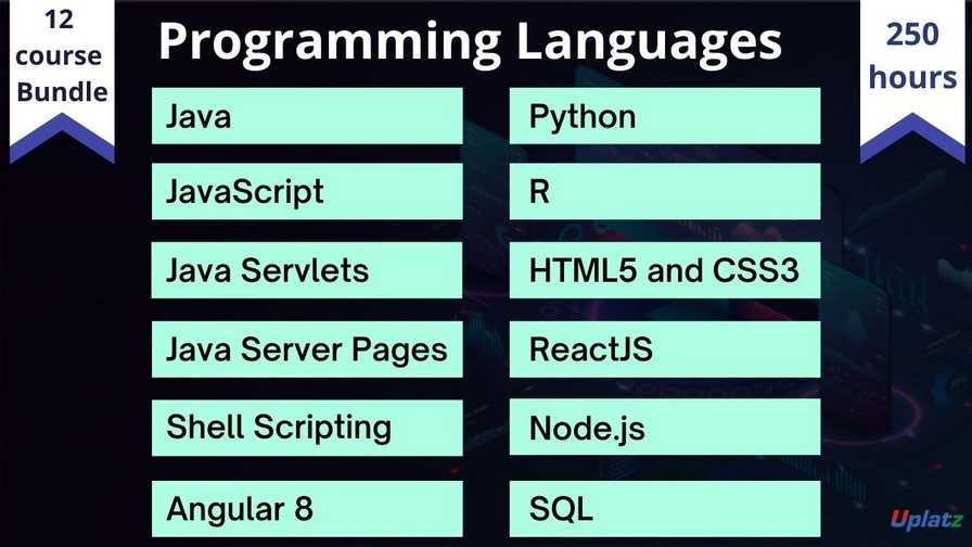
- Bundle Course - Programming Languages
- 250 Hours
- GBP 15
- 2454 Learners

Data Visualization is the graphical representation of data in order to interactively and efficiently convey insights to clients, customers, and stakeholders in general.
One of the key skills of a data scientist is the ability to tell a compelling story, visualizing data and findings in an approachable and stimulating way. Learning how to leverage a software tool to visualize data will also enable you to extract information, better understand the data, and make more effective decisions.
Data Visualization is the process of communicating complex information with simple graphics and charts. Data Visualization has the power to tell data-driven stories while allowing people to see patterns and relationships found in data.
Python allows us to create visualizations easily and quickly using Matplotlib and Seaborn. Matplotlib is the most commonly used graphing tool in Python. Seaborn is an add-on to Matplotlib that allows us to style our graphs more professionally and create sleeker graphics.
The main goal of this Project on Data Visualization with Python course by Uplatz is to teach you how to take data that at first glance has little meaning and present that data in a form that makes sense to people. You will learn how to: Create line graphs, Create bar charts, Create pie graphs, Add error bars to graphs, Add labels and styling to graphs, and the like.
In this complete industry-driven Project on Data Visualization with Python you will learn the analysis and visualization of Python. The tutor has demonstrated the analysis and visualization of Covid-19 datasets with the help of Python. With this course you will learn how to apply the concepts of Python Data Visualization on practical projects or applications, and in real world scenarios.
Course/Topic - Project on Data Visualization with Python - all lectures
-
This tutorial is about a project titled “Project on Visualizing COVID – 19” used by the instructor to explain various practical implementations of Data Visualization in real-world scenario. In this first part of the tutorial, you will get the project description from the instructor, the different tasks to be executed during the project and also you will see some practical examples of data sets being used to explain the complete overview of the project.
-
In this second part of the tutorial, you will learn about Visualizing COVID-19 data for different countries by selecting the data set for each country. You will be seeing practical and in-depth explanation on this from the instructor.
-
This is a continuation video on Visualizing COVID-19 data for specific countries. You will be seeing some more explanations on working with the data sets for some other specific countries using Bar Chart as illustrated by the instructor at the beginning of his project description.
-
In this video, you will learn and understand the data visualization work around on the total number of deaths over the period of time in specific countries. This will be seen explained in details by the instructor throughout the tutorial.
-
In this tutorial, you will learn about the Graphical Data Analysis using Strip Plot and how it can be implemented in the project, taking into consideration the total number of deaths due to COVID-19 in different parts of the world. Through this, you will also understand the concept of query () and in operator and how it can be used during the entire work process of visualizing COVID-19 data.
-
In this video, you will learn about creating an animated horizontal bar graph for five countries under Visualizing COVID-19 and what are the different steps involved while doing the same. This will be seen explained in detail by the instructor with step-by-step procedure and by taking different examples.
1) How to present data using some of the data visualization libraries in Python, including Matplotlib, Seaborn, and Folium
2) How to use basic visualization tools, including area plots, histograms, and bar charts
3) How to use specialized visualization tools, including pie charts, box plots, scatter plots, and bubble plots
4) How to use advanced visualization tools, including waffle charts, word clouds, and Seaborn and regression plots
5) How to create maps and visualize geospatial data
Here’s a suggested course syllabus for a Project on Data Visualization with R. This course is designed to provide participants with hands-on experience in creating compelling visualizations using R, focusing on practical applications and projects.
Course Overview:
This course focuses on applying data visualization techniques using R to explore, analyze, and present data effectively. Participants will engage in practical projects that enhance their understanding of visualization principles, R programming, and data storytelling.
Module 1: Introduction to Data Visualization
This module introduces the fundamental concepts of data visualization, including the importance of visual representation in data analysis. Participants will learn about various types of visualizations (e.g., bar charts, line graphs, scatter plots) and principles of effective design. The module will also cover the “data-to-viz” framework for choosing the right visualization based on the data type and analysis goal.
Module 2: Setting Up R and RStudio
Participants will learn how to install and configure R and RStudio. This module covers the basics of R programming, including data structures (vectors, data frames, lists), basic operations, and using R packages. Familiarization with RStudio’s interface and tools will also be included to ensure participants can efficiently work on their projects.
Module 3: Data Wrangling with R
In this module, participants will explore data wrangling techniques using the dplyr and tidyr packages. Topics include importing data from various sources (CSV, Excel, databases), cleaning and transforming data, handling missing values, and reshaping data for analysis. Practical exercises will reinforce the importance of data preparation before visualization.
Module 4: Introduction to ggplot2
This module introduces ggplot2, one of the most powerful visualization packages in R. Participants will learn the grammar of graphics and how to create basic plots using ggplot2. Topics include aesthetic mappings, layers, scales, and themes. Practical examples will illustrate how to customize plots for better presentation.
Module 5: Advanced Visualization Techniques
Participants will delve into advanced visualization techniques using ggplot2, such as faceting, creating multi-layered plots, and using color palettes effectively. The module will also cover specialized visualizations like heatmaps, boxplots, and geographic maps using ggmap or sf. Projects will focus on real-world datasets to create informative visualizations.
Module 6: Interactive Visualizations with Shiny
This module introduces the basics of creating interactive web applications using R and the Shiny package. Participants will learn how to build Shiny apps that allow users to interact with visualizations dynamically. Practical projects will involve creating dashboards and user-friendly interfaces to showcase data insights.
Module 7: Data Storytelling and Presentation
In this module, participants will learn the art of data storytelling, focusing on how to present data visualizations effectively to various audiences. Topics include structuring a narrative, incorporating visuals into reports, and using R Markdown for generating dynamic reports. Participants will practice crafting compelling stories using their visualizations.
Module 8: Capstone Project
In this final module, participants will work on a capstone project that combines all the skills learned throughout the course. They will select a dataset, conduct analysis, and create a series of visualizations that tell a story. The project will culminate in a presentation where participants showcase their findings and visualizations.
Course Conclusion and Feedback
The course will conclude with a reflection on key learnings and best practices in data visualization. Participants will receive feedback on their capstone projects and have the opportunity to discuss challenges faced during their projects. Guidance for further learning resources and career opportunities in data visualization will also be provided.
Self-paced content on our learning platform that reinforce lessons and provide flexibility to revisit foundational concepts at any time during the course and afterwards. Python is the preferred language for new technologies such as Data Science and Machine Learning.
It has evolved as the most preferred Language for Data Analytics and the increasing search trends on Python also indicates that it is the " Next Big Thing " and a must for Professionals in the Data Analytics domain. On completing this Data Visualization with Python course receive Course Completion Certificate from Uplatz.
Need for Data Visualization engineer is also increasing as data is increasing day by day, so it is becoming difficult to understand it and take a decision on it unless it is presented in more meaning-full or understandable way; so pursuing careers in Data Visualization is a really good decision.
There are three broad categories of Careers in Data Visualization:
Data Visualization Engineer: The data visualization engineer focuses on design and development of reporting solutions to provide fact-based analysis to the decision makers to identify patterns and trends which may not be revealed by text data. Bachelor’s or Master’s degree is required for Data Visualization Engineer position.
Business Intelligence Analysts: Business Intelligence Analysts focuses on data analysis and business reporting. Analyze business requirement and develop functional specifications. Business Intelligence Analyst is responsible for building reports, dashboards, models and tools to analyze data, report, and present operations related data, which is used to monitor product usage, take important business decisions and forecast business productivity. Sometimes they also need to engage with the internal and external client to determine requirements, decide priorities of requirement & make sure that there is no communication gap.
Data Analysts: Data analysts work on reporting and visualization part to explain the hidden figures of data with the help of graphs, charts etc. Their role is to analyze data collected from sales, marketing etc. and help the firm for better decision making by presenting their finding in the form of reports. A bachelor’s degree is required for Data Analyst position at entry level. There are different categories of data analyst position: operational analyst, marketing analyst, financial analyst etc.
Q1. List out the data types used in Python?
Ans-
Python has the following built-in data types:
a) Number (float, integer)
b) String
c) Tuple
d) List
e) Set
f) Dictionary
Numbers, strings, and tuples are immutable data types, meaning they cannot be modified during runtime. Lists, sets, and dictionaries are mutable, which means they can be modified during runtime.
Q2. Mention few differences between lists and tuples.
Ans-The lists and tuples are made up of elements, which are values of any Python data type. However, these data types have a number of differences:
a) Lists can be altered, while tuples cannot be altered.
b) Lists are formedusing square brackets (For instance., my_list = [a, b, c]), whereas tuples are closedwithin parentheses (e.g., my_tuple = (a, b, c)).
c) Lists are bit slower than tuples.
Q3. Explain Python dictionary?
Ans-A dictionary is referred as one of the built-in data types in Python. It is used to define not sorted mapping of unique keys to values. Dictionaries are arranged by keys, and the values can be any valid Python data type (even a user-defined class). Dictionaries are mutable, which means they can be altered. A dictionary is formed with curly braces and indexed using the square bracket notation.
Q4. Define lambda functions?
Ans-Lambda functions refers to anonymous functions in Python. They're very useful when you want to define a function that's very short and consists of only one expression.
Q5. Define list comprehensions?
Ans-List comprehensions provide a concise way to create lists.
Q6. Explain how the list is used in Python?
Ans-A list is created using square brackets. But while using a list comprehension, these square brackets contain an expression followed by a for clause and then if clauses, when needed. Assessing the given expression in the context of these for and if clauses generates a list.
Q7. Define negative index, and how is it used in Python?
Ans-A negative index is used in Python to index a list, string, or other container class in reverse order (from the last).
Q8. Mention some well-known Python data analysis libraries?
Ans-The Python Data Analysis Libraries are:
a) NumPy
b) Pandas
c) Matplotlib
d) Seaborn
e) SciKit
9. What is the use of With() function?
Ans-The With() function is used to apply an expression to a dataset.
Q10. What is the use of By () function?
Ans-The By () function is used to apply t function at each level of factors.


