Project on Data Visualization with R
Learn how to analysis and visualization of R Programming on practical projects or applications, in real world scenarios. Price Match Guarantee
Full Lifetime Access
Access on any Device
Technical Support
Secure Checkout
Course Completion Certificate
 90% Started a new career
BUY THIS COURSE (GBP 29)
-
 85% Got a pay increase and promotion
Students also bought -
-

- Project Management Fundamentals
- 2 Hours
- GBP 29
- 387 Learners
-
- Project on Data Visualization with Python
- 5 Hours
- GBP 29
- 376 Learners
-
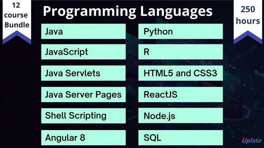
- Bundle Course - Programming Languages
- 250 Hours
- GBP 49
- 2454 Learners

R is an amazing platform for data analysis, capable of creating almost any type of graph. This book helps you create the most popular visualizations - from quick and dirty plots to publication-ready graphs. Visualization remains one of the most powerful ways draw conclusions from data, but the influx of new data types requires the development of new visualization techniques and building blocks.
In data science, it's not enough to be able to analyze data. You must also be able to create compelling visualizations to showcase your insights and help people understand your results.
Data Visualisation is a vital tool that can unearth possible crucial insights from data. If the results of an analysis are not visualized properly, they will not be communicated effectively to the desired audience.
In this introductory course on data visualization in R, you will learn about the different resources you can use to explore and showcase your data visually. Most importantly, you'll learn how to use ggplot2, a powerful and immensely popular data visualization library for R.
By the end of this course, you will be able to create visualizations such as line charts, bar plots, scatter plots, histograms, and box plots to understand your data, and help others understand your data as well. You will also learn how to add and work with multiple plots in your code to show different visualizations in a single dashboard.
In this tutorial on Data Visualization with R, you will learn the analysis and visualization of R Programming. In this video course the tutor has demonstrated the analysis and visualization of Covid-19 datasets with the help of R Programming. With this course you will learn how to apply the concepts of R Programming on practical projects or applications, in real world scenarios.
Course/Topic - Project on Data Visualization with R - all lectures
-
This is a project tutorial titled Visualizing COVID-19 where you will see the different scenarios being explained by the tutor on visualizing COVID-19 data and how it can be done through Data Visualization in R process. In this first part, you will understand the complete overview of the project, its description and the different tasks associated with it being done by the ggplot.
-
In this second part of the project video, you will learn about the “Annotate” process and the number of COVID cases being reported in China with the help of Data Visualization. You will be seeing the task performed on the dataset being provided by the WHO along with understanding the tribble function and how it will help during the entire work process.
-
In this last part of the session, you will understand the work around of the task being done with the help of plot. You will see a detailed explanation by the instructor seeking help of few examples to explain the complete process of plotting in respect to the COVID-19 project being implemented.
• Learn to create basic bar charts, histograms, pie charts, scatter plots, line plots, box plots, and maps using R and related packages.
• Learn to customize charts and plots using themes and faceting.
• Learn to create maps using the Leaflet package for R.
• Learn to create interactive dashboards using the Shiny package for R.
• To be familiar with standard techniques for visualizing data, including heat maps, contour plots, etc.
• To be able to transform raw data into formats suitable for analysis
• To be able to perform basic exploratory analysis
• To be able to create data visualizations in R.
1. Introduction to Data Visualization
Importance of data visualization
Principles of effective visual communication
Overview of R and its visualization capabilities
2. R Programming Basics
Introduction to R and RStudio
Data types and structures in R
Basic data manipulation with R
3. Data Import and Preparation
Importing data from various sources (CSV, Excel, databases)
Data cleaning and preprocessing techniques
Handling missing values and outliers
4. Visualization Libraries in R
Overview of popular visualization libraries (ggplot2, plotly, lattice)
Installation and basic usage of libraries
5. Basic Plotting with Base R
Creating basic plots (scatter plots, line plots, bar charts)
Customizing plots (titles, labels, colors)
6. Advanced Visualization with ggplot2
Understanding the grammar of graphics
Creating layered visualizations
Customizing themes and aesthetics
7. Interactive Visualizations
Introduction to interactive visualization with plotly
Creating interactive dashboards with Shiny
8. Specialized Visualization Techniques
Heatmaps, box plots, and violin plots
Time series visualization
Geospatial data visualization with ggmap or leaflet
9. Best Practices in Data Visualization
Choosing the right type of visualization
Color theory and accessibility considerations
Avoiding common pitfalls in data visualization
10. Project Development
Defining the project scope and objectives
Collecting and preparing data for the project
Developing visualizations based on project goals
11. Presentation and Communication
How to effectively present your visualizations
Tips for storytelling with data
Preparing a final project report or presentation
12. Final Project Showcase
Students present their projects
Peer feedback and discussions
The Data Visualization with R Certification ensures you know planning, production and measurement techniques needed to stand out from the competition.
Data visualization is the technique used to deliver insights in data using visual cues such as graphs, charts, maps, and many others. This is useful as it helps in intuitive and easy understanding of the large quantities of data and thereby make better decisions regarding it.
Data visualization is the graphical representation of information and data. By using visual elements like charts, graphs, and maps, data visualization tools provide an accessible way to see and understand trends, outliers, and patterns in data.
Data visualization is not only important to communicate results but also a powerful technique for exploratory data analysis. Each plot type like scatter plots, line graphs, bar charts and histograms has its own purpose and can be leveraged in a powerful way using the ggplot2 package.
Data visualization is the practice of translating information into a visual context, such as a map or graph, to make data easier for the human brain to understand and pull insights from. The main goal of data visualization is to make it easier to identify patterns, trends and outliers in large data sets.
Uplatz online training guarantees the participants to successfully go through the Data Visualization with R Certification provided by Uplatz. Uplatz provides appropriate teaching and expertise training to equip the participants for implementing the learnt concepts in an organization.
Course Completion Certificate will be awarded by Uplatz upon successful completion of the Data Visualization with R online course.
The Data Visualization with R draws an average salary of $125,000 per year depending on their knowledge and hands-on experience.
Data visualization is a good career, but there aren't many jobs for making reports out of data because it's not a field per se. It's an excellent skill to have and is mostly used in other data jobs. You'll need to know front-end development or data analysis to offer real value to the company.
To be a data visualization engineer, one needs a degree from University in a subject that develops analytical skills like Math, Statistical, and computer science as they must have strong analytical skills. Let us clearly understand the different career paths and skills required for them.
Note that salaries are generally higher at large companies rather than small ones. Your salary will also differ based on the market you work in.
Analytics Consultant.
Data Visualization Engineer.
Data Scientist (Analytics)
1. List out the data types used in Python?
Python has the following built-in data types:
• Number (float, integer)
• String
• Tuple
• List
• Set
• Dictionary
Numbers, strings, and tuples are immutable data types, meaning they cannot be modified during runtime. Lists, sets, and dictionaries are mutable, which means they can be modified during runtime.
2. Mention few differences between lists and tuples.
The lists and tuples are made up of elements, which are values of any Python data type. However, these data types have a number of differences:
• Lists can be altered, while tuples cannot be altered.
• Lists are formedusing square brackets (For instance., my_list = [a, b, c]), whereas tuples are closedwithin parentheses (e.g., my_tuple = (a, b, c)).
• Lists are bit slower than tuples.
3. Explain Python dictionary?
A dictionary is referred as one of the built-in data types in Python. It is used to define not sorted mapping of unique keys to values. Dictionaries are arranged by keys, and the values can be any valid Python data type (even a user-defined class). Dictionaries are mutable, which means they can be altered. A dictionary is formed with curly braces and indexed using the square bracket notation.
4. Define lambda functions?
Lambda functions refers to anonymous functions in Python. They're very useful when you want to define a function that's very short and consists of only one expression.
5. Define list comprehensions?
List comprehensions provide a concise way to create lists.
6. Explain how the list is used in Python?
A list is created using square brackets. But while using a list comprehension, these square brackets contain an expression followed by a for clause and then if clauses, when needed. Assessing the given expression in the context of these for and if clauses generates a list.
7. Define negative index, and how is it used in Python?
A negative index is used in Python to index a list, string, or other container class in reverse order (from the last).
8. Mention some well-known Python data analysis libraries?
The Python Data Analysis Libraries are:
• NumPy
• Pandas
• Matplotlib
• Seaborn
• SciKit
9. Mention few similarities between R and Python.
R Programming Language Python Programming Language
Model Building is very similar to Python Model Building is very similar to R
Model Interpretability is better Models Interpretability is not better than R
R has efficient data visualizations libraries and tools Python does not have efficient data visualizations libraries and tools
10. Define R Programming Language.
R is a programming language used for developing statistical software and data analysis.
11. How to write R commands?
R commands begin with # at the starting line of each code.
12. List out the cons of R Programming.
The cons are:
• Lack of Standard GUI
• Not preferred for big data
• Does not provide data in spreadsheet view
13. What is the use of With() function?
The With() function is used to apply an expression to a dataset.
14. What is the use of By () function?
The By () function is used to apply t function at each level of factors.
15. How to represent missing values in R programming?
The missing values are represented as NA which should be only in capital letters.


